Check Out Der Spiegel’s New Cafe/Canteen
Der Spiegel has an excellent new cafe space designed by Ippolito Fleitz Group. Here are the details:
“The employees canteen was and is a calling card of the SPIEGEL Group, reflecting its journalistic philosophy as much as its culture of dialogue ? not least because of its prominent position in the building and its high visibility from the exterior. Nonetheless it is a space which looks inward, only accessible to SPIEGEL employees and their guests. That means it isn?t a ?brand space? as such. The starting point for our deliberations was the characteristics of the space and of the building. The building distinguishes itself through its exposed position on the water and its modern architecture, expressed in the vertical interior space of the 14-storey atrium. The floor plan of the canteen defines a large, polygonal space whose strong horizontal emphasis is further highlighted by the uninterrupted row of windows on two sides.
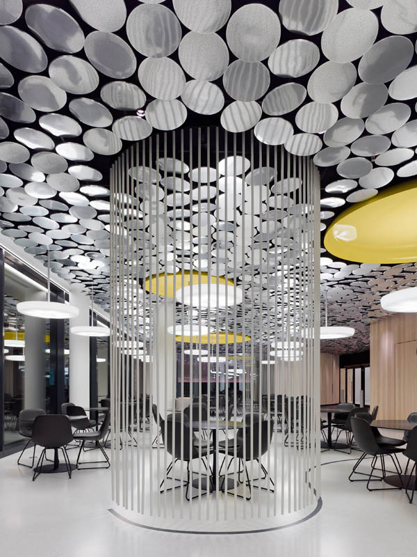
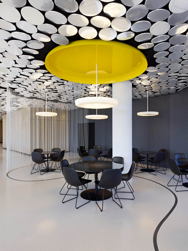
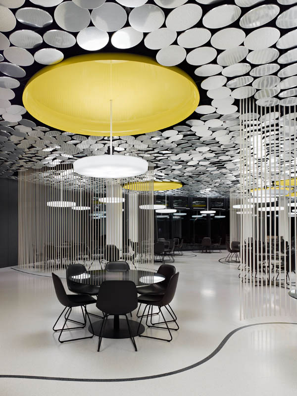
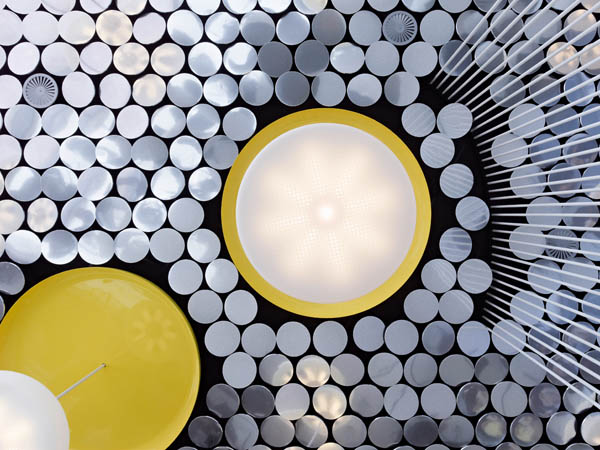
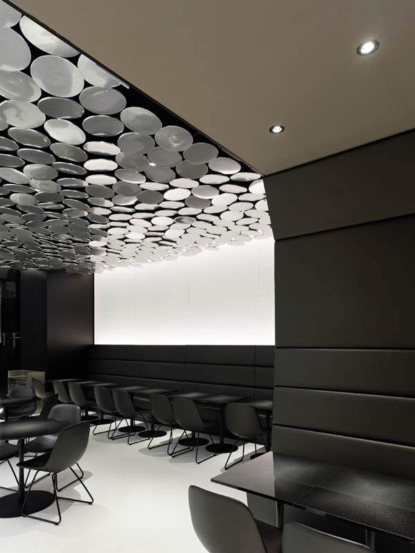
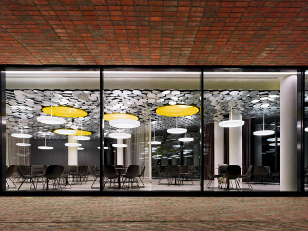
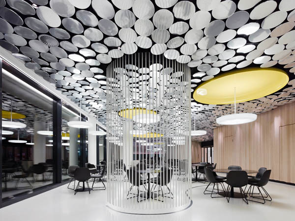
Because the space had to be flexible, it was soon clear that the ceiling design would be the distinguishing moment of the canteen. Reflecting both this fact and the harbour location, we developed a matt shimmering ceiling which reflects light in much the same manner as water. It is formed of 4,230 circles made of micro-perforated satin-polished aluminium, laminated onto noise-absorbing supporting material and set at slight angles to each other. This means that the canteen?s natural light ambience reacts to its surroundings. During the day the ceiling is enlivened by water and light effects from the surrounding area. The ceiling also has functional advantages: the area above the ceiling plates is painted black, along with the mandatory technical fittings, rendering them invisible. Ceiling diffusers and sprinklers effectively disappear. In addition, the upper ceiling was configured to be noise-absorbent, complementing the acoustic properties of the micro-perforated plates.
The round, communicative tables are made from black coated steel frames which seem to grow from the floor in a graceful motion. Granite plates serve as table tops, their lasered surfaces working with the ceiling lights to create glare-free, brilliant light.The tables are placed within the space in three large groups in loose arrangements and so provide an organic counterpoint to the polygonal floor plan. Movement zones are thus clearly delineated. Three lines are set into the smooth, white terrazzo floor: they ensure tables don?t encroach on walkways. Along these lines four areas are arranged with removable, lightweight spatial filters composed of white, hanging rods. Large yellow light dishes support the zoning of the space just as the hanging lamps locate tables within the space.
Wood panelling lends a sense of depth to structural hubs. The whitewashed, varnished surfaces appear even deeper thanks to a vertical, wavy relief which gives a textile-like effect.
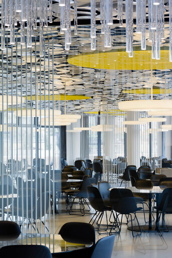
Through a zigzagging glass façade a separate area can be formed at one end for discrete events or for use of the canteen late at night. A shoal of bright, hanging Plexiglas rods creates glare-free illumination and an intimate setting. The glass façade between this area and the canteen is formed of doubly reflective glass. So at times when both areas are in use, the separation is almost immaterial. However when the canteen is closed and thus darker, the façade appears half-mirrored, half-transparent.”
Design: Ippolito Fleitz Group
