Bruce B./Emmy B. Design Agency Offices Revisited
Bruce B./Emmy B. is a design agency whose space I briefly tackled in 2010. But armed with additional high-quality images and loads of information, now is a great time to revisit the project.
The Search for Space and a Design Partnership
The story begins when Ippolito Fleitz Group – longtime friends of Bruce B./Emmy B. – secured a new office space in West Stuttgart. They chose a great Wilhelminian-era building that had been heavily damaged in World War 2, but recently reconstructed and remodeled which was located in a lively area known as the Augustenstraße.
As luck would have it, the principals of Bruce B./Emmy B. (who happened to be in search of a space themselves) stopped by for a visit and spontaneously decided to move their firm to the same building. And even better, they hired Ippolito Fleitz Group to design a new interior for their agency.
An Open Design to Translate Work into Architecture
Studio Ippolito Fleitz’ goal in the project was to create an office environment that both symbolized and enhanced Bruce B./Emmy B.’s work methods – namely openness and an ‘Iron-sharpens-Iron’ attitude.
The firm adds, “Objects and design elements initially appear to be in diametric opposition, yet strike a harmonious balance throughout. They are emblematic for the wish of Bruce B./Emmy B. to respond to their clients with an open, strategic mindset and an excellent command of antithetical thinking.”
Details, Details, Details
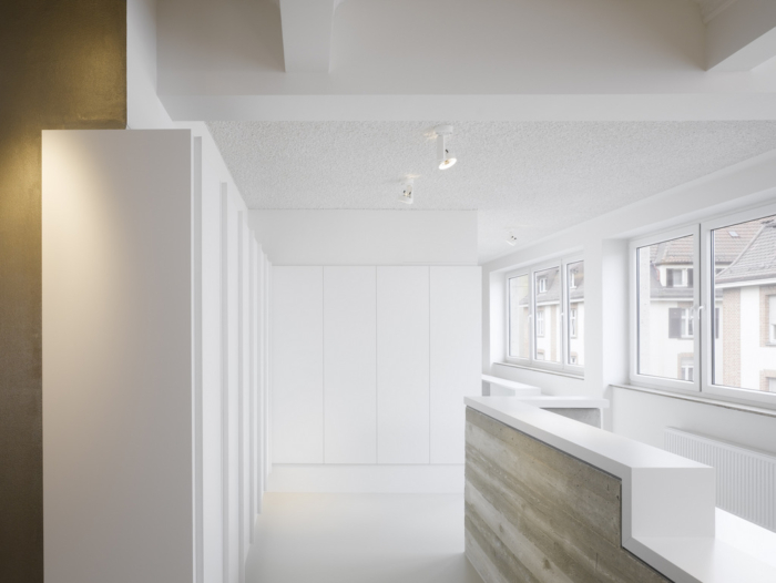
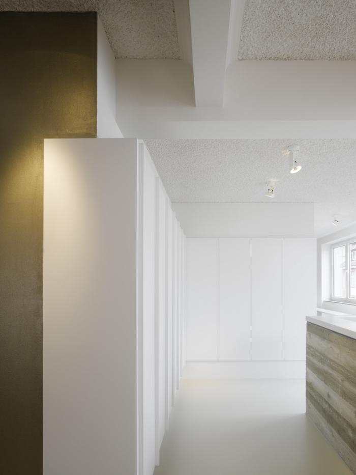
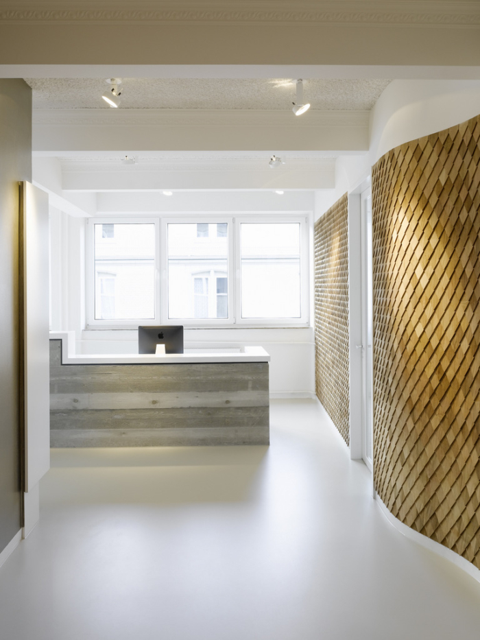
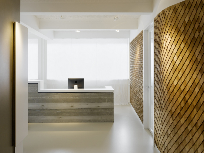
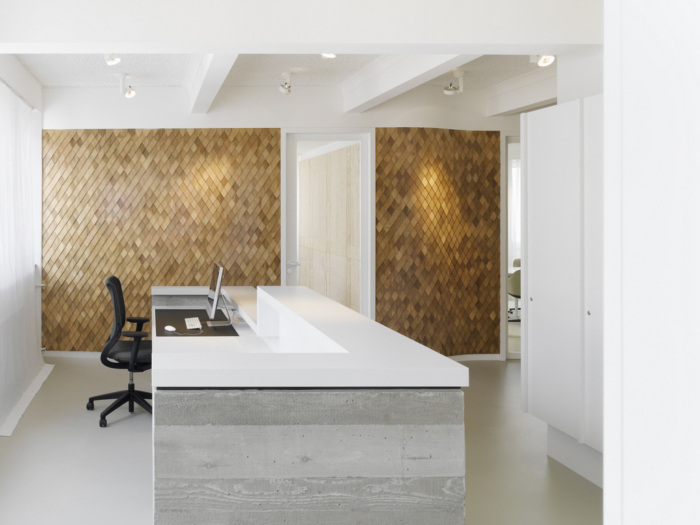
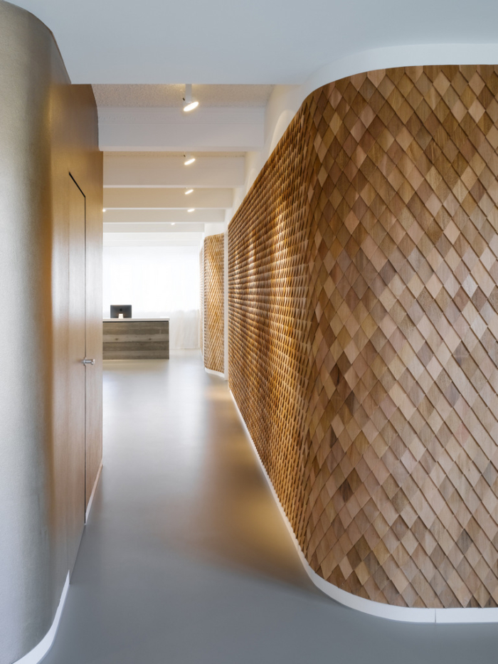
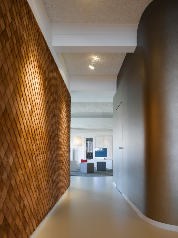
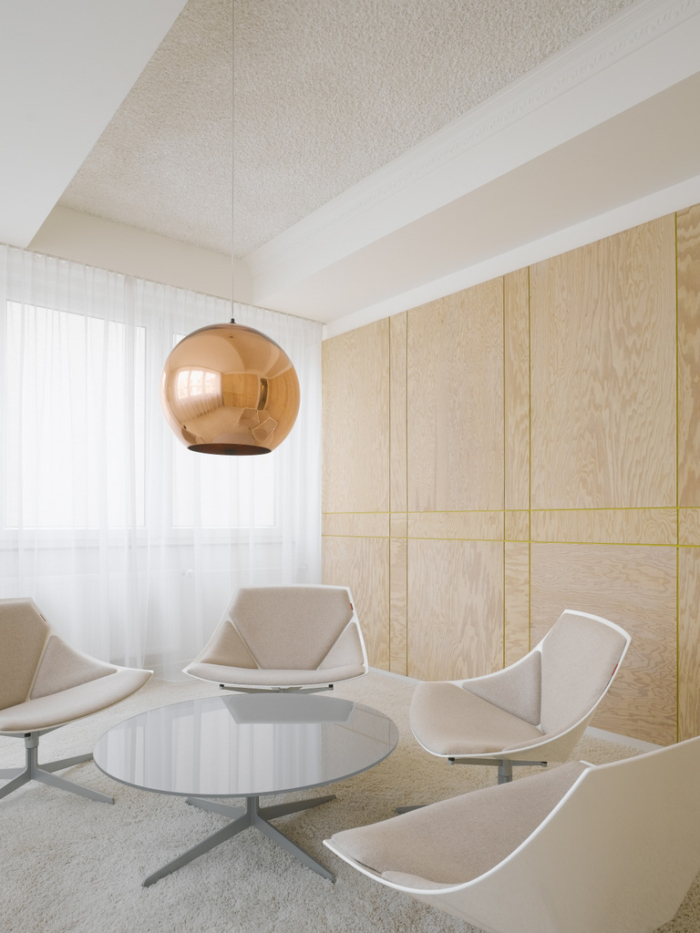
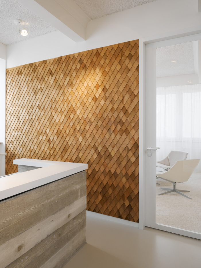
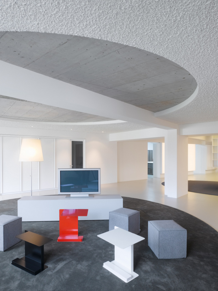
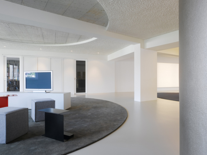
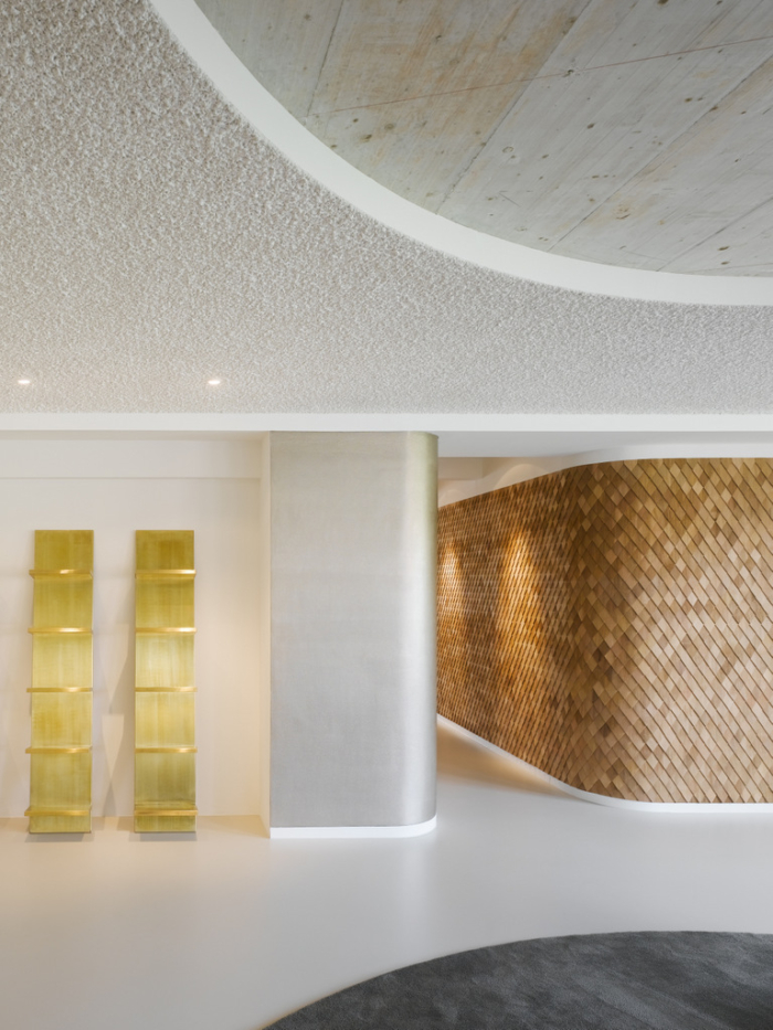
It would be hard to find details in this project that haven’t been thought through. In order to immediately capture visitors attention upon entering, the reception desk is created out of exposed and rough concrete – and is of course put up against a pristine white desk top.
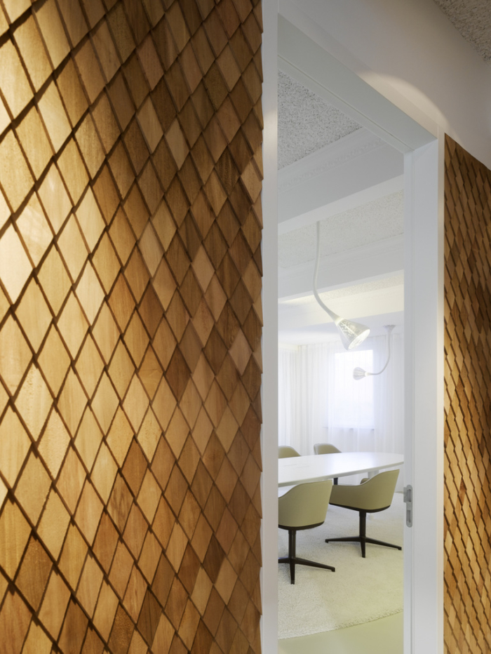
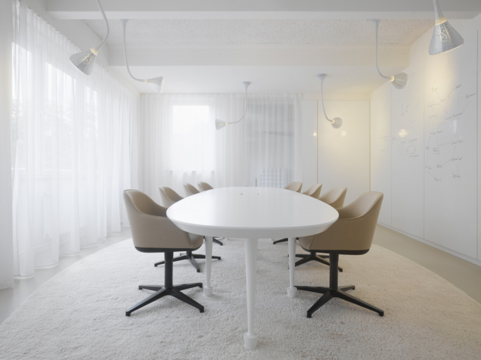
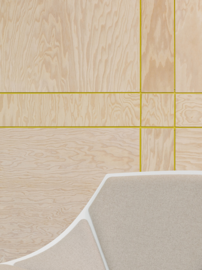
The conference rooms have similar edgy details like wood paneling with think yellow accent grooves. Another contains a conference table with randomly situated legs to create a more playful attitude.
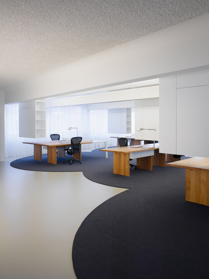
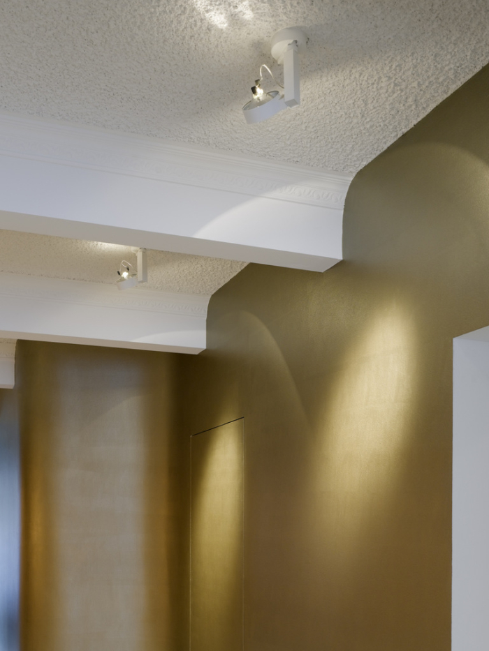
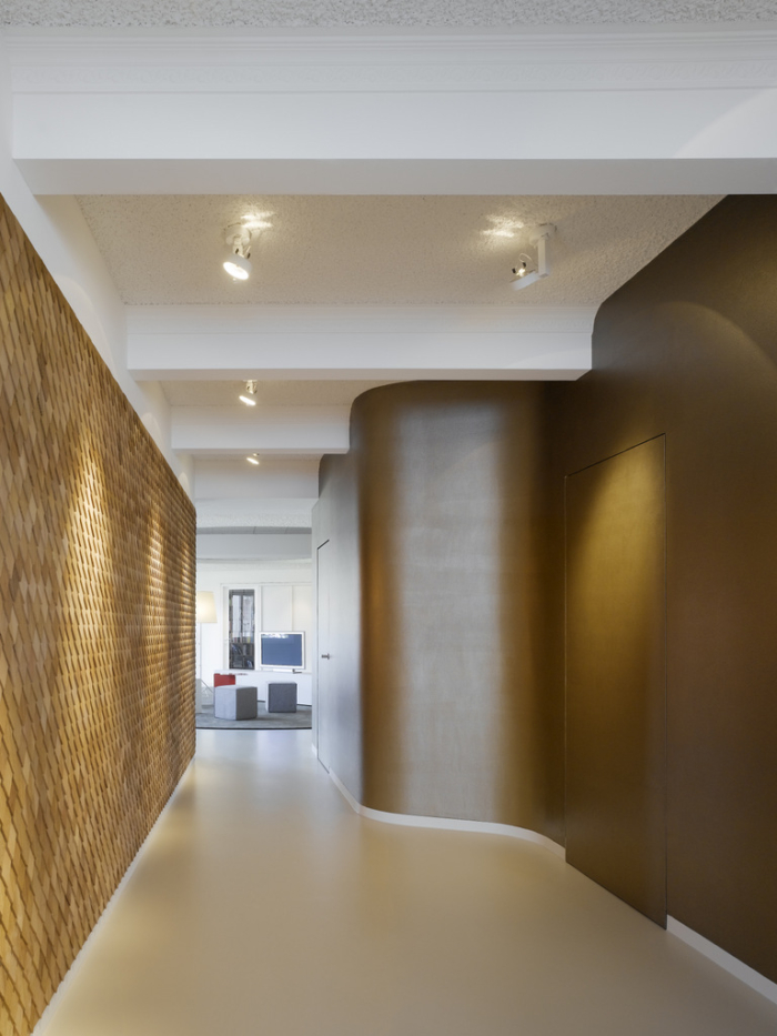
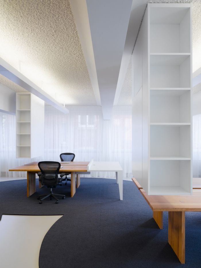
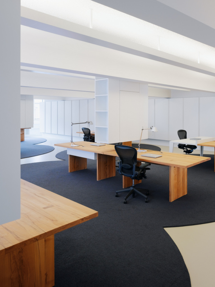
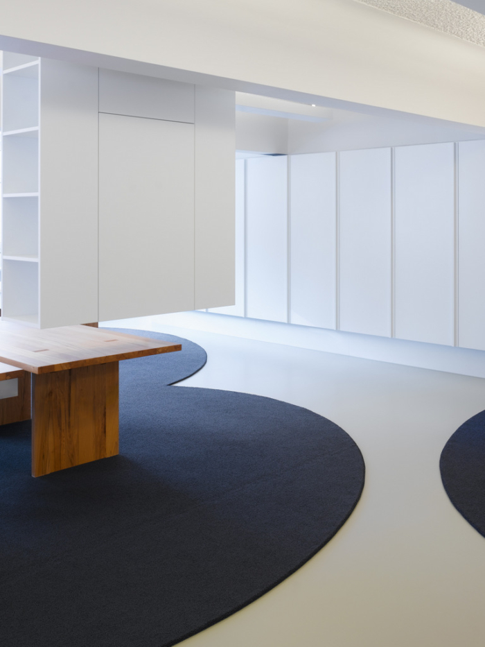
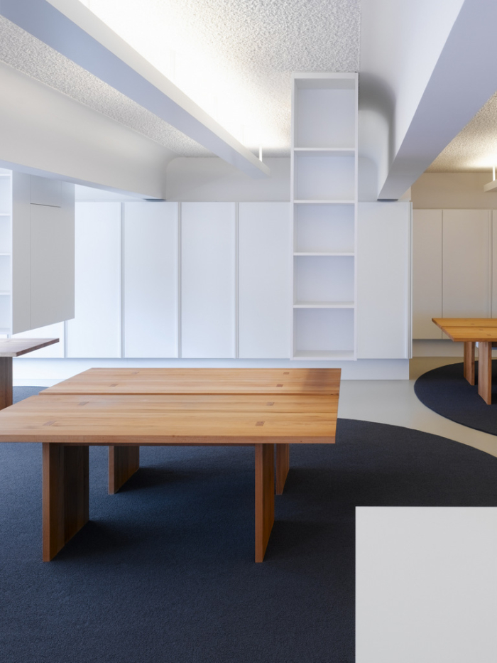
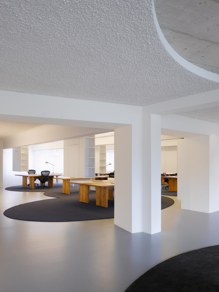
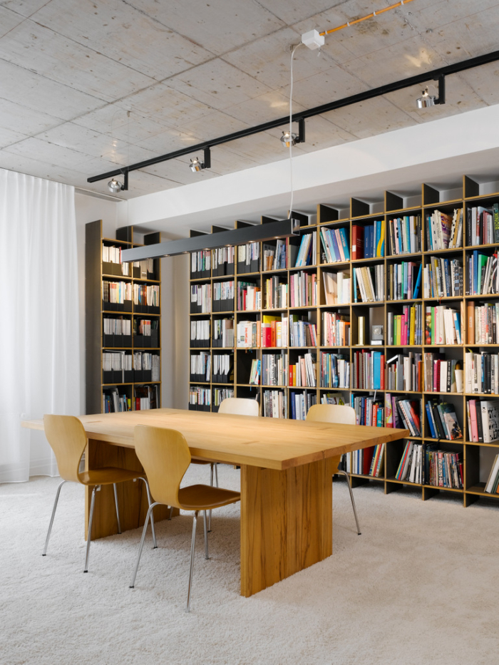
And the ceilings in throughout these areas are covered in stucco to bring a homely and familiar, apartment-like attitude to a business setting. But once into the main work space, shelving units are hung from the cieling, which actually break up the size of the room quite nicely.
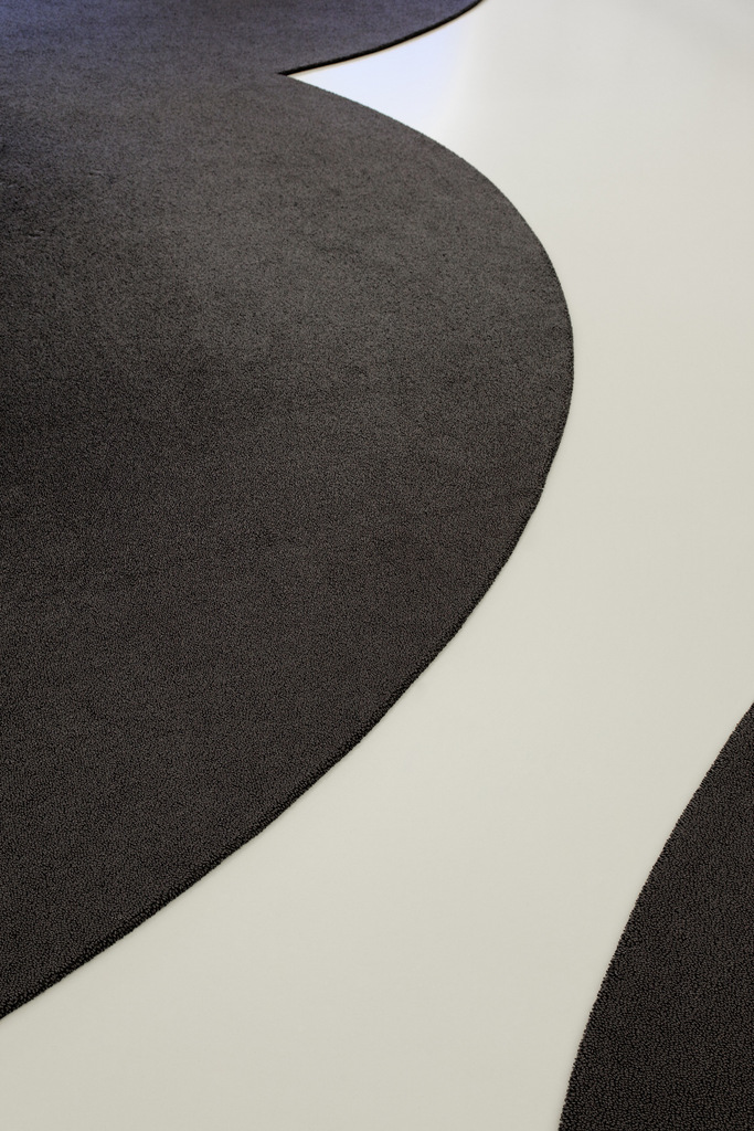
One last detail necessary of pointing out are the floors which carry the diametric-opposition theme further. You’ll no doubt notice the islands created by the carpeting and desks – which is of course intentionally done to demarcate ‘space’ that can be entered and exited.
Photography
The photography of this space was taken by Zooey Braun.


