Rocket Internet Offices – Berlin
de Winder has designed the offices of venture capital company Rocket Internet, located in Berlin, Germany.
The office spaces in Rocket Tower, the former GSW building complex in Berlin-Kreuzberg, were redesigned in 2016 for Rocket Internet, the publicly traded internet company. The complex consists of a 22-storey high-rise slab, a 3-storey plinth and the “extension”, built in 1995-1999 from plans by the architectural competition winning firm of Sauerbruch Hutton, plus the original 17-storey tower from 1961. At the time, its architecture and energy balance were regarded as visionary. Rocket Internet has been the sole tenant of the tower and slab since 2016 and has established its headquarters there.
De Winder became involved in Rocket’s property search and provided consultation, beginning in 2015. Our firm then developed the spatial layout and interior design for the newly created Start-up Campus. Hillig Architekten was responsible for the renovation and conversion of the complex.
The goal was to upgrade the interior spaces while preserving the visionary ideas of Sauerbruch Hutton and create high quality, ergonomically-oriented workplaces for over 2,000 employees.
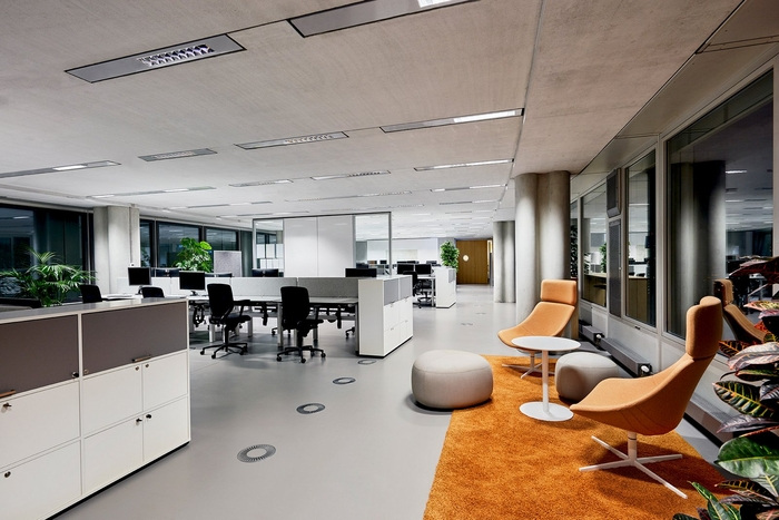
This required a re-organisation of floor plans in the tower with dissolution of the existing, classical cell structure and new building services infrastructure. The floors in the high-rise slab were opened up again by dismantling some of the office cells found there. The opening created spaces filled with light from both sides in new floor plan arrangements that were attuned to the needs of specific departments.
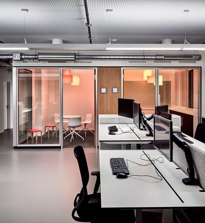
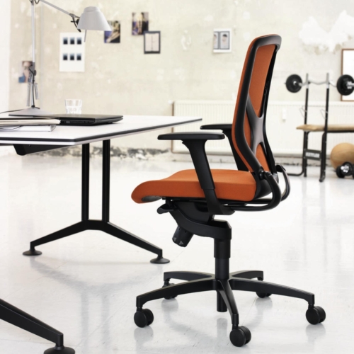
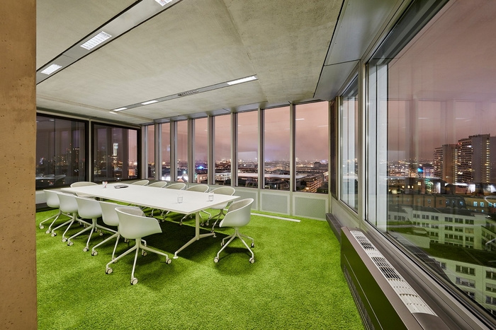
Thus, teams that require calm when working received concentration-supporting retreat areas, while highly communicative departments, such as Business Development, obtained open areas for interaction. All workplaces were equipped with electric, height adjustable, sitting/standing desks, ergonomic seating and acoustically effective panels. White boards, coloured lounge groupings, meeting areas and a boardroom at the northern tip complemented these areas on every floor of the slab building. A 50-person auditorium was integrated into the 13th floor of the tower for team meetings, smaller presentations or workshops.
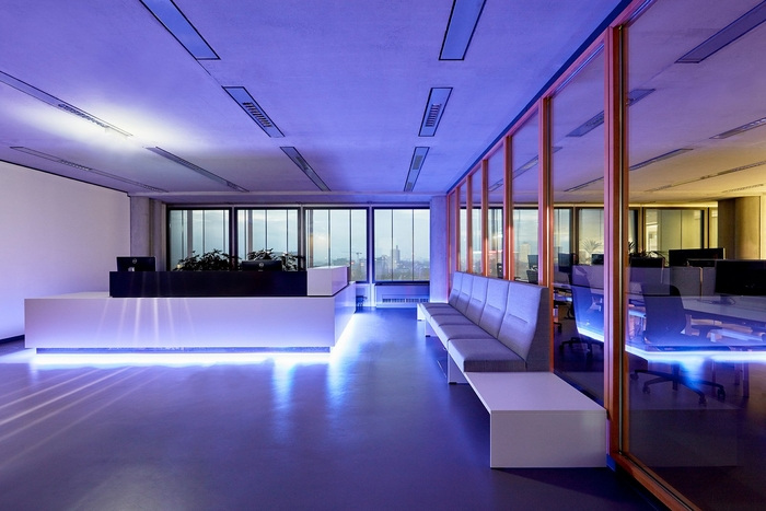
The official reception area, with counter and visitor lounge, is located on the 14th floor of the high-rise slab. Existing wood and glass elements from the former office cell were used here to differentiate the reception area from the work places.
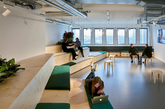
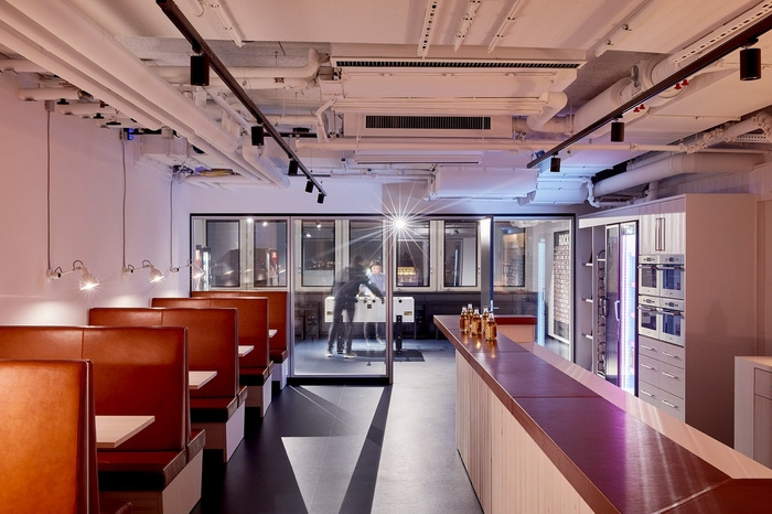
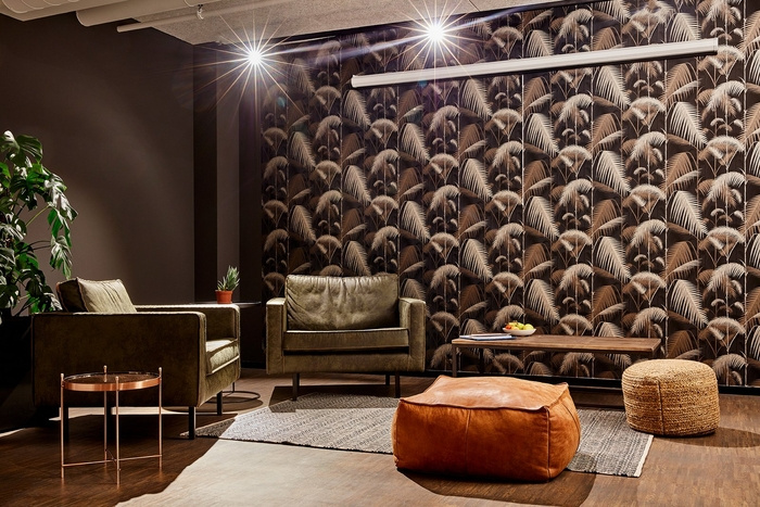
The central meeting point for all Rocket employees is the meeting and lounge area on the 16th floor of the tower, with its staircase to the roof terrace above. On this floor, six meeting rooms of varying size are available for employees and guests. The lounge encompasses the Diner and its kitchen counter, an expansive Living Room with a 30-metre-long seating landscape and a Fireplace Room. The Living Room serves as a break room, party zone or meeting area for up to 200 people.
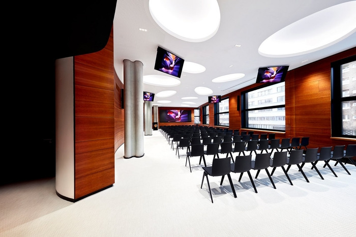
The former GSW conference area on the 1st floor of the slab was modernised as the new Rocket Tower Conference Centre for all-hands meetings or external events. The 200-m2 large conference hall forms its centrepiece. This space accommodates up to 200 people and now has the latest conference technology, an LED screen and sound system. The Sauerbruch Hutton spatial geometry was preserved and only the colour scheme and finishes were redesigned. By concentrating on the room’s defining materials and a black and white scheme, the original spatial concept has returned to the fore. Ceiling and floor form a bright whole that is wrapped by the cherry wood wall panelling. Two large multi-functional areas and seven group rooms in the tower complement the conference area on this floor.
The building’s ground-floor sports area, which was implemented in collaboration with the McFit Global Group GmbH fitness chain, received a Cyberrobics video wall in addition to the cardio and equipment areas. The Beta Space, where up to four different start-ups can work on their concepts on four spacious work units, is located on the 17th floor of the slab.
To make the real “inner space” of the building recognisable again, special value was placed on a reduced palette of colours and materials, in addition to opening up the floor plan. So the expanse of the space is emphasised on every floor by the correspondence of light grey rubber floors and exposed concrete ceilings and the gaze is directed to the surrounding cityscape.
Design: de Winder
Photography: Mark Seelen










Now editing content for LinkedIn.