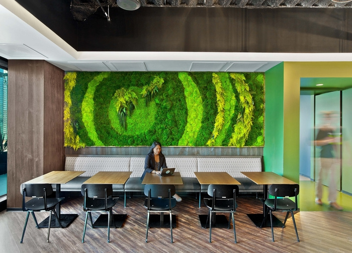
LinkedIn Offices – San Francisco
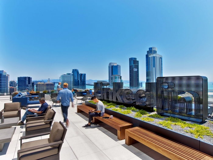
IA Interior Architects designed the headquarters for professional networking company LinkedIn, located in San Francisco, California.
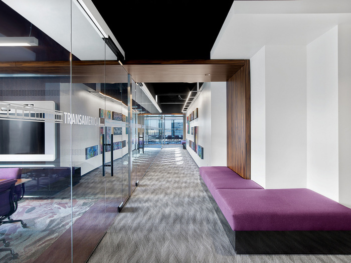
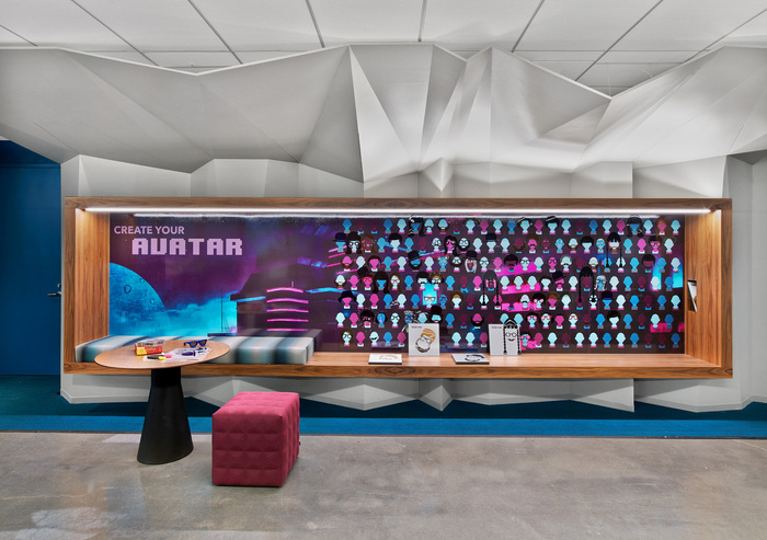
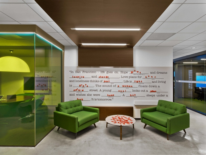
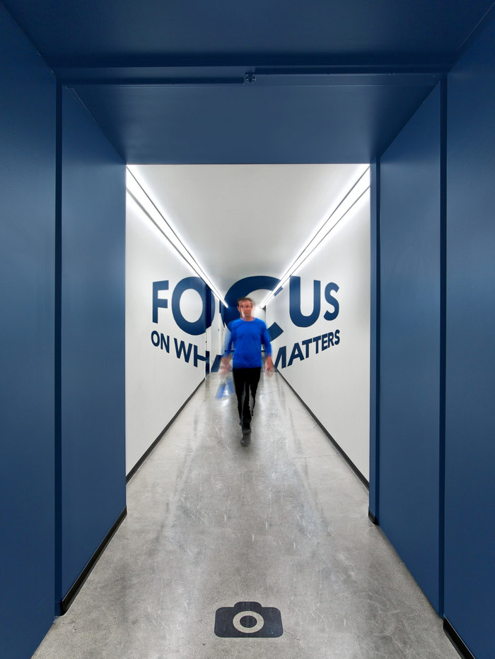
For LinkedIn’s office tower at 222 Second Street in San Francisco, the project team at IA Interior Architects drew inspiration from the diverse landscape and history of the city. Through color, texture, pattern, and art, IA designed each floor with San Francisco front and center. Using guidance from the client, it was a priority for the design team to create a community of new experiences that bring employees closer together with their teams, encourages them to explore the building, and features creative design elements that reflect the city and local LinkedIn Members.
The IA team worked on a kit of parts with flexibility being a top priority; every work station can be moved to accommodate various types of work. Similarly, the conference rooms can be shifted depending on need; employees can add to them by popping out a wall or shrink them by doing the reverse. Typical floors all have scrum, touchdown, workstation, and solo zones, organized similarly on each floor. We purposely designed our workspace this way to encourage movement throughout the day and help build stronger connections and relationships between teams and colleagues.
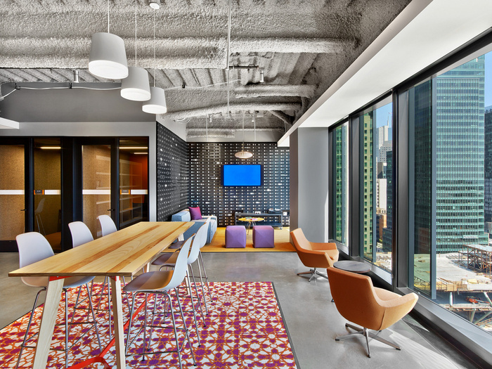
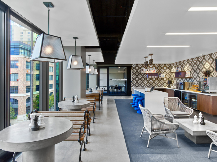
Each floor takes on a specific identity based on the unique space element located within the centralized hub. The hub makes up a central zone with a variety of space types that support different work modes and activities. You can find the hub located in the same area on every floor, just off of the elevators. Individual space and some meeting areas are located around the perimeter, giving everyone access to natural light and views to the outdoors.
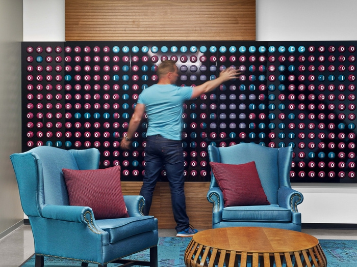
There is no shortage of power outlets, so you can plug in and work from basically anywhere. Each floor has writable surfaces, staff walls, and interactive zones, with the graphic theme setting the framework. There is an All Hands space that is reconfigurable and supports large meetings as well. There is a UX Lab, a range of game rooms, and a Makers Room filled with art supplies and other items design to encourage creativity. Additionally, every floor includes either a game space or a library/quiet zone; this is important for the engineers who spend a lot of time in the building and need some respite. Each floor’s respite areas, called “Refresh” aligns with the theme of the floor.
Designer: IA Interior Architects
Design Team: Carolyn Tucker, Neil Schneider, Colin O’Malley, Adrienne Harbarger, Michelle Hoffmann, Ruben Gonzalez, Kevin Lieberman, Nicholas Mosher, Amy Ehara, Anne Nilsson. Cara Rooney, Julie Maggos, Meghan van Noort, Amanda Eggleston, Christine Lai, Gary Bouthillette, Megan Howell
Contractor: Swinerton Builders
Furniture Dealer: Pivot Interiors
Photography: Eric Laignel






Now editing content for LinkedIn.