The Princess Margaret Cancer Foundation Offices – Toronto
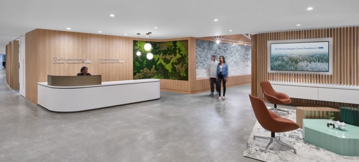
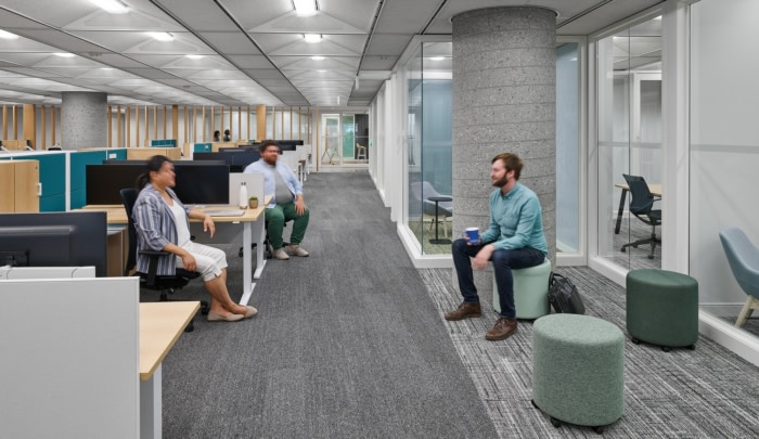
The design of the The Princess Margaret Cancer Foundation offices uses nature, color, pattern and flow to communicate the Toronto-based research institute's mission of ending cancer.
Figure3 was tasked with the design of The Princess Margaret Cancer Foundation offices, a top research institute located in Toronto, Canada.
The Princess Margaret Cancer Foundation (one of the top 5 cancer research centres in the world) had a vital mission for their new office in Toronto: create a work environment that reflects the Foundation’s passion and courage to conquer cancer in our lifetime. The Foundation wanted their new office space to enable the team to collaborate, communicate and innovate to accelerate fundraising, strengthen their commitment to their mission, and serve as a platform to recruit and retain the best talent.
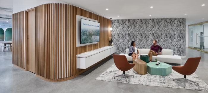
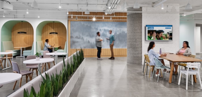
The space was to celebrate and bolster the Foundation’s goals and achievements while conveying a sense of hope through an uplifting range of spaces, colour and branding. To do this, the team focused on a number of key concepts throughout the design process: elements of nature, colour, pattern and flow.
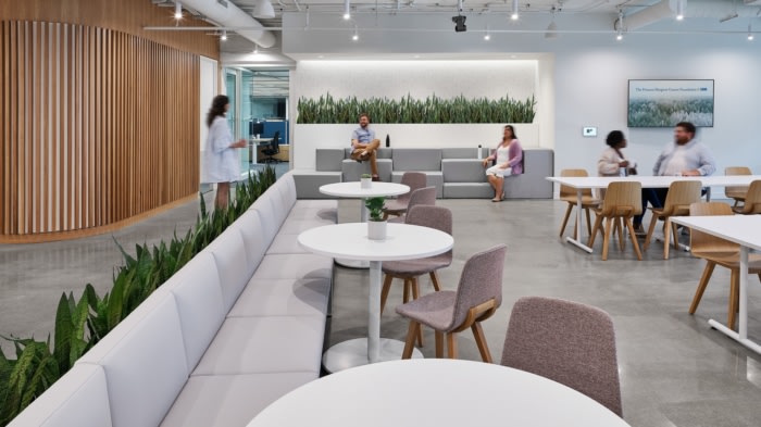
The colour palette was carefully curated to take staff, partners and guests on a visual journey that explores wellness, creativity and movement. Careful placement of built-out spaces, offices and meeting rooms are intentionally detailed with glass to ensure natural lights shines through. Celebrating nature and life, the use of sustainable materials and biophilia are used, reflecting the energy and pace of the organization.
An additional visual feature is the interactive donor and history walls in the reception, which incorporate physical and digital elements to inspire and engage donors with the track record of research breakthroughs that have happened at the Princess Margaret Foundation, while also highlighting the most critical funding priorities in need of support from donors.
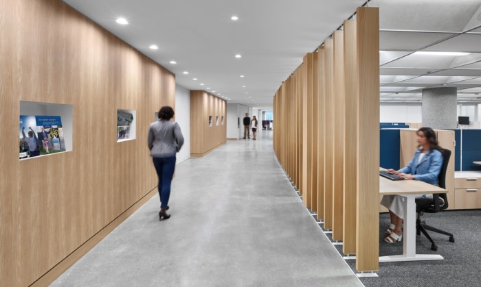
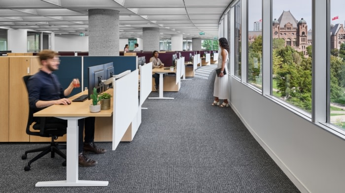
The team chose an activity-based office to promote movement and support the workforce for their variety of tasks suited for individual needs. The office is split into differing sections, or “neighbourhoods”, made up of flexible workstations and provide a nice alternative to private rooms and offices. Defined pathways act as “sidewalks”, which connect the neighborhoods together, all while supporting a natural flow to the way people move throughout the space.
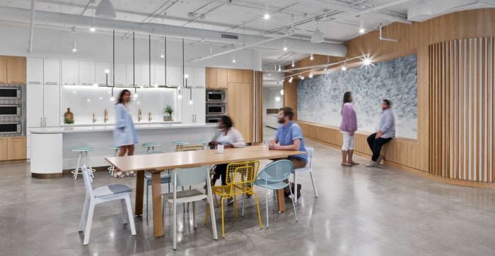
Each part of the office was designed with a sense of purpose, multi-use and connection. The main café is designed to be the central hub for staff to gather and interact throughout the day. The cafes, quiet zones, and meeting rooms are designed to open up into larger spaces so the Foundation can host town halls and staff celebrations.
Overall, the new workspace aligns with the Foundation’s mission to fight cancer while promoting collaboration, innovation, and communication – all needed to deliver on the Foundation’s bold new strategic plan. With enhanced navigation, an appropriate mix of spaces to support different methods of work, and tons of natural light, the office staff are fully equipped to work and feel their best.
Design: Figure3
Photography: Steve Tsai

























Now editing content for LinkedIn.