LINGXING Offices – Shenzhen
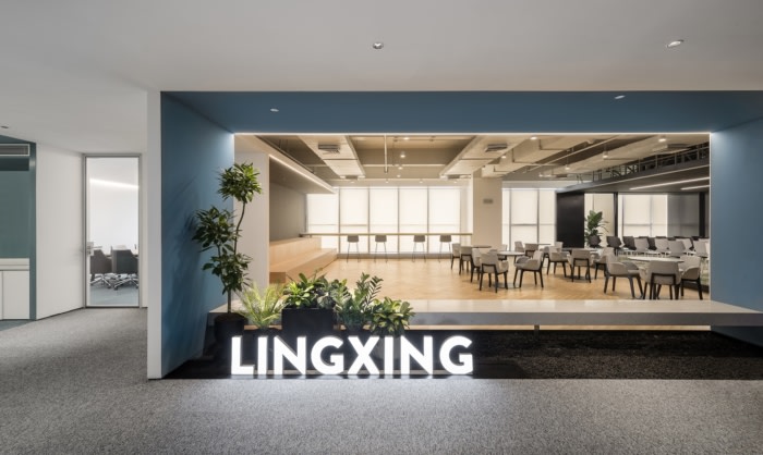
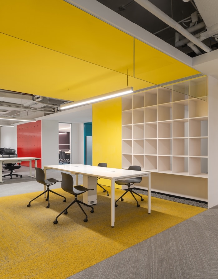
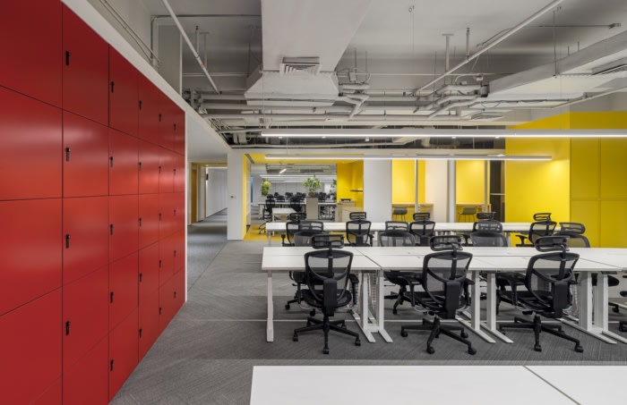
Onexn Architects used designated work zones marked by pops of color on a neutral backdrop to design the LINGXING offices in Shenzhen, China.
LINGXING is an emerging internet company that dedicates itself to creating value for the cross-border e-commerce industry through SaaS ERP software system. In the new era, workspace is no longer simply a place where people gather for work. It is also a carrier of new modern lifestyle and a window that conveys corporate values and culture. As conceiving the headquarters office for this new company emerged in the Internet era, the design team responded to its revolution and demands with systematic design thinking, and gave new interpretations to workspace under such context.
Located in a tower building, this headquarters office faces both built and green landscape on three sides, and the other side embraces built landscape.
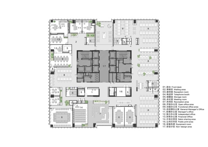
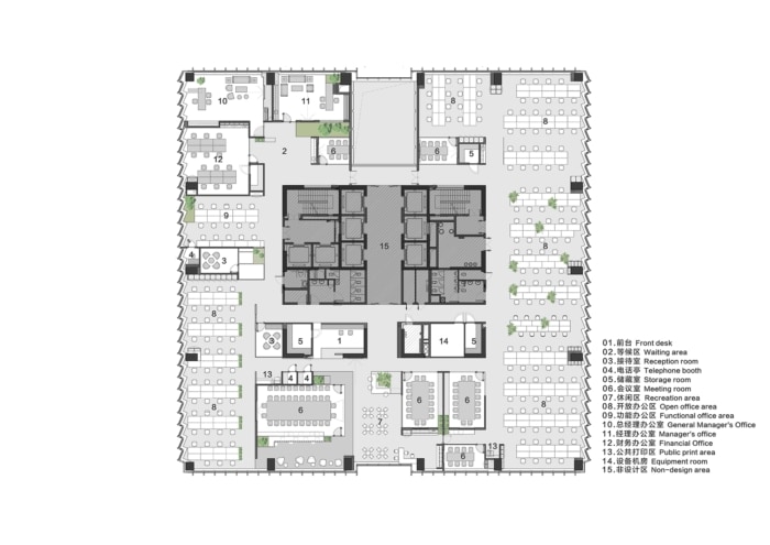
The design team arranged the public functional area at the position that faces south and enjoys optimal view, in a bid to share the quality resources to all staff, which is in accordance with Lingxing’s corporate philosophy of fairness and equality. Other spaces are designed as open and independent offices according to demands. Such layout design is applied to both the 35th and 36th floors, but the degree of openness varies for different functions.
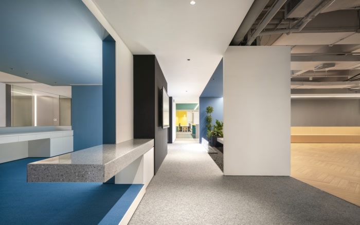
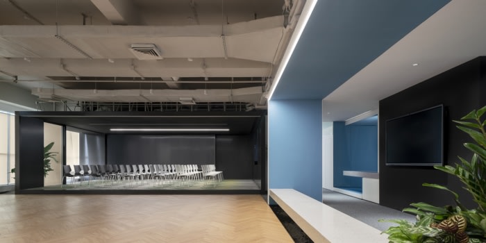
The space is composed of a series of “geometric blocks”, with “boxes” acting as containers of different functions.
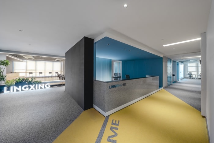
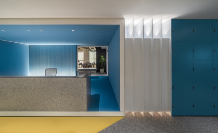
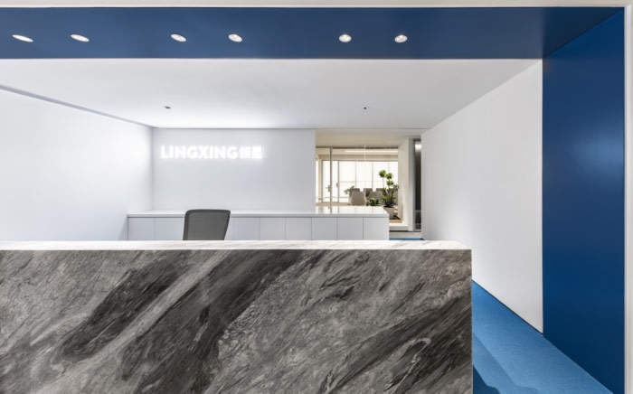
The reception area at the main entrance is a semi-opened box, which helps to provide a clear view of the activities on all sides.
Opposite to the elevator hall is the preexisting core cube, to which an LED display screen is added, hence making the space full of technological dynamism.
The semi-open reception area creates a relatively unobstructed line of sight and enables the interpenetration of adjacent spaces, producing fun spatial experiences.
The main entrance and elevator hall are set at the core cube area, which was originally closed and narrow.
The designers introduced light and new materials to this area, to eliminate the oppressive feeling of the original space. The geometric volumes interweave with the light, creating a futuristic experience with an array of spaces.
U-shaped glass and floor light strips are placed at the core tube area and the reception area, allowing light to extend along the space and form a visual guide.
The public area on 35F serves as the main entrance and a corporate display space that conveys the company’s people-oriented philosophy through an open spatial pattern.
A viewing frame at the far end of the main entrance divides the space and maintains a clear line of sight.
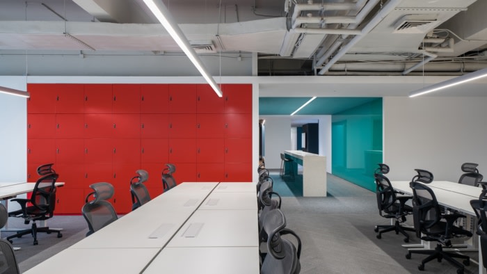
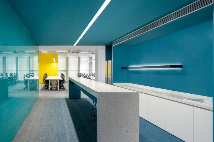
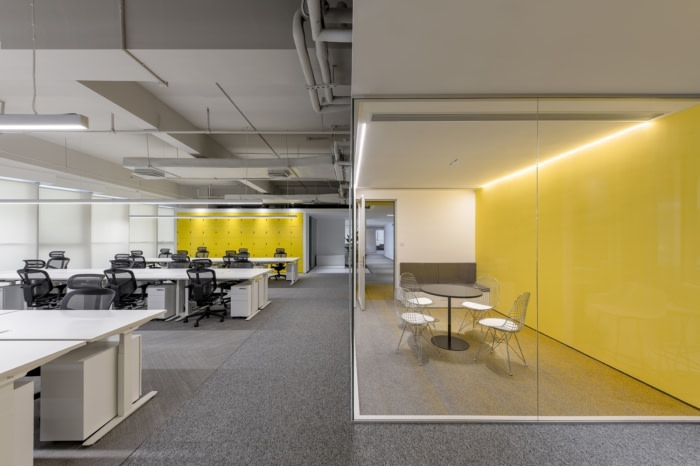
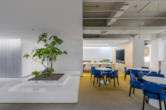
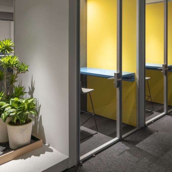
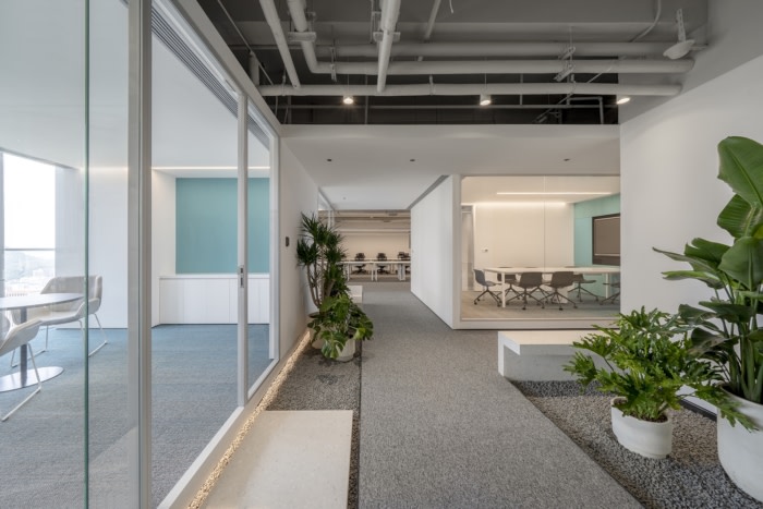
The efficient circulation is surrounded by various open communication spaces, such as reading area, discussion area, small meeting room and phone booths. Auxiliary spaces with shared functions are either incorporated into the communal areas in a geometrically tangential manner or scattered in the open working area, breaking the long and solid boundaries of the larger space.
The varied scales and ways of enclosure make the space more flexible. Within it, users can feel the subtle changes of the relationship with the geometric space, and are encouraged to interact with it. Formed by inserted geometric blocks, different spaces interpenetrate, which ensures both the independence and interconnectivity of functions, as well as the natural transition between privacy and publicness. The soft boundaries offer employees a comfortable and fluid spatial experience.
Design: Onexn Architects
Design Team: Wang Jingjing, He Ziying, Lv Rongcan, Guo Yanxin, Ye Runze
Photography: Zhang Chao, Luo Canhui






Now editing content for LinkedIn.