On Branding: An Interview with Raquel Sachser, Senior Designer at M Moser Associates
On Branding is a editorial series of interviews investigating the concept of branding in the modern workplace.
We had a chance to speak with Raquel Sachser, Senior Designer at M Moser Associates‘ New York City offices, who has recently worked on the offices of Pivotal Labs, Raymond James, and Honeywell.
Raquel tells us about what branding in the contemporary office landscape looks like and how the firm works to help clients create an environment which matches the unique identity of each organization.
—
1. What does workplace branding look like for a client of M Moser Associates? Is it different depending on the company?
M Moser’s workplace branding results in unique story-telling for each client, for each location. We tailor the clients’ graphic story to the company’s brand, initiatives, and cultural/community goals for the next chapter in their business.
Environmental graphics drive successes around activating the space, clear message delivery, and wayfinding, and we’ve found graphics are one of the tools our clients use in attracting best-in- class talent. New graduates joining the workforce and choosing between “X, Y, and Z” company are wanting to work in a place that resonates with them. Graphics fully resonate when they are aligned to architectural concepts; communicating company brand to visitors, and supporting the organization’s goals, values and mission.
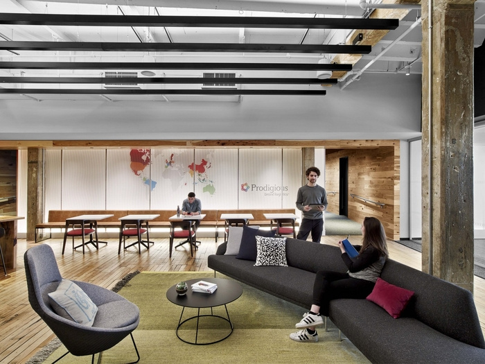
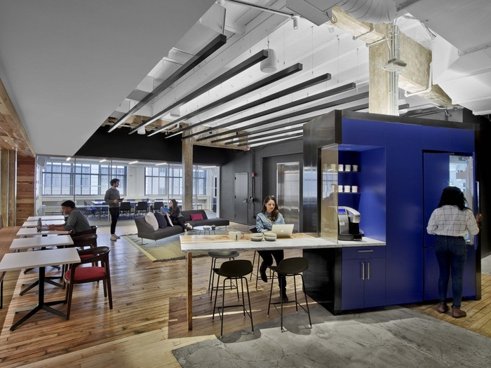
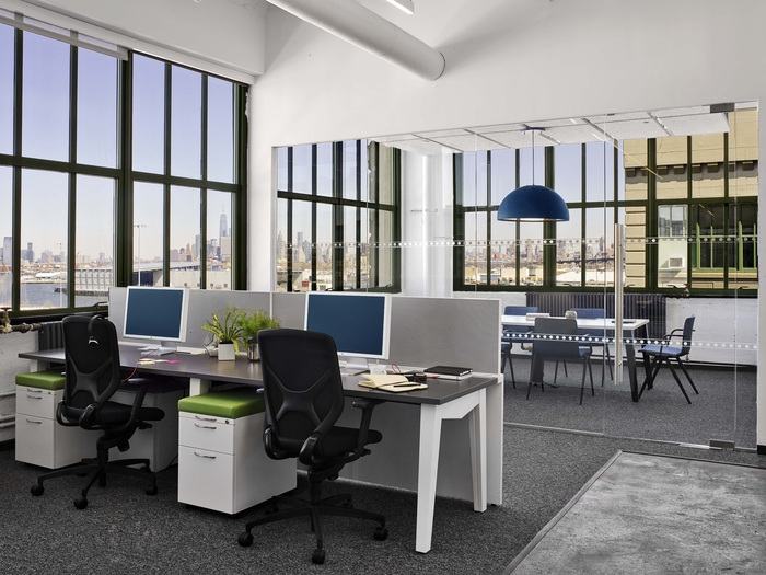
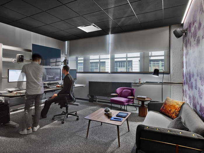
Prodigious’ Brooklyn Offices
2. Workplace branding seems to be often portrayed as simply the addition of company logos and colors. Do you find there are misconceptions about what it is or what it can be?
There are certainly misconceptions around workplace branding. Before design, M Moser considers and studies the personality of the space and the client, the client’s brand aspirations and goals, the perception of the brand and consumer awareness of the brand. We additionally factor in the potential user experience for all levels of staff members within the workplace and how a user experience could enhance the company community.
We define environmental graphics and branding through three principles: Communicate, Enhance, and Activate, and relate these to graphics, wayfinding, artwork and architecture.
For example, “Communicate” may simply be a stylized version of a client’s logo within a reception area, catering to the end-users’ knowledge of space, greeting them when they enter, and making it known where they are. “Enhance” often refers to commissioning local artwork to reimagine their brand within a community hub space to bring the brand’s personality and company values to staff in a communication-focused setting. “Activate” may refer to wayfinding – using company branding to name meeting rooms, create floor graphics that create a bespoke user experience (ie from reception, pantry, to town hall and finally workspace).
In regards to the common misconception equating and simplifying brand to a logo, M Moser believes that a company’s brand is reflected in their culture, staff, recruitment, and retention, as well as the staff’s unique work style. M Moser designs spaces for each client after careful and considered workplace strategy studies and continued conversations with the facilities management, C-suite executives, as well as the staff.
Prodigious’ Brooklyn Offices
3. Can a company’s brand and identity go beyond aesthetics to influence the organization and design of a space?
Yes! For Prodigious, a French-based multi media content agency under the Publicis Groupe umbrella, M Moser worked very closely with executives in both France and New York during the planning stage to design an office that had regional resonance to the American employees and felt unique to their work, while aligning with the corporate brand.
A primary focus around Prodigious’ migration from Manhattan to Industry City in Brooklyn revolves around the ability to attract and retain talent, and connect to the surrounding community. The move into a neighborhood full of designers, makers, and content creators has been a transformative step for the business and its employees. Our design for Prodigious focused on the employees becoming a living and breathing part of the evolving neighborhood and building the vibrant maker-oriented community around them within their Industry City space – another example of a brand being more than a logo. Prodigious’ move is a brand come to life, influencing the staff and visitors positively, building pride, and showcasing their work in a creative, visual way.
The team chose colors and materials that balanced their visual branding and creative focus. The main goal was to design the space to allow Prodigious to do their best work while displaying their product and providing a welcoming environment for their clients. The finished workplace has open, bright and creative spaces surrounding the tech-driven environments for people to interact and complete focused, heads-down work. We wanted to celebrate Prodigious being in Industry City by keeping the exposed columns, with blemishes and writing, on the original structure, while updating the space in ways that fit our client’s modern image. The contrasts between light and dark, simple and technical, create both a unique experience in the office and reflect Prodigious as makers – supporting their work processes and production.
Prodigious’ Brooklyn Offices
4. What are some benefits associated with a company brand being strongly represented in the workplace?
M Moser believes that a brand is your organization’s identity, while culture is your people’s identity – a successful workplace is a balanced manifestation of the two. Your brand not only reflects your company’s culture – it can enhance, activate, and communicate this in a larger way to the people you employ, recruit, retain, and invite into your workplace.
Your workplace design is a direct reflection of your company – at M Moser, our creatives believe that understanding your business goals, your definition of business success and your understanding of your people is imperative to design a unique solution for your needs. While we strive for beautiful aesthetics and gorgeous finishes, we put people as our first motivator.
What is important is how people work, how they want to work, and we create the where to enable their ultimate successful outcome. A strong brand/culture represents a community of learning, open communication, ownership, and fun. It’s a tool supporting the business drivers as a place that inspires and establishes a sense of pride for your people to do their best work.
Prodigious’ Brooklyn Offices
5. Do you have any other thoughts about what workplace branding is, isn’t, or should be?
Defining a brand within workplace design is a great strength of M Moser – we weigh all aspects of design with the same heavy hand: change and move management is important to a company’s brand – utilizing their brand and culture to motivate their team for a new workplace, as an example.
Designing an office that promotes various work styles and workspaces for a variety of staff with very different jobs is another great example of utilizing workplace branding – what is right for an Executive at a financial tech company may not be the same work style as that of an advertising executive.
M Moser utilizes the motto “people, process, place” to create an understanding of a company’s entire culture and brand, and using our agile design process to create a cohesive and realized physical space reflecting this understanding.
Thank you Raquel!
All photos courtesy of M Moser Associates