Four Things That Make Google’s Offices So Googly
I was recently explaining to someone why I started Office Snapshots – and my answer was that I had seen a few images of a Google office and wondered if other places like it existed, and if they could be seen on the internet. I quickly found out that other great offices existed, but there was no good place to check them out online.
All that said, that conversation got me thinking about what makes a Google office so Googly that everyone is drawn to them? While there are a lot of possible answers – of which many are tied to the company culture – I tried to come up with a few that are specific to the design and features the offices contain.
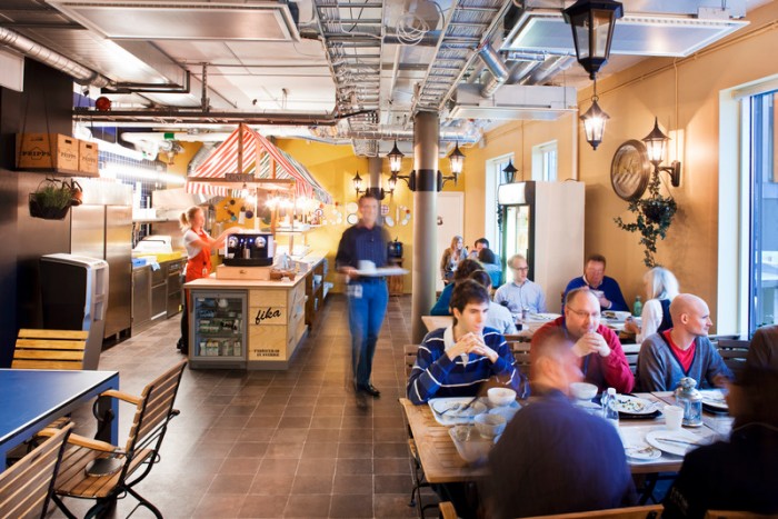
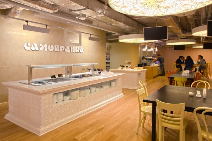
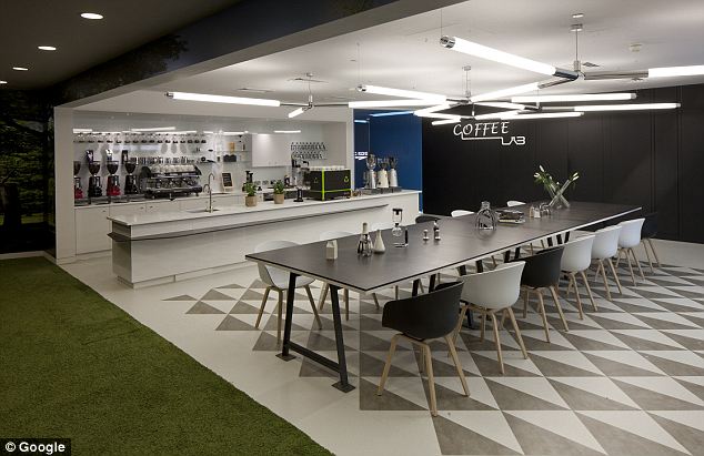
Selected Google Office Archive: Moscow, Zurich, Stockholm, Mountain View, Beverly Hills, London
Color, Color, Color
The most easily noticeable part of the various Google offices are the vibrant colors they contain. While the palette seems to have started with inspiration from Google’s logo, it has since been expanded to include any color imaginable – most noticeable in their Moscow, Zurich, and Stockholm spaces.
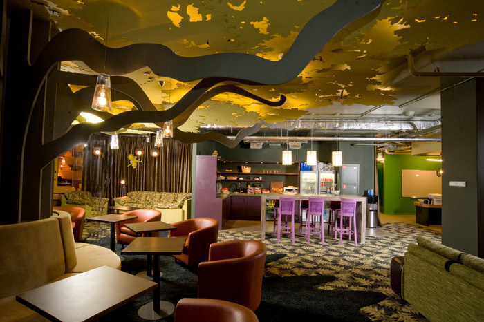
Why are they colorful? Partly for the fun, creative vibe color brings to any space – though their designers might also be reacting to some research which has shown that a more pleasant working environment can be created by using a variety of colors that mimic nature.
Design that Encourages Play
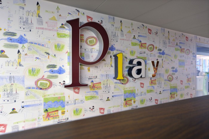
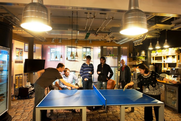
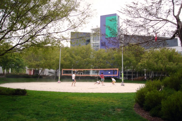
If you look into any of Google’s offices – you’ll always find some sort of play in action. Google Venice has a climbing wall, Zurich and Youtube have slides, most have video gaming, while others have swimming, gyms, and even volleyball. The size and variety of play options is limited by size, region, and budgets. While the Mountain View Headquarters seems to outweigh all others in every aspect of play, you’d be hard-pressed to find a Google office that doesn’t encourage it to some degree.
Using the Third Space within the Office
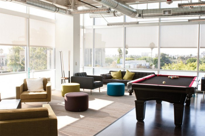
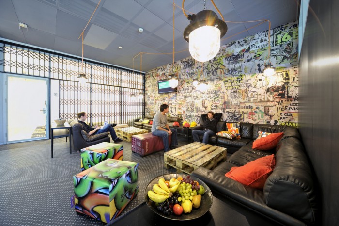
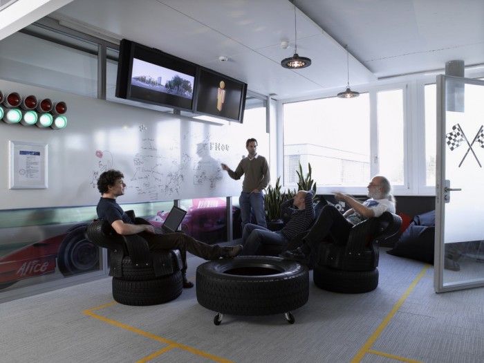
One of the key features of any Google space are the casual seating areas – or third spaces. These spaces are essentially alternative workplaces that aren’t your desk. Oftentimes they are a small enough for 2-3 people, while others are build for groups of 10-20.
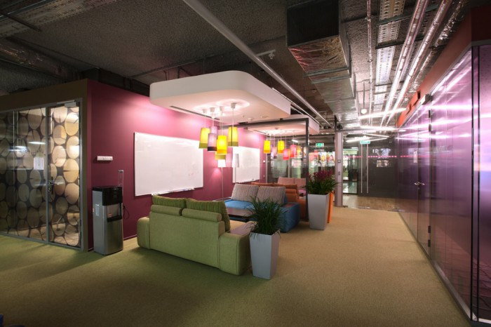
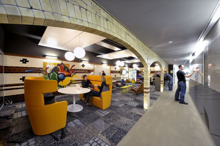
Google has seen fit in a number of their high profile offices – like London, Zurich, and more recently Venice and Hollywood – to include these types of workspaces. With mobile workers increasing and many using spaces outside the office to get work done, Google has seen fit to create spaces that mimic traditional third spaces within the confines of their office.
A Better Cafeteria Keeps You Working
When I first heard about Google and their work experience, I believe it was the free meals they provided their employees. While this might seem like an innocent perk, I believe the goal is to encourage employees to work longer by keeping them on campus. It also can work to create a collaborative and connected company culture though the spontaneous interactions in the lunchroom. And depending on what you serve, you can control (to an extent) the health of your employees.
