Google’s Moscow Office – Pure Google, With Great Local Style
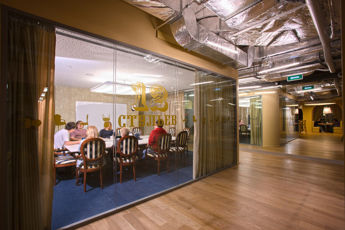
Google’s European offices are the best designed spaces company-wide and the Moscow office is no exception. The office was designed by Camenzind Evolution to reflect warmth and family, the needs of individuals over corporate standards, and of course, a strong Russian identity.
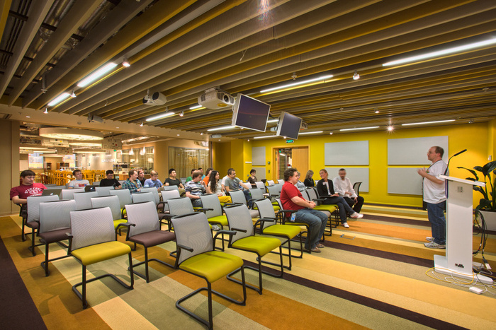
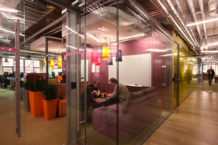
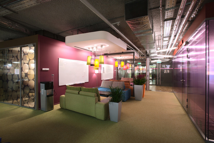
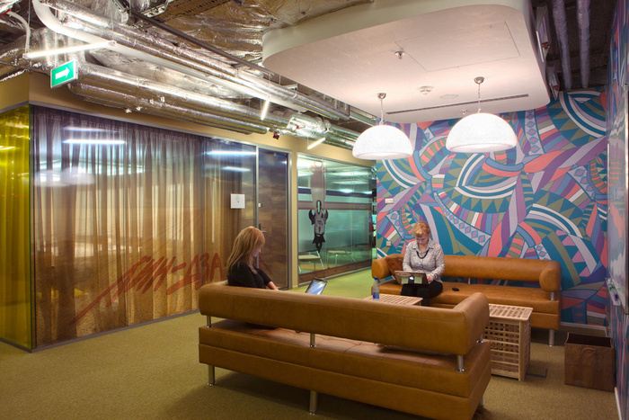
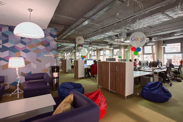
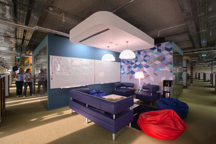
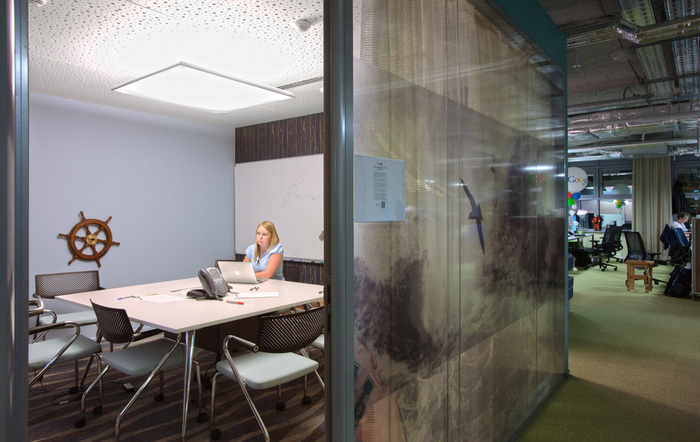
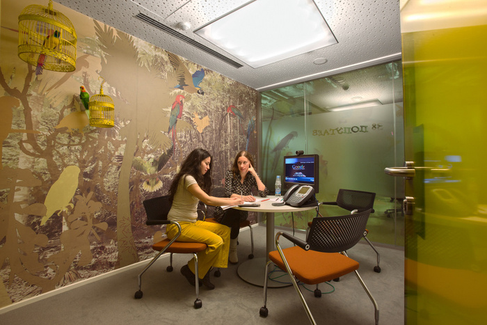
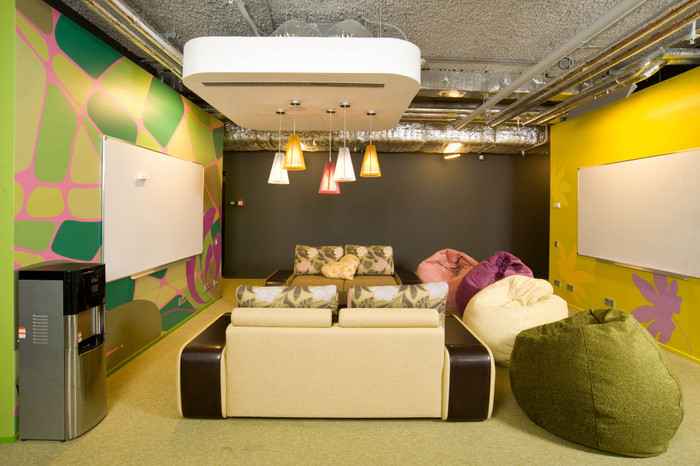
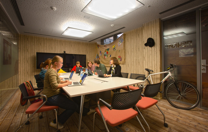
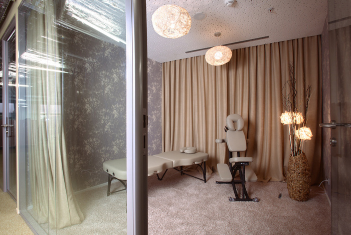
The space is immediately welcoming, warm and inviting, relaxed yet focused, comfy and still serious as it provides functional and diverse work environments throughout. Work environment diversity is probably the most important aspect of the Google Moscow space. Throughout the office you’ll notice a type of workspace that is compatible with every kind of work whether it be group-oriented or individual.
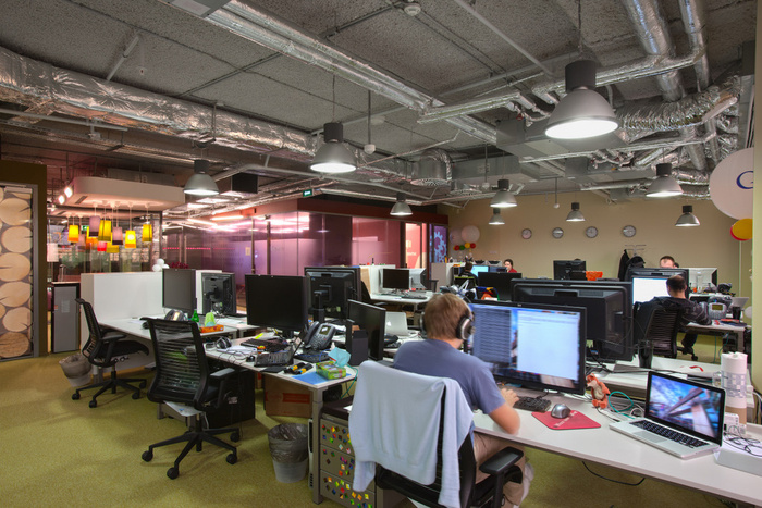
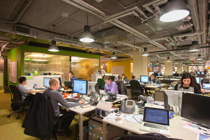
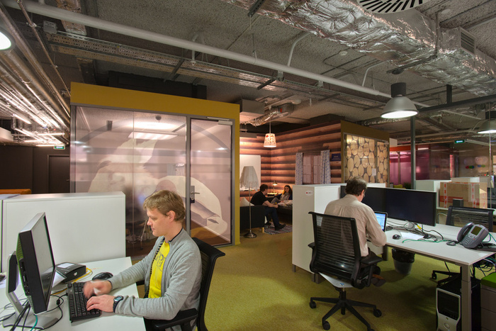
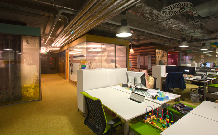
Employee workstations are classic open desk arrangement with one important distinction – a plethora of both casual and formal meeting space at their fingertips.
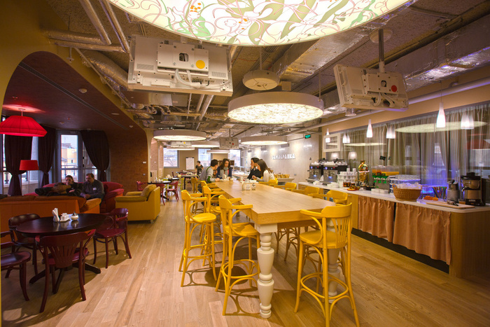
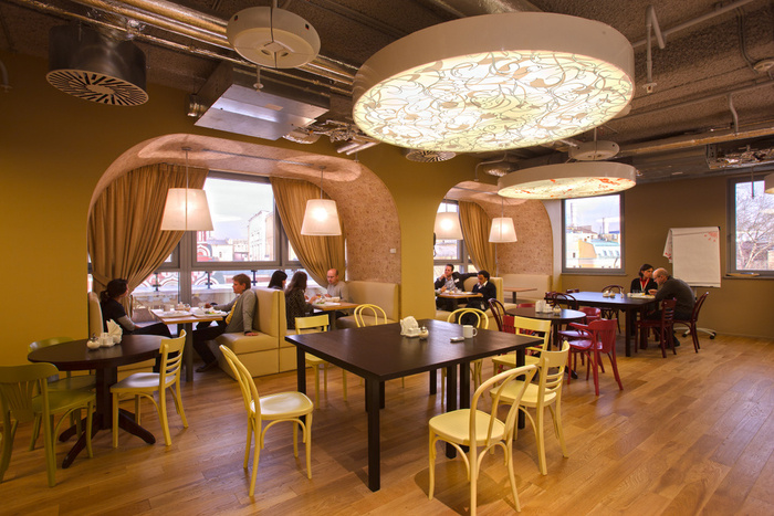
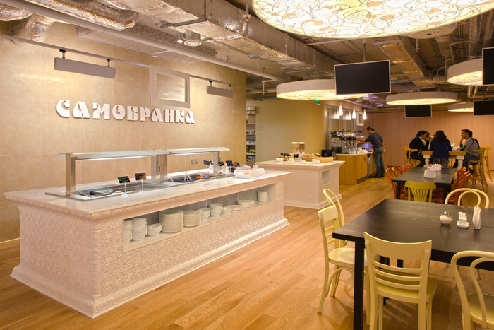
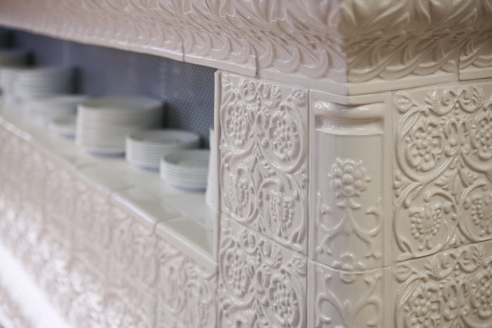
As far as cafeterias go, Moscow-based Googlers could do worse. Inspired by classical Russian dining chambers, the buffets are clad in exquisite tiles crafted by local monks. While many cafeterias are harsh, bright and uncomfortable, Google’s is warm and comfortable like a diner or home.
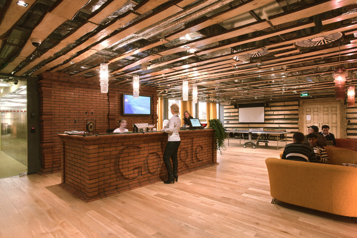
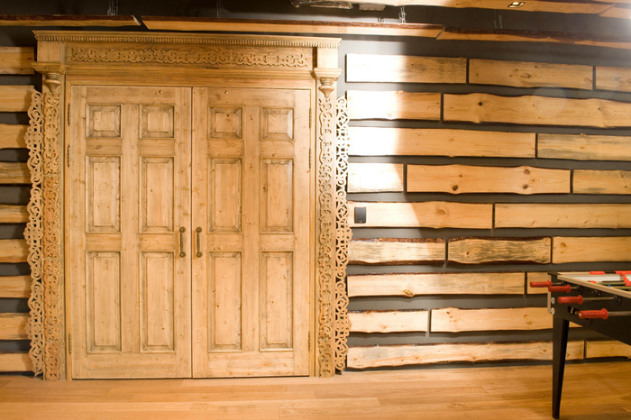
In terms of style, this space is one of my favorites because it doesn’t have annoyingly bright tones of red, blue, and green present in some Google spaces. You’ll also notice that the glass walls all have some sort of translucent covering to give the occupant a little more privacy. One of my favorite features are the wooden boards used as wall coverings as well as ceiling panels.
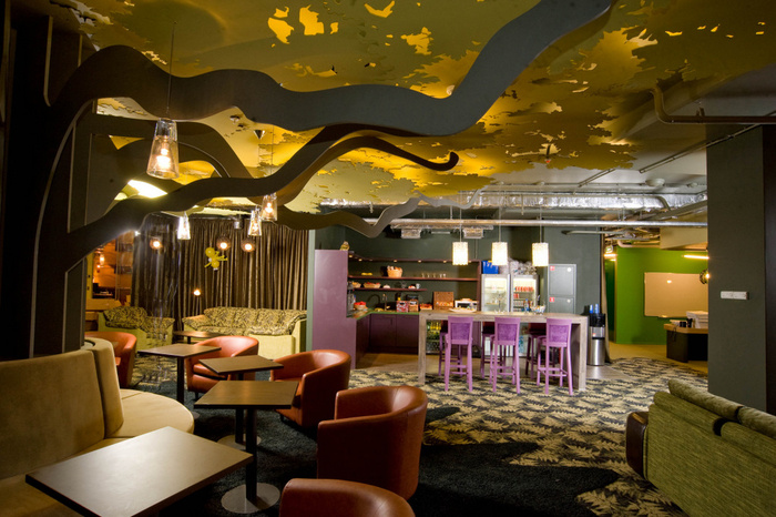
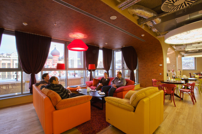
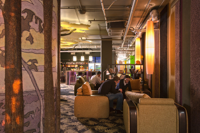
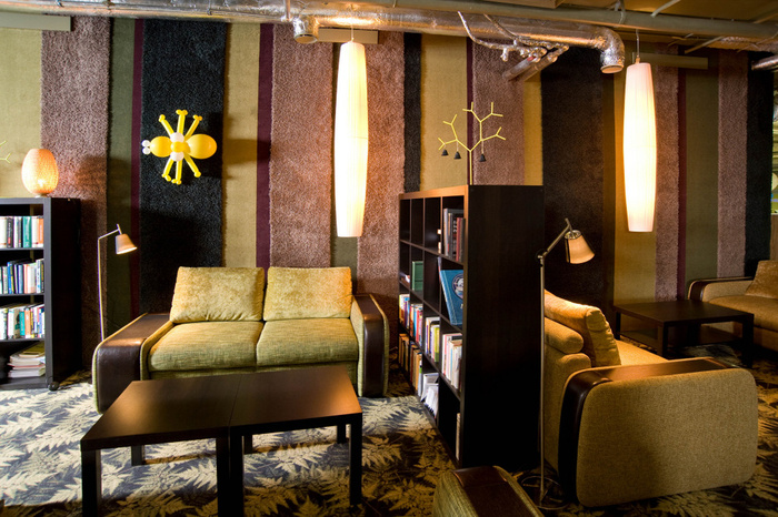
Lastly, the so-called ‘Magic Forest’ coffee lounge is a perfect space for employees to take a comfortable and casual break and relax throughout the day.









Now editing content for LinkedIn.