The Colorful and Metaphoric Office of Besturenraad / BKO
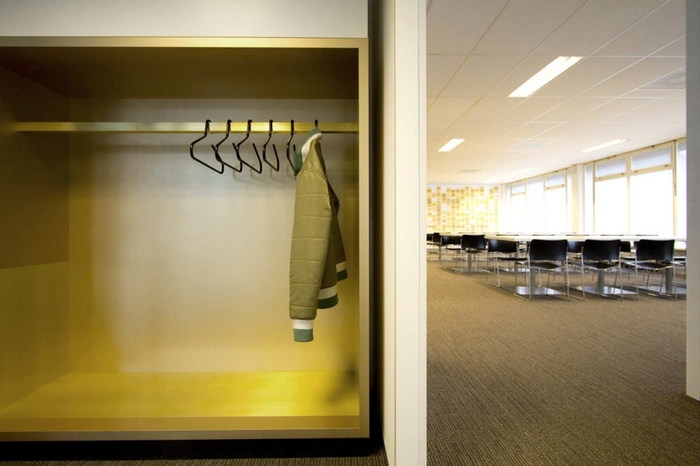
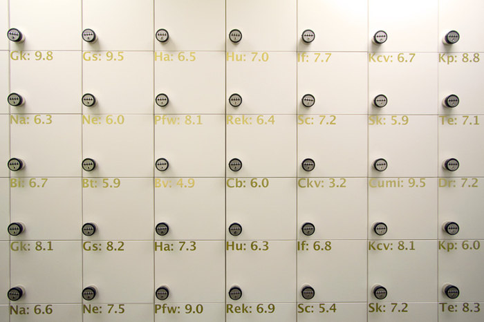
Today’s project is very unique in that it is not our typical type of office. A few details I’ll point out are the lockers (which we’ve discussed here) and the bright colors and wall decorations that seem to be a trend in Europe right now. Pretty cool project, here’s some details:
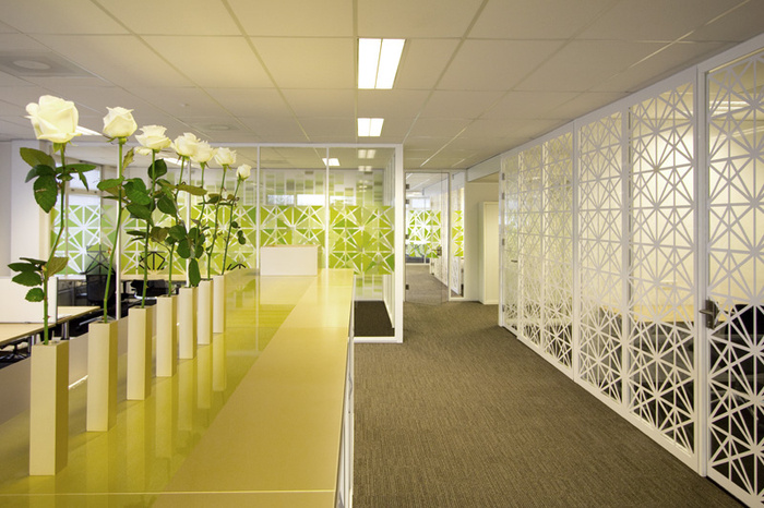
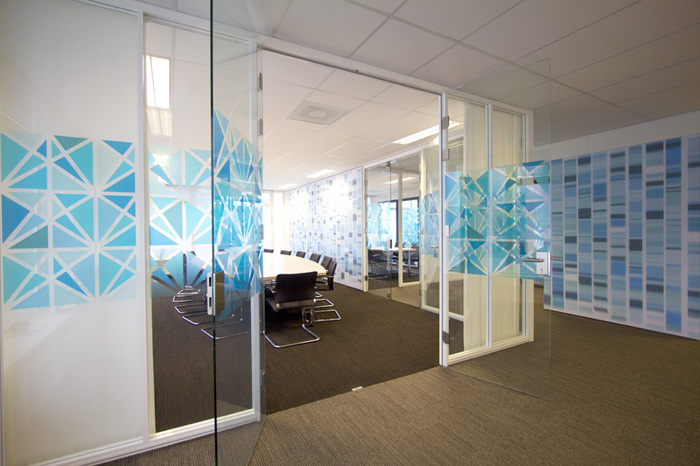
“COEN! created a new working environment and identity layer for the ‘Besturenraad / BKO’. These two organizations are going to cooperate more intensively at a new location and take care of two denominational types of eduction in the Netherlands: Catholic and Protestant. The aim of this project was to visually connect the shared goals and principles of both organizations.
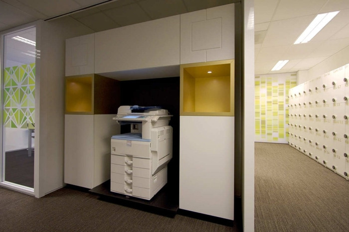
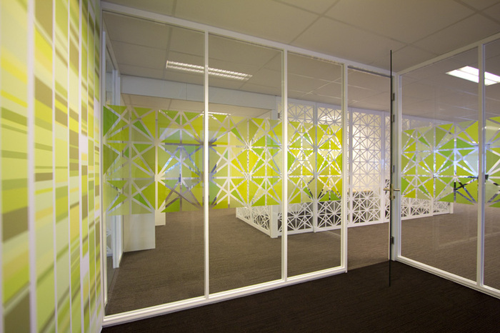
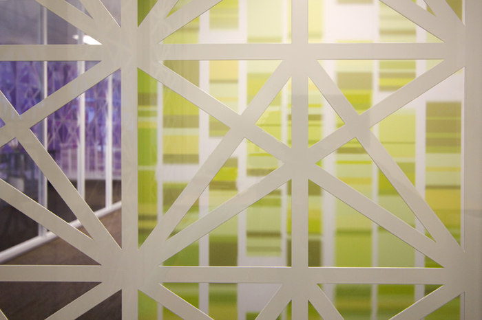
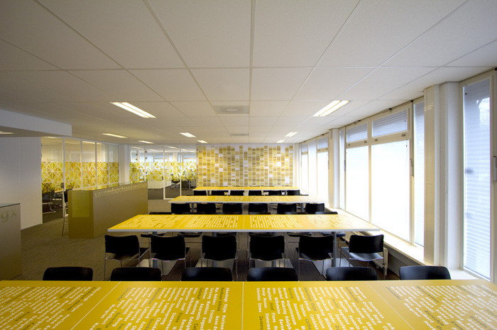
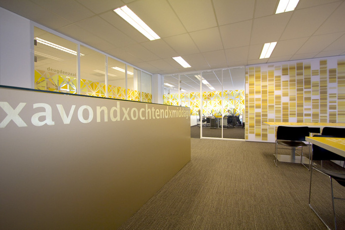
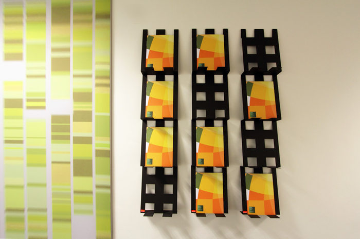
For the design of this story COEN! used The Book as a metaphor. Apart from the Christian and Catholic values a book also consists of structure, text and image. You see stained glass patterns, metal grids based on the golden section and special text prints with a message. The relation between faith and education is also subtly made clear by DNA patterns and golden ‘office altars’.
Project images sent over by Coen van Ham of COEN!


Now editing content for LinkedIn.