Herrera y Asociados Offices – Valencia
DOBLEESE Space & Branding designed the offices of Herrera y Asociados to reflect the insurance brokerage’s strong commitment to their clients in Valencia, Spain.
When we speak of Herrera y Asociados we refer to a prestigious Insurance Brokerage with more than 75 years of experience. A company with a marked family character and a strong commitment to its clients, based on four fundamental pillars: Trust, security, rigor and closeness. These features have set the course for this comprehensive upgrade project.
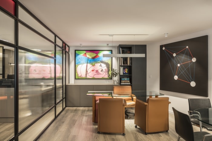
After analysing their corporate image and after different interviews with the property, we discovered the great interest in design and art that Herrera y Asociados has, practically a hallmark, something impossible to ignore.
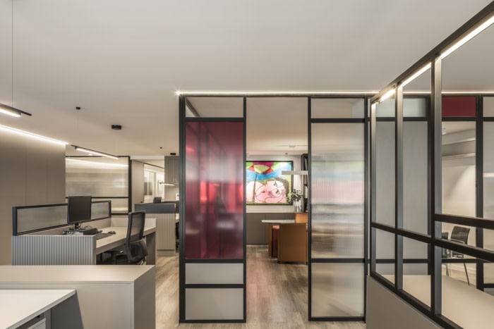
That was the great challenge we faced: to be able to capture the elegance, sophistication and that artistic passion capable of impressing and overwhelming any lucky person who visits its headquarters. All this, wrapped in a warm and close atmosphere that is far from the collective image that we have of traditional and cold Insurance Brokers. That’s why the project inspiration comes from Piet Mondrian’s neoplasticist pieces of art.
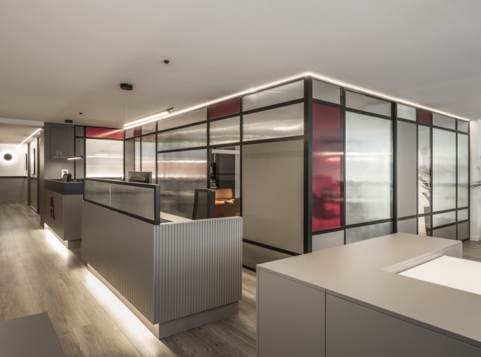
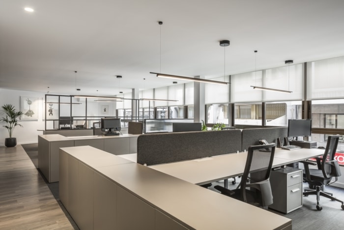
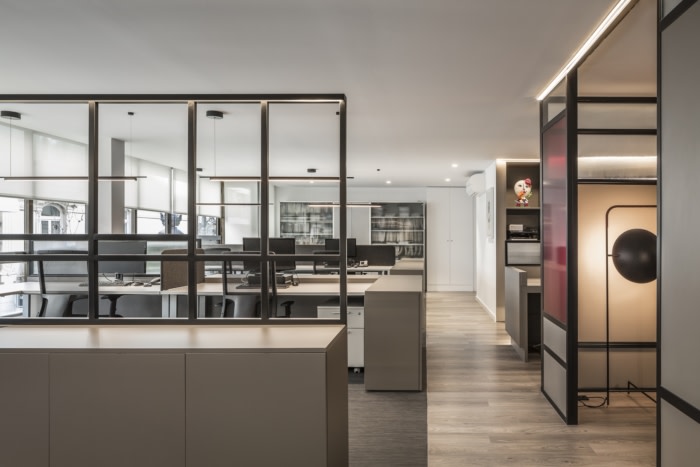
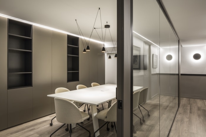
The continued growth of the company demanded new functional needs. Thus, new spaces are added to the existing program, such as a boardroom, agile rooms -that are so booming these days-, an office… all of this, accompanied by a spacious and bright work area. The new distribution collects all these functions in a fluid and harmonious way. As the place has a short facade length, the design seeks to make the most of the entry of natural light. For this, in the delimitation of offices, work areas and meeting rooms, permeable screens and lattices of neoplasticist inspiration have been used, giving the premises a great luminosity.
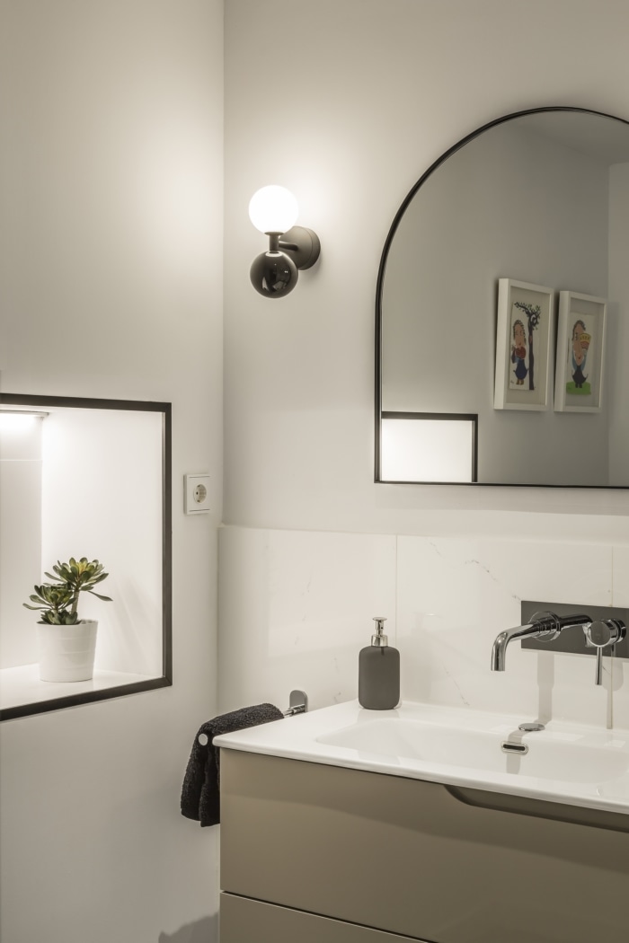
In the same way, artificial lighting has been subjected to a detailed study. Each of the spaces envelops clients and workers in a relaxing and welcoming atmosphere. The goal is to avoid a cold workplace without personality; on the contrary, the focus is to create a space designed for comfort and harmony, something that, definitely, affects performance.
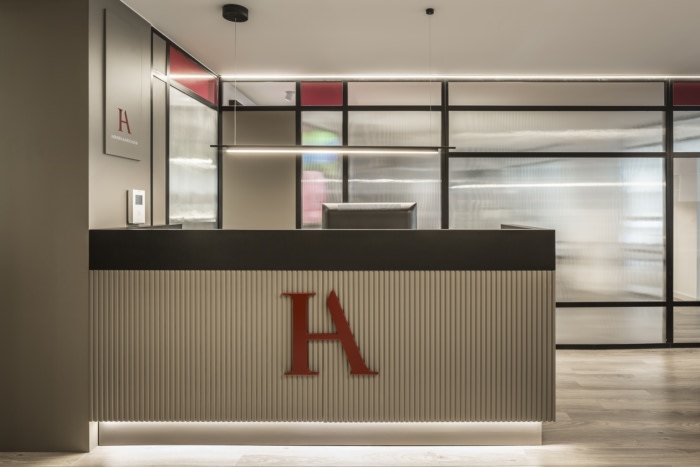
The use of materials such as lacquered steel, tinted glass, woods and special textiles provides the space with elegance and sophistication. Two types of flooring not only add a distinctive touch, but also zone the program.
While in the common uses of the offices a laminate floor has been chosen, in the work areas the textile floor provides an extra acoustic comfort. The colour range used navigates between taupe greys and black: this is where elegance and warmth converge. For its part, the colour notes are set by vermilion, the corporate colour, representing the character and personality of a company with such relevance in the sector. The partition grid so characteristic of the Mondrian style and the owner’s pieces of art accompany us in an experience that, at certain moments, reminds us of an art gallery.
Design: DOBLEESE Space & Branding
Photography: Germán Cabo


