Whole Foods Market Office Expansion – Austin
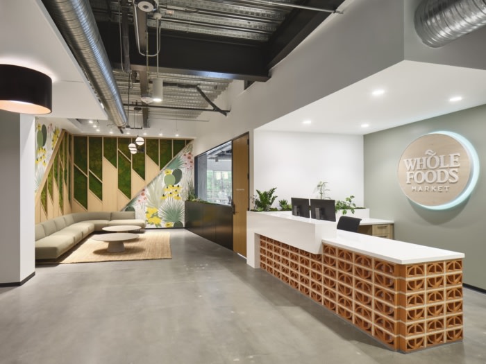
Whole Foods created a unique office expansion while balancing cohesion with their existing headquarters, a space to offer employees control of their work environment in Austin.
Sixthriver was engaged by Whole Foods Market to design their corporate campus office expansion in Austin, Texas.
When designing the expanded offices, there was a unique opportunity to create a new suite that was part of a larger collection of office spaces across the city. The Whole Foods Market team wanted the new suite to relate to the existing offices while offering a unique design, something that would make the space distinguishable for the existing occupants. The space provides a mixture of collaboration and private break away locations, allowing employees to be able to control their work environment.
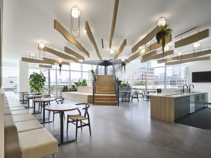
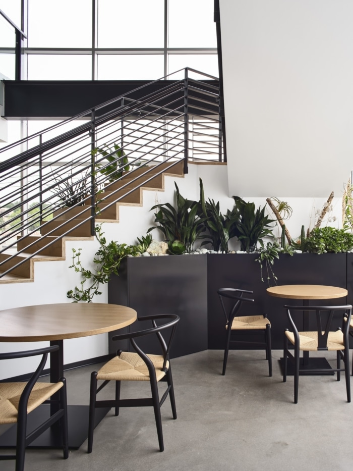
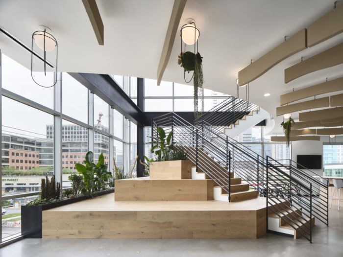
A unique moment inherited with the existing space was the double height “birdhouse” leftover from the previous tenant’s branding. It is an iconic corner of the building that is directly across from Whole Foods original store in Austin, Texas and highly visible from the street. We transformed the corner into a stair that not only serves as a series of steps from one level to another, but also an inhabitable communal space for the staff. Additionally, the design team incorporated a variety of local vendors/artists to Austin as the city is a large part of Whole Food’s history and origin. The art package curated for the space is a 103-piece collection, 65 of which are custom commissions. Roughly half of the art collection is sourced from local and regional artists including the muralist who created the feature biophilic mural in the reception.
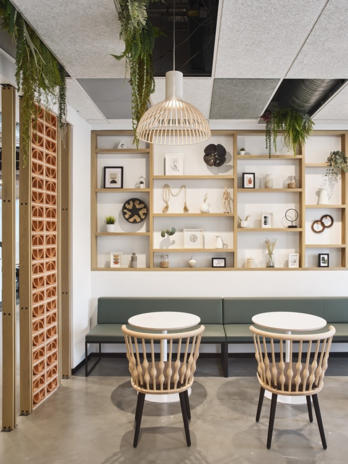
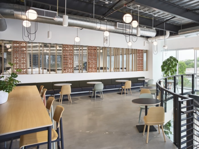
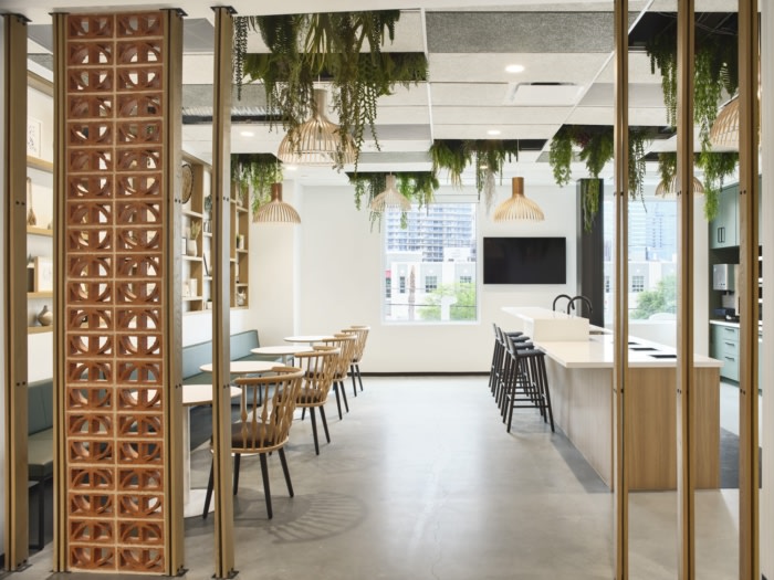
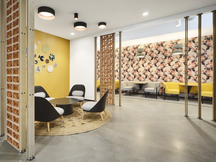
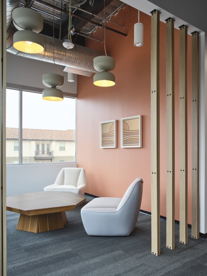
The selection of natural tone wood products and raw construction methods spoke to Whole Food’s dedication to organic and sustainable practices and to their local, Austin roots. Wood slat and breeze block details are repeated in various locations across the 3-levels in areas such as huddle spaces and break rooms, tying each floor together.
Design: Sixthriver
Contractor: Sabre Commercial
Artwork Curation: met/gal art + advisory
Photography: Andrea Calo








Now editing content for LinkedIn.