Understood Offices – New York City
Inclusive, flexibility and mobility define the new work environment for Understood in New York City, an office space to honor the neurodiverse population they serve.
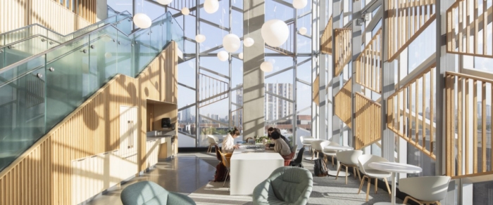
Float Studio created an accessible space to honor different work styles at the Understood offices in New York City, New York.
Understood — a social impact, non-profit organization and lifelong guide for those who learn and think differently – today opened its new office space designed by Float Studio. Its New York headquarters sets the standard for an inclusive environment in which the neurodiverse and those with physical or mobility challenges can excel. The design concept infuses universal design and disability inclusion best practices as well as input from Understood team members, many who have, or have experience with learning or thinking differences.
Branding & colors
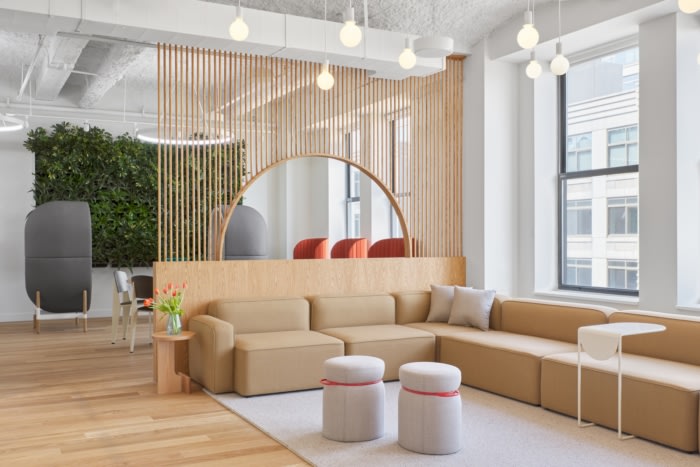
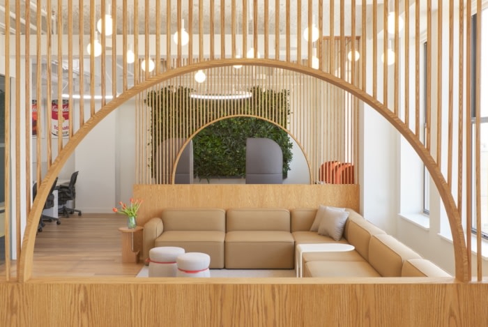
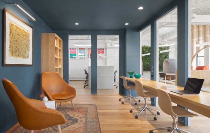
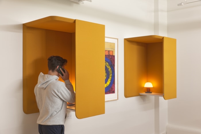
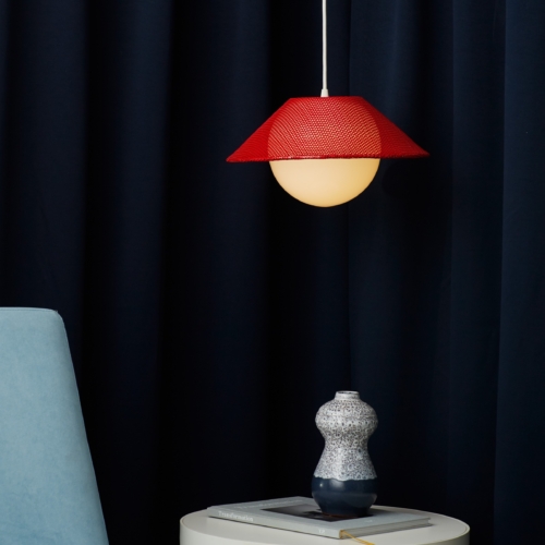
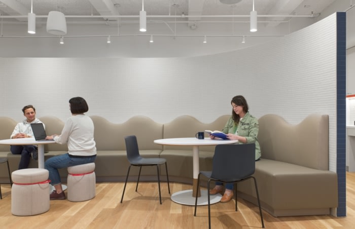
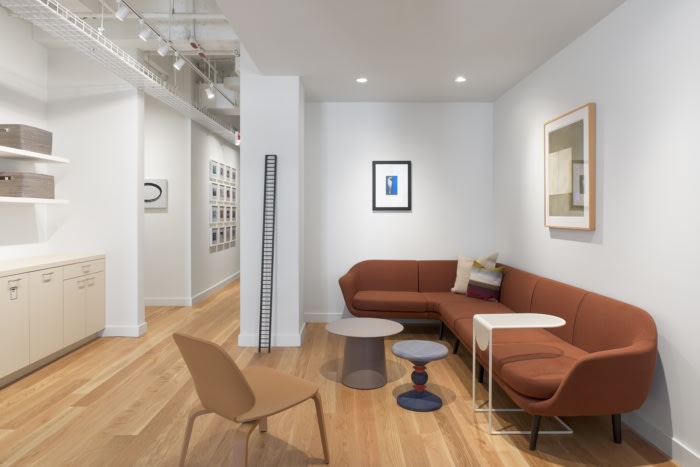
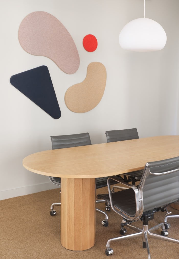
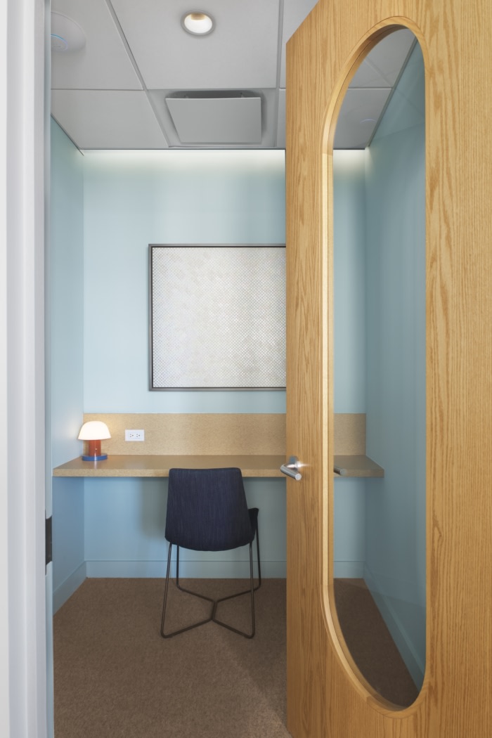
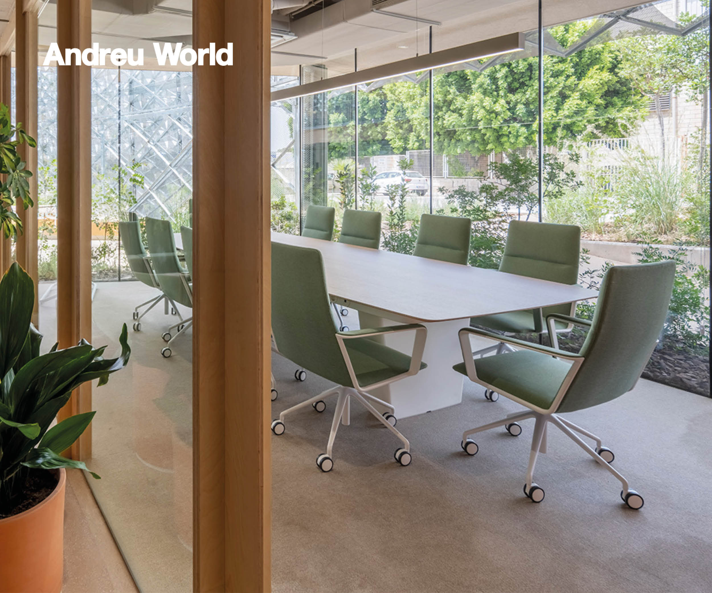
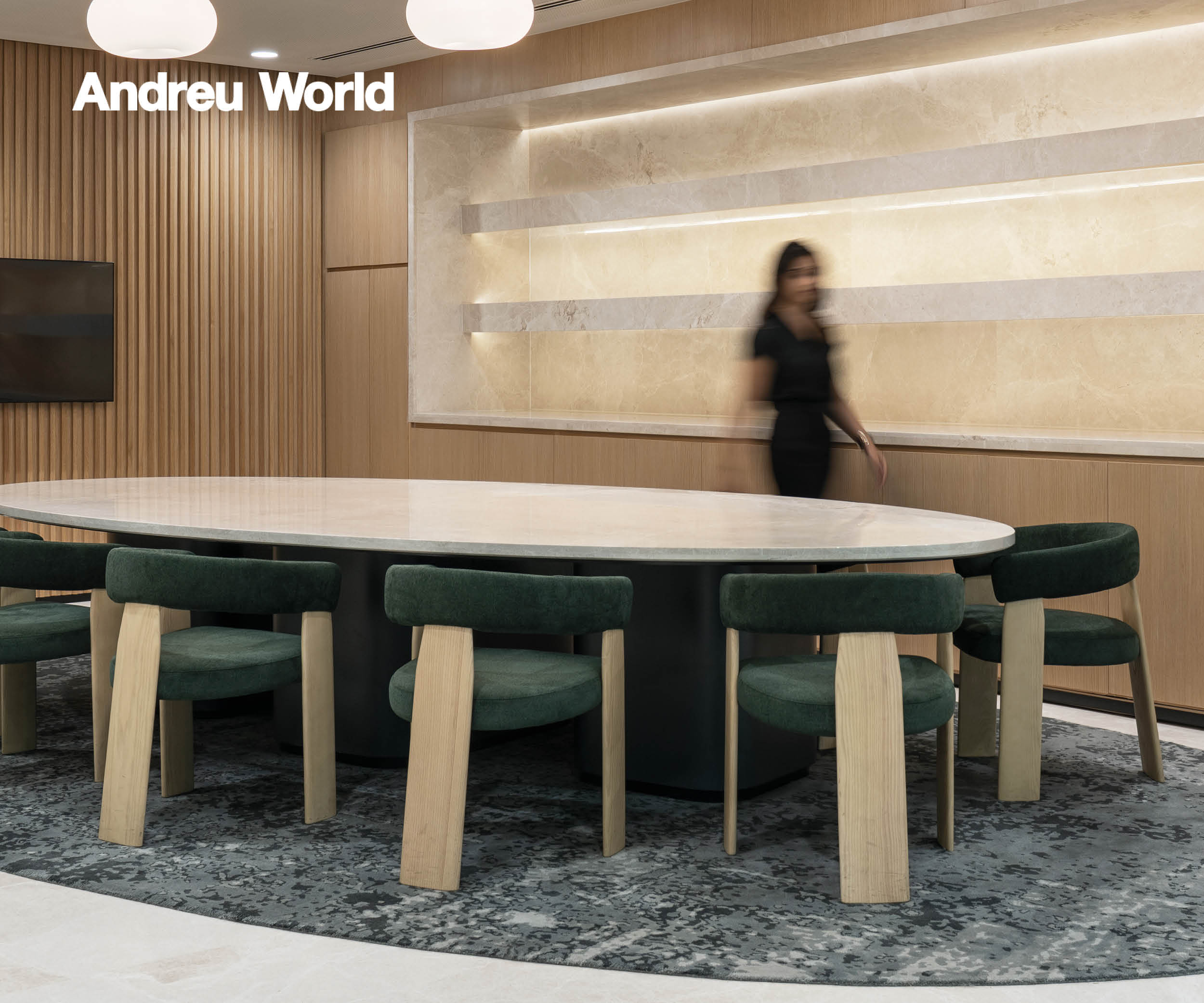
With Color Theory in mind, Float used Understood’s branding to create comfortable, distinct spaces. Cool colors for more focused spaces such as phone booths, the conference rooms, and the library. The more collaborative spaces include warmer tones of beige and cream with restrained pops of Understood’s signature scarlet to evoke inspiration and creativity without being overstimulating. Green walls bring nature into the space, which has a calming and grounding effect, especially for the neurodiverse.Quiet, flexible spaces
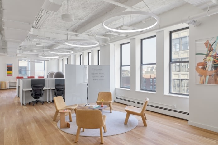
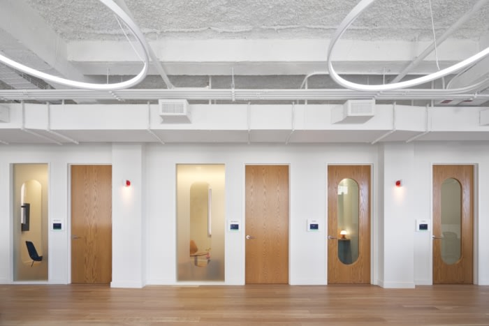
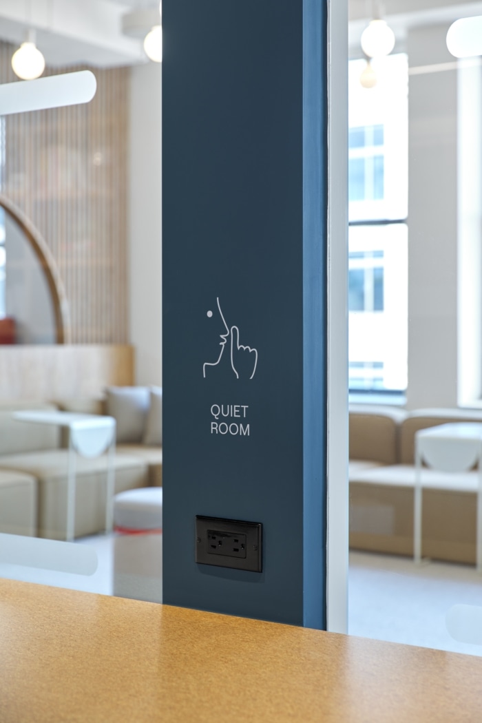
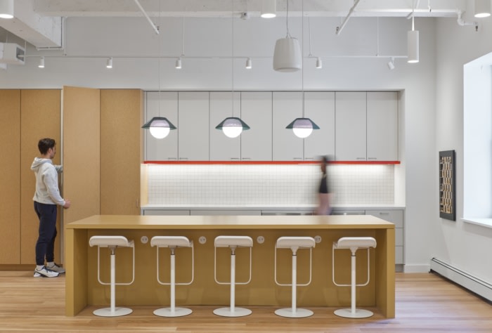
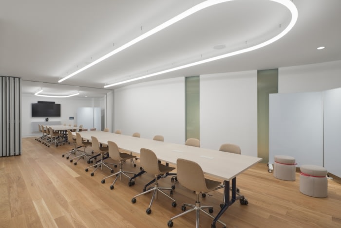
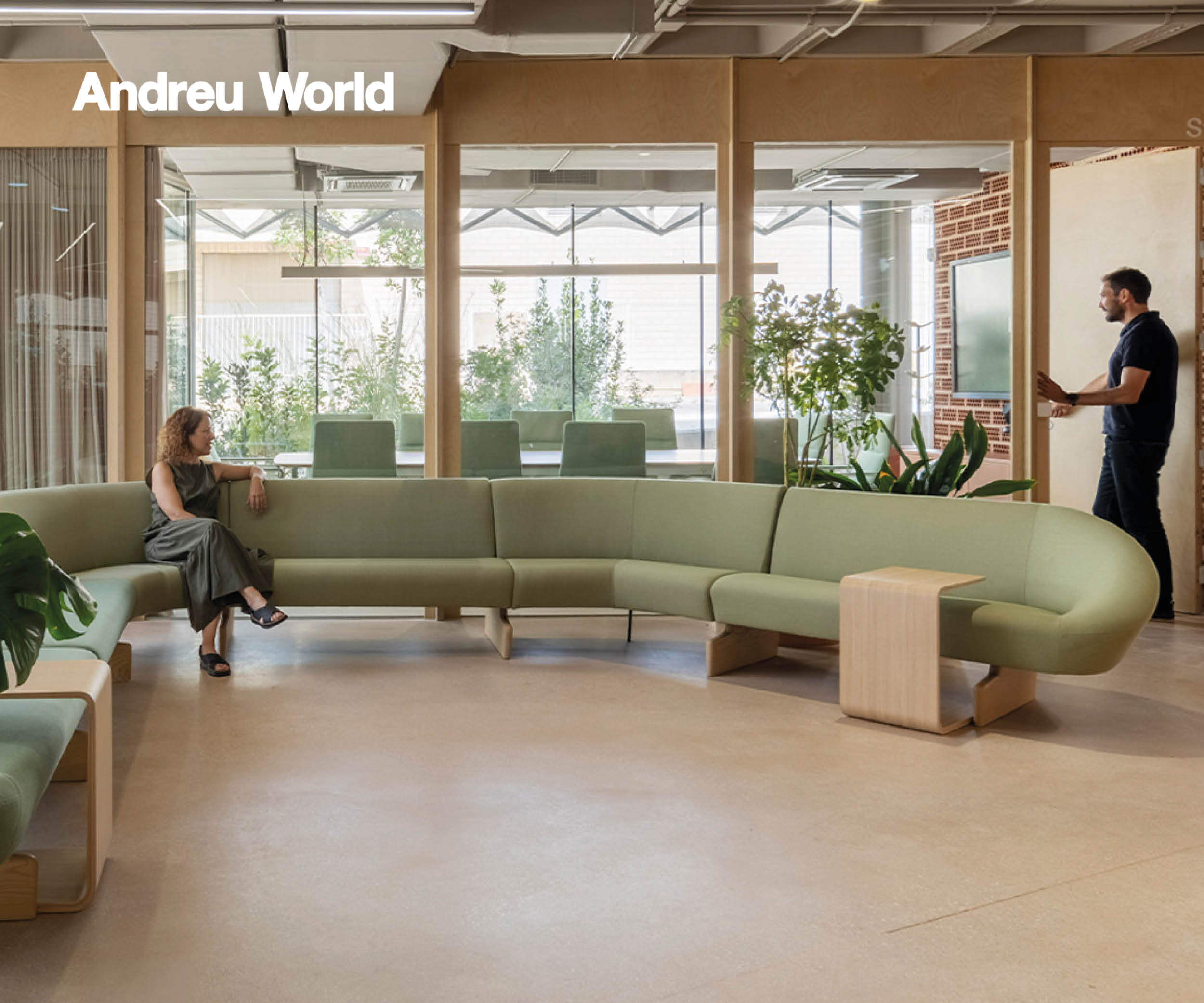
Great care was taken to limit distractions found in a typical open office. To avoid building out walled rooms for each use case, which can be isolating and disorienting due to disrupted sight lines, Float sought other ways to make quiet environments that were sculptural and interesting: a distinct library, hanging phone booths, pods to pop into, a pantry that is placed away from the open office. A operable wall from Modern Fold adds to the flexibility, and alongside movable white boards allow the division of common spaces.Dividers on desks and privacy hoods in the library help combat visual distractions. On the glass systems, distraction bands and pill shaped cutouts are used instead of doing a full frosting, which shields those in closed rooms from the distractions of the open office but allows them to still get a sense of what’s happening outside so occupants can be as engaged as they like.
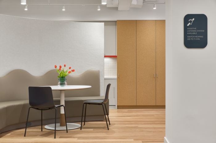
To combat audible clutter, Float ran an acoustical report which resulted in two layers of drywall throughout as well as acoustical spray on the ceiling to help dampen noise, aided by white noise machines, glass systems rated for sound, soft end panels on workstations, and in general fabric selection with acoustic properties, across the furniture and curtains. An induction loop that coils through the large conference rooms and pantry goes one step further for those using hearing aids or loop listeners as it helps cut out background noise.
Multi-functional furniture
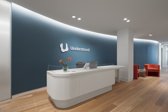
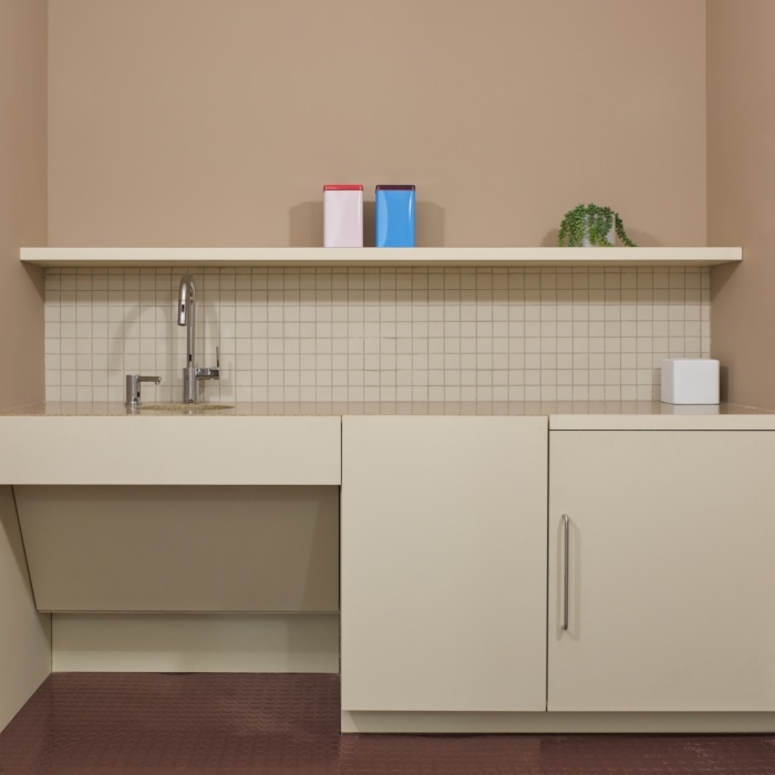
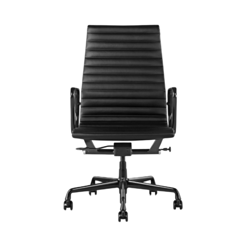
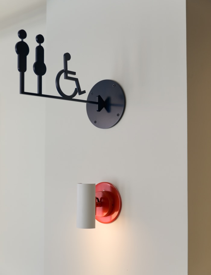
Because of the finite space to create breakout areas, every piece of furniture had to be multi-functional – it had to create space, absorb noise, and look beautiful. It had to be sturdy, as to be conscious of body inclusivity, provide a variety of textures to provide a calming sensory experience. All tables are on pedestals to allow access from all angles; if it’s a surface it’s floating – no obstructions connect to the floor, which would disrupt accessibility.The standard ADA guidelines were treated as a baseline and were improved on wherever possible, removing barriers that would require extra work to get an equal experience for wheelchair users. Thoughtful choices were made regarding the height of the pantry, having sinks with roll under counter clearance, and building a reception desk where those in wheelchairs can staff it or pull up right to it instead of needing to take a side approach. The two ADA restrooms were built in consultation with the United Spinal Association, with additional gender neutral restrooms and ambulatory stalls.
Signage and lighting
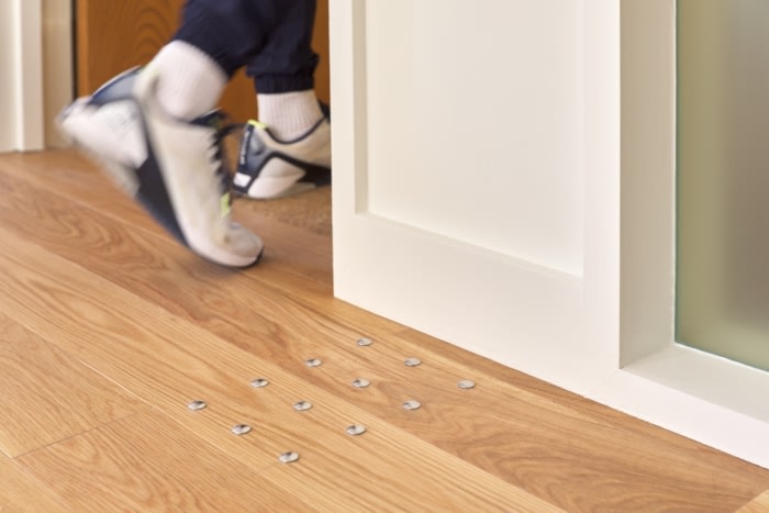
Bold visual and tactile cues across the office create an ideal environment for the neurodiverse and those with sight differences. All signage has larger lettering and includes braille, and there are floor studs with tactile warning surface indicators at each meeting room. Dynamic lighting throughout shifts as the natural light does, based on the time of day. Workstations that have a high contrast edge band so you can more easily tell where the end of the desk is. The perimeter and the best window views and natural light were prioritized for where the staff sits, not being saved for offices or closed conference rooms. Overall, the office is bright with subtle tonal shifts, making each area distinct without harsh transitions.
Design: Float Studio
Photography: Aaron Thompson


Now editing content for LinkedIn.