M&C Saatchi Offices – Melbourne
Made For completed a creative and collaborative space for the M&C Saatchi offices in Melbourne, Australia.
Creative advertising heavyweights, c pride themselves on bolstering connection and change – creatively, commercially and culturally. M&C Saatchi have impeccable brand consistency across all their channels, their brand experience seamless and considered from head to toe. Our work for M&C required that we spatially and experientially match the expression of their brand. Modern, leaning tech, but ultimately functional and never over complicated.
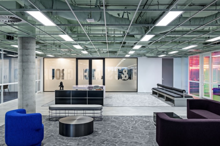
M&C Saatchi’s workplace design was informed by considering the company’s own core values. Following the workshopping phase with the client, we landed on developing a design that would hero the brutal simplicity of geometry, led by a grid driven layout. Through a progressively paired back spatial approach, the design created opportunities for ownable moments of colour, texture, and finish.
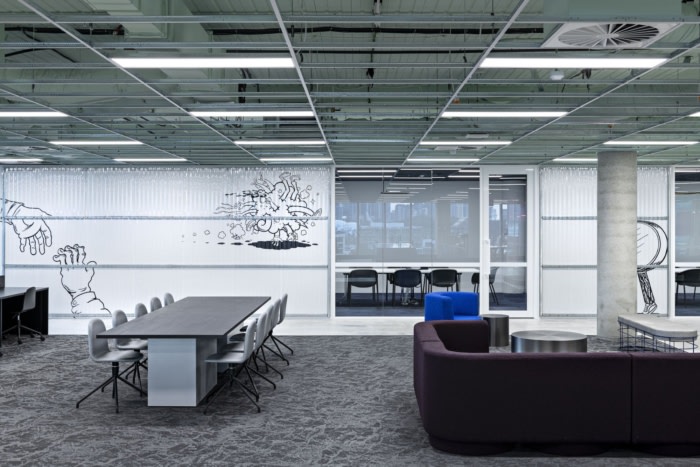
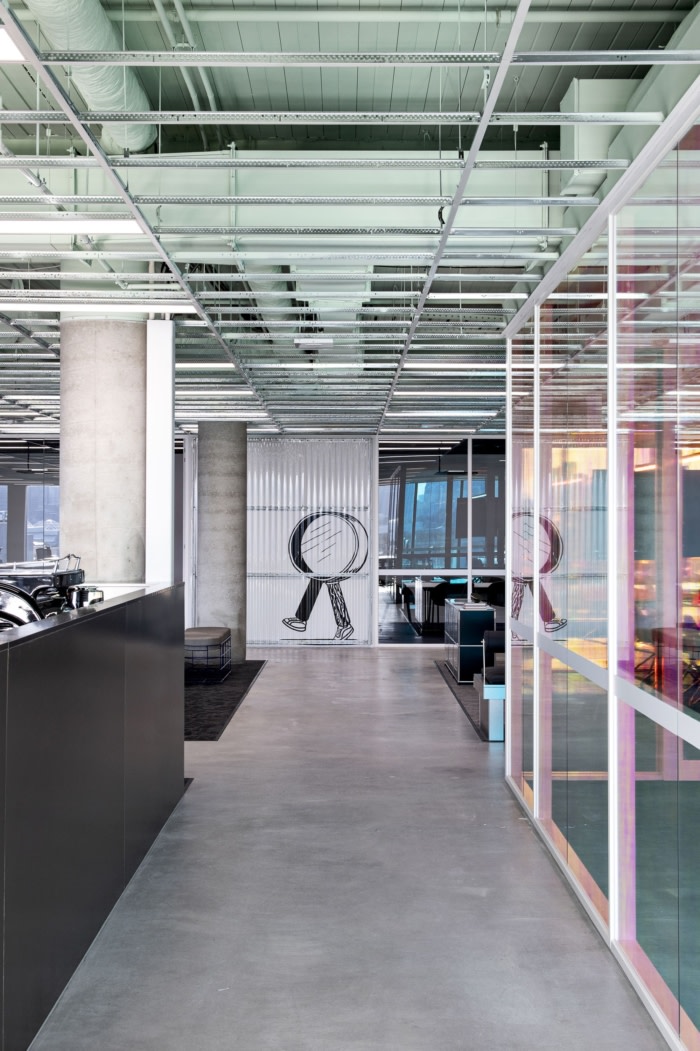
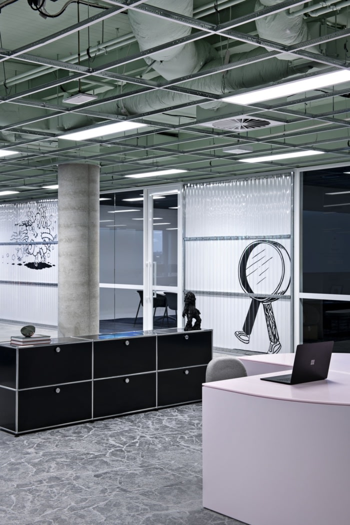
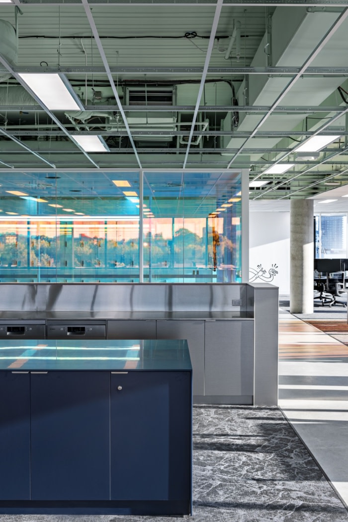
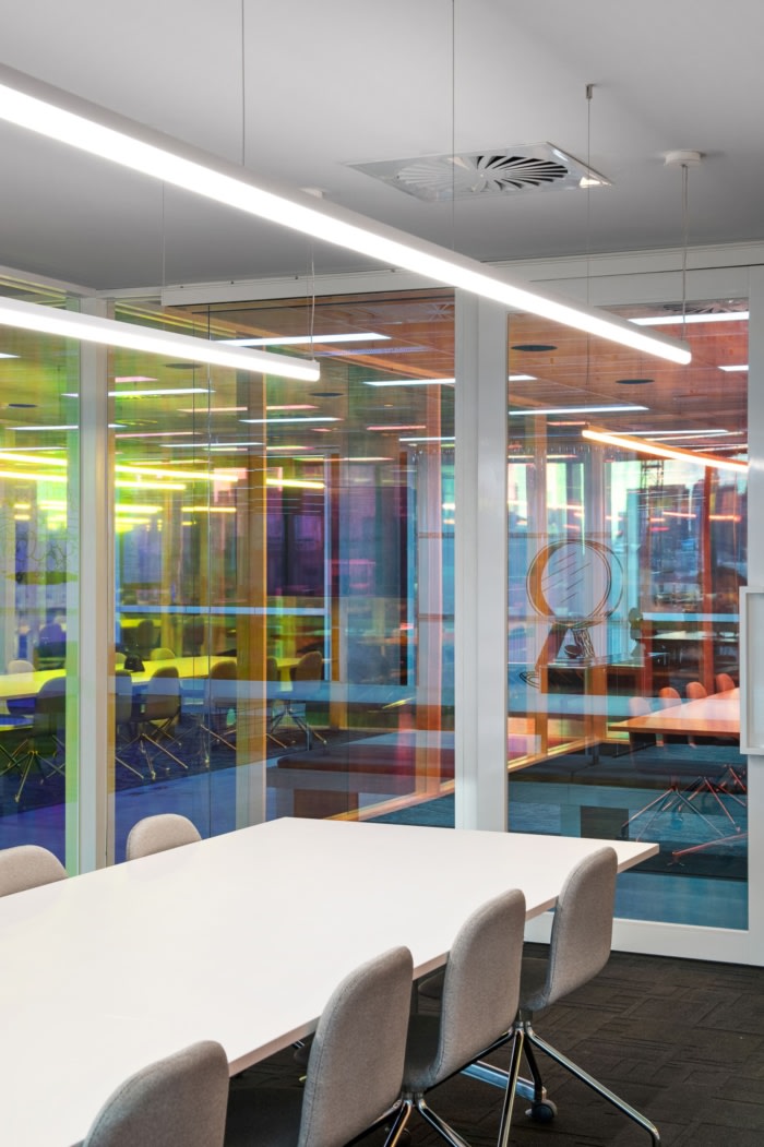
This manifested in an open plan approach to the design with minimal built form, encouraging moments of connection and serendipity in the space. The final design is almost free of boundaries, connected through materiality, natural light and organic movement in the space, unifying this core element of connectivity. Lustrous materials are balanced with soft and bold toned upholstery and joinery, di-chromatic window film as the floating boardroom block, balanced by translucent corrugated sheeting framing the murals.
In line with pursuing a progressively paired back approach, we embraced many pre-existing elements in the space. If we were to remove an existing condition (ceiling, floor), we needed a compelling reason why. For instance, the white ceiling tiles throughout didn’t speak to the brand, but the cost of relocating all the services and grid was both too heavy, financially and environmentally.
We left the grid in place, removed the tiles allowing them to be re-used on other fitouts within the building, and sprayed out the ceiling a muted green ‘beyond’ the grid. In a world of sprayed white, black or bold colours, we felt a highly muted green spoke to the level of restraint required by the very best in creative industry, capturing the essence of never going too far. By using some raw construction materials, the naturalness felt equally well harnessed, acting as a point of contrast to the refined and tech-like feel of the space.
Design: Made For
Photography: Spacecraft Media


Now editing content for LinkedIn.