OLX Group Offices – Sao Paulo
OLX Group’s São Paulo headquarters by Alfa 2 Arquitetura prioritizes a hybrid concept, flexibility, natural light, and acoustic comfort, integrating innovative design, technology, and green elements for employee well-being.
Developed by architects André Almagro and Gabriele Farias, from Alfa 2 Arquitetura, OLX’s new headquarters arrives in the financial and cultural heart of São Paulo with the aim of promoting greater connection and quality of life for the employees. The hybrid concept adopted by the company directly influenced the design decisions and the layout functionality.
With 1000m² spread over 80 workstations, the space, which can accommodate up to 200 people for events and collaborative exercises, was designed to offer well-being, inspiration and fun. In addition to incorporating innovation, technology and design into an adaptive infrastructure, the company offers acoustic and audiovisual comfort for hybrid meetings, considering the venue as a meeting and connection point.
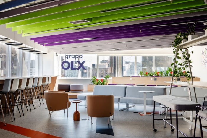
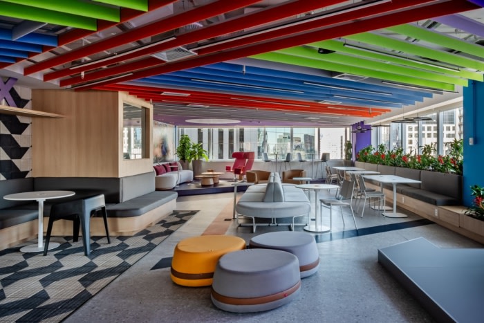
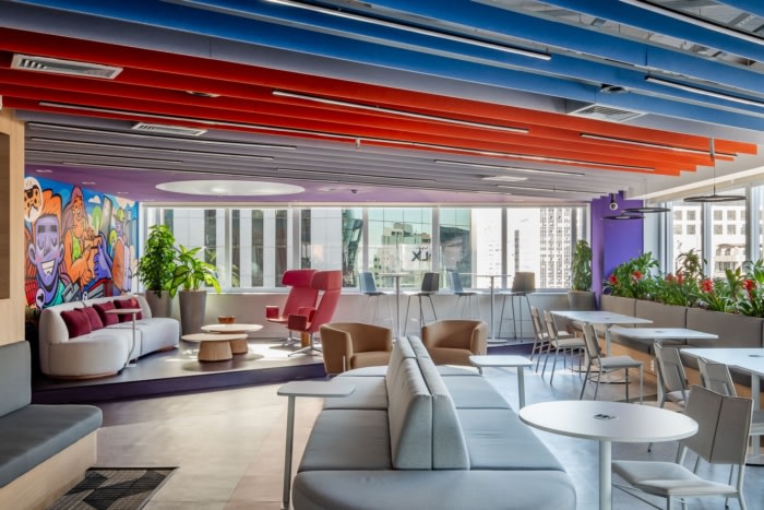
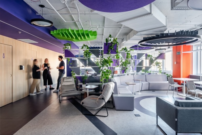
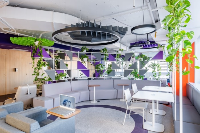
The layout was inspired by its privileged location and the panoramic views it offers. The project’s highlight is the decompression area, with around 350m² facing Paulista Avenue, with stands, flexible furniture and an integrated eating area to host events for employees, clients and partners. The aim is to allow changes in the furniture arrangement as needed, reinforcing the concept of flexibility and adaptability in the design.
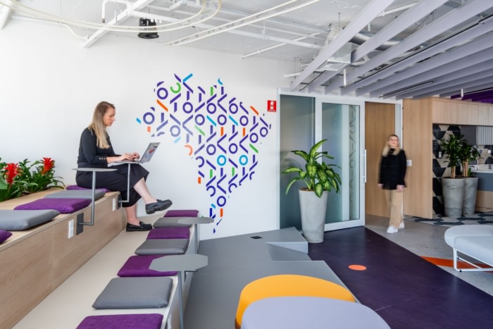
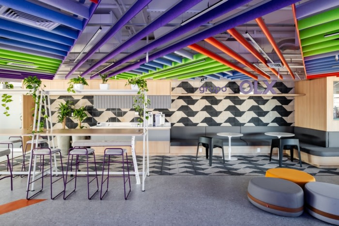
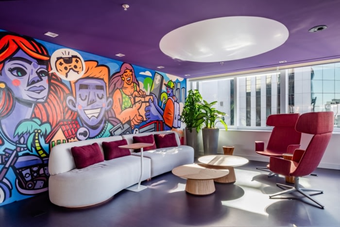
The main covering material that stands out in this coffee point is the hydraulic tile in the shape of the map of São Paulo state, created by artist Mirthes dos Santos. Installed on the floor and wall, it brings a balanced and harmonious composition and pays homage to the most iconic element of São Paulo’s sidewalks. Further on, the space received an artistic intervention, developed exclusively for the OLX Group, signed by Ronah Carraro, who brought his urban work into the daily lives of the employees.
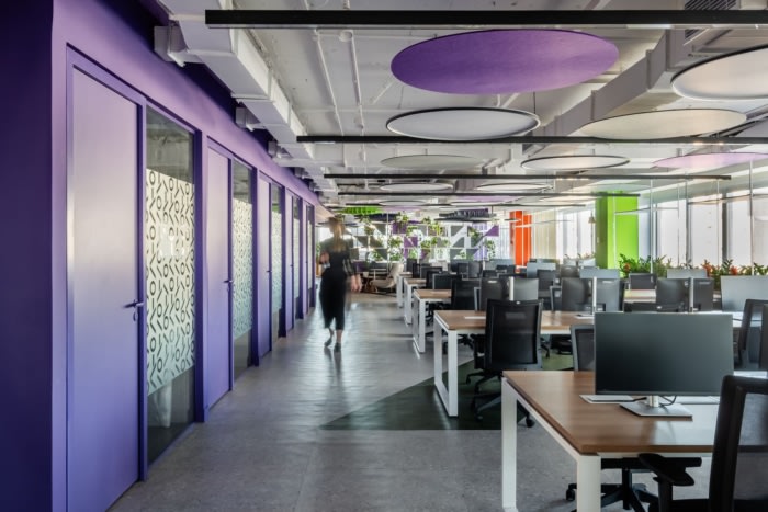
The flow of traffic was designed to be fluid and efficient, avoiding long corridors and paths that lead nowhere. The spaces were designed to encourage movement, promote coffee breaks, facilitate meetings with colleagues and value interaction in inviting, well-distributed places. The brand’s logo was positioned overhead to welcome employees at a striking point in the company, where they can take photos with the skyline in the background.
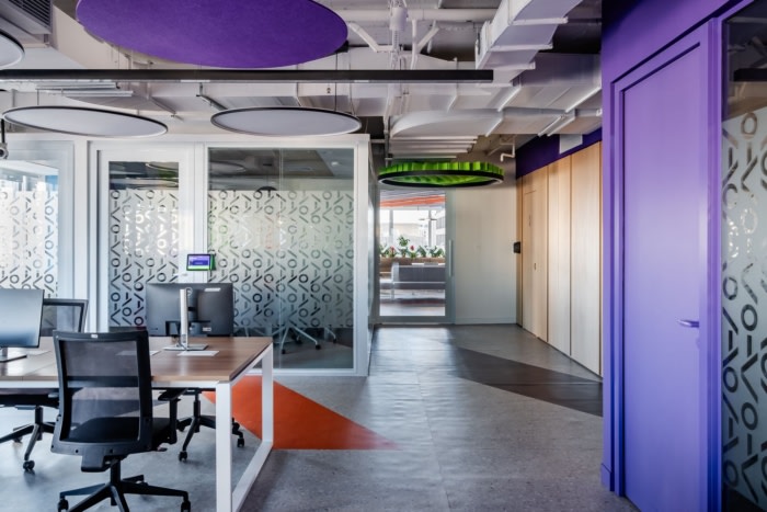
The color palette used in the decoration reflects the brand’s dynamic identity, with purple as the protagonist, followed by shades of grey, orange, blue and green, which complement this connection of movement. As a contrasting base, the architects opted for the use of light wood, which introduces a light atmosphere and a feeling of coziness.
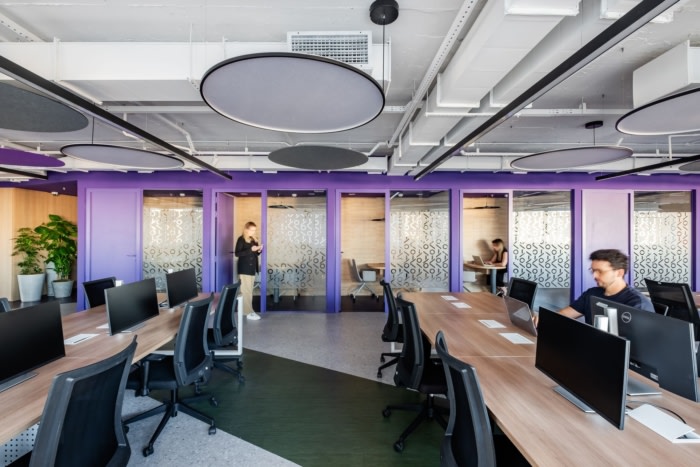
The office prioritized natural light by positioning the standard workstations close to the façade, divided into two parts, each with 40 positions, which optimize the distribution of circulation. The meeting rooms were installed to become real acoustic barriers between the eating area and the staff, ensuring a more productive and comfortable environment. The phone booths were developed close to the building’s core, making use of the initially blind walls to meet the needs of employees during moments of concentration.
All the acoustic elements, such as panels and ceilings, are made from 80% recyclable materials. The workstations and ergonomic office chairs from the old headquarters were also reused. Besides that, water flow reducers were installed in the toilets to limit excessive water consumption in taps, promoting conscious use.
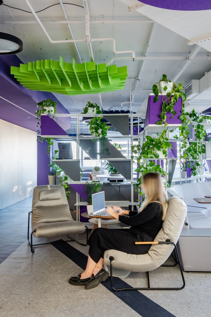
The landscaping is found in practically every area of the project, with selected natural plants that best adapt to the location. The distributed composition includes floor planters in different sizes, as well as hanging planters on shelves and many flowerpots that frame the seating areas. This connection between the office and nature has made the spaces even more welcoming, increasing the feeling of well-being.
Design: Alfa 2 Arquitetura
Photography: Nathalie Artaxo
