Gregory + Appel Offices – Indianapolis
Parallel Design Group‘s 42,000 square-foot redesign for Gregory & Appel in Indianapolis blends historical reverence with bold, modern design, strategically using color for energy and brand alignment.
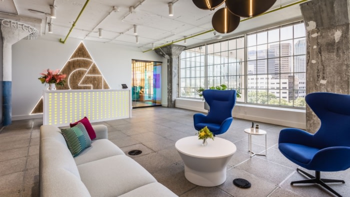
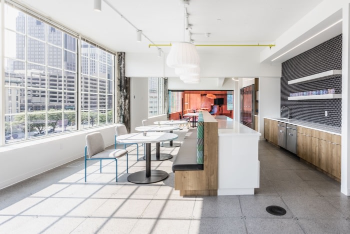
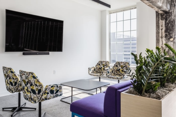
The 42,000 square-foot redesign for Gregory & Appel blended a rich respect for the building’s history with a bold, modern approach to design. The client’s goal was to maintain their established brand identity while injecting fresh life into the space. The solution was to strategically use color to energize the office and align it with evolving market trends. By leveraging color psychology, Parallel Design Group created a vibrant palette that complemented the brand’s core values while infusing the environment with dynamic energy.
Additionally, Parallel sought to strike a delicate balance between tastefulness and forward-thinking, without veering into the realm of appearing cheap or overly trendy. During our first meeting, the client provided us with a direction that perfectly encapsulated the desired concept for the space: “Maximal light, minimal clutter. Fun, warm, interesting and not hard. Brand-wise, closest to Allbirds or Goodr, not Ray Bans or Cole Haan.” This statement fueled our creativity, setting the stage for a design concept that would be vibrant, daring, and effortlessly cool.
A standout feature of the design is the use of dichroic film—an iridescent, holographic material that changes with light and movement. This innovative element was applied to such high-traffic areas as the elevator lobby, library, and main conference rooms, creating visual excitement and making these spaces glow both inside and out. The film’s color-shifting effect and mirrored surfaces offered a playful and interactive design experience, elevating the space in unexpected ways. The film’s glow is visible even from the downtown streets of Indianapolis.
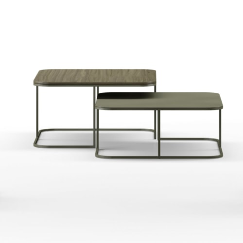
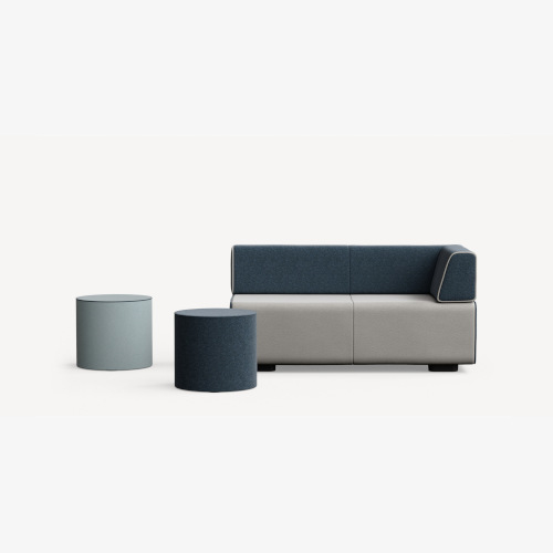
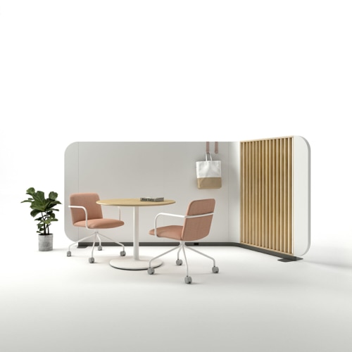
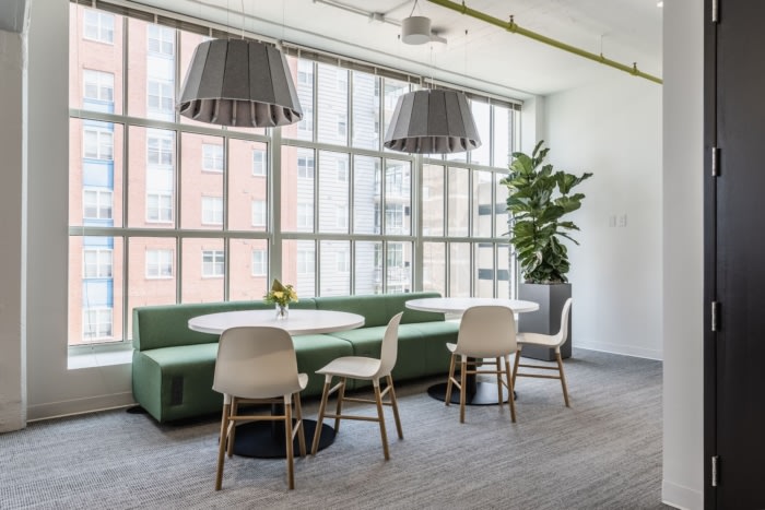
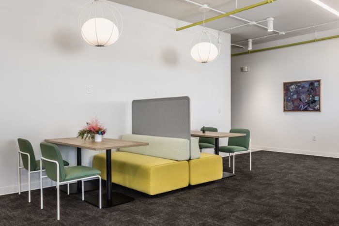
Color also played a critical role in wayfinding and spatial organization. Each office “neighborhood” was assigned a unique color palette, helping employees navigate easily while fostering a sense of community and exploration. The use of color blocks throughout the space not only guided movement but also created distinct zones that encouraged collaboration.
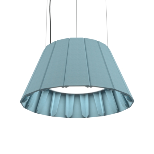
The project presented several technical challenges, particularly around lighting and mechanical systems. The building’s concrete structure required carefully selected lighting specifications that could be mounted directly to the ceiling while meeting functional needs.
Ultimately, the redesigned space is both captivating and functional, inspiring creativity, collaboration, and pride. The success of this initial project has been so impactful that it has already led to further expansions.
Design: Parallel Design Group
Contractor: Burnside Builders
Furniture Dealer: RJE
Photography: The Addison Group | Kendall McQuay


Now editing content for LinkedIn.