AkzoNobel Offices – Pune
CBRE Design Collective’s AkzoNobel office in Pune, India, employs vibrant color to create an emotionally engaging, sustainable workspace that fosters collaboration and reflects the transformative power of paint.
The AkzoNobel office design is envisioned as a vibrant, purposeful environment where colour becomes a powerful medium for emotion, identity, and engagement. Guided by the understanding that colours evoke both physiological and psychological responses, the interiors are carefully curated to inspire different emotions across different spaces.
Strategic use of colour plays a defining role throughout the office. Bold yet balanced colourful accents are introduced in areas that require attention, interaction, or action—such as collaboration zones, innovation corners, and circulation pathways—adding character, energy, and visual interest. These accents work in harmony with a refined primary palette, ensuring clarity without overwhelming the senses. Carefully selected imagery complements the color story, reinforcing brand values while enhancing spatial storytelling. Each color is chosen for its emotional resonance of Joy, Passion, hope, trust, peace, elegance, Luxury.
This thoughtful chromatic language directly reflects AkzoNobel’s belief in the transformative power of paint.
The design is strongly inspired by AkzoNobel’s global “Let’s Colour” initiative, launched in 2009, which demonstrates how color can uplift communities and transform lives. Much like the initiative’s impact across over 2,400 projects in 46 countries, the office interior becomes a living example of how vibrant environments can foster inclusion, creativity, and positive change.
Sustainability is deeply embedded in the design approach, aligning with AkzoNobel’s People. Planet. Paint. purpose. Durable, responsible materials and long lasting finishes are prioritized, reflecting the brand’s commitment to environmental stewardship and longevity—mirroring the use of high performance paints like Dulux Promise Exterior in community upliftment projects.
The office includes multiple thoughtfully designed spaces to host small events, meetings, and collaborative gatherings, such as a welcoming reception area and a flexible.
Overall, the AkzoNobel office stands as a vibrant, sustainable, and emotionally engaging workspace—where design, color, and purpose come together to inspire people and positively impact everyday experiences.
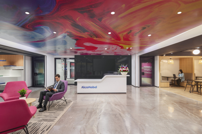
The AkzoNobel reception space is conceived as an immersive brand experience that immediately communicates the company’s belief in the transformative power of paint. Designed as the first point of contact for visitors, the space seamlessly blends creativity, innovation, and professionalism—reflecting AkzoNobel’s global leadership across its diverse coatings businesses.
A striking feature ceiling becomes the focal element of the reception, showcasing fluid, marbled patterns in bold hues drawn from AkzoNobel’s rich color palette. This expressive overhead canvas symbolizes the science, artistry, and technical mastery behind coatings—evoking movement, flow, and transformation, much like paint itself in motion. The ceiling installation visually reinforces the brand’s ethos that color has the ability to inspire emotion, stimulate creativity, and redefine environments.
The visitor lounge seating introduces warmth and approachability through vibrant, upholstered forms in signature tones of purple and complementary accent colors. These elements soften the space while reflecting AkzoNobel’s dynamic character and human-centric design approach. Rounded furniture shapes contrast with the architectural lines, creating a balanced environment that feels both welcoming and contemporary.
Thoughtful material selection plays a key role throughout the reception. Neutral stone flooring and textured wall finishes provide a calm, durable backdrop that allows the colors to stand out while emphasizing longevity and sustainability—aligned with AkzoNobel’s People. Planet. Paint. purpose. Subtle lighting enhances the richness of surfaces and highlights architectural details without overpowering the visual narrative.
Additional artistic elements, such as sculptural paint-flow installations and curated color expressions, further reinforce AkzoNobel’s core business and innovation in coatings technology. These elements celebrate colour not just as decoration, but as a functional, emotional, and performance-driven medium.
Overall, the reception space functions as a bold yet refined brand statement—an environment that welcomes visitors while clearly expressing AkzoNobel’s identity as a company that brings together science, sustainability, and creativity to Paint a better future.
Workhall – A striking highlight of the space is the suspended ceiling installation, composed of layered mesh elements and linear frames in vibrant hues—red, yellow, blue, green, and purple. This overhead feature symbolizes the diversity of AkzoNobel’s businesses and the science of coatings layers, visually expressing flow, innovation, and transformation. The floating composition adds visual depth while reinforcing AkzoNobel’s philosophy that color is not merely decorative, but functional and impactful.
Large graphic wall murals animate the workhall perimeter, featuring expressive brushstroke imagery and abstract compositions. These murals celebrate creativity, movement, and human potential—key values deeply rooted in AkzoNobel’s Let’s Colour initiative and its broader commitment to improving everyday spaces. The artwork energizes the environment and serves as a constant reminder of the brand’s purpose led approach.
Material selection throughout the work hall emphasizes durability, sustainability, and comfort. Carpet tiles, as per colour zones with geometric patterns support wayfinding and zoning, while enhancing acoustic performance. Integrated planters introduce greenery, softening the workspace and promoting well being.
Lighting is carefully layered, combining linear task lighting with suspended feature fixtures to ensure optimal illumination without glare.
Overall, the AkzoNobel work hall is a vibrant ecosystem of work and creativity—a space where people, colour, technology, and purpose intersect. It reflects
AkzoNobel’s dedication to innovation, sustainability, and human centric design, empowering teams to collaborate, ideate, and deliver solutions that help paint a better future.
The Meeting rooms are designed as a refined, high performance space that reflects AkzoNobel’s leadership in various businesses such as Aerospace Coatings and Marine & Protective Coatings, Automotive OEM solutions ,where precision, durability, and advanced technology define the business.
A prominent feature wall mural anchors the space, depicting abstracted marine imagery layered with linear graphics and flowing forms. This visual language represents ocean currents, hull movement, and coating layers, symbolizing durability, performance, and lifecycle protection. The subtle integration of graphic lines suggests data, performance tracking, and technical precision—key aspects of AkzoNobel’s marine coatings expertise. A key feature is the graphic aerospace mural, subtly integrated with angular planes and aircraft imagery.
The spatial language is clean and structured, inspired by aircraft geometry, hangars, and aerodynamic forms. A neutral base palette of whites and greys establishes clarity and focus, while strategic yellow accents—drawn from AkzoNobel’s brand identity symbolize innovation, optimism, and forward momentum. These accents also echo safety markings and wayfinding cues commonly found in aviation environments.
Overall, the meeting room is a brand led, technology inspired space that communicates trust, innovation, and longevity—positioning AkzoNobel as a global leader in protective coatings that safeguard assets, optimize lifecycles, and enable smarter, more sustainable operations across air and sea., and roads.
Design: CBRE Design Collective
Photography: Yasar Curtay


Now editing content for LinkedIn.