Mendeley Offices – London
align has recently completed the design of a new office for technology company Mendeley located in London.
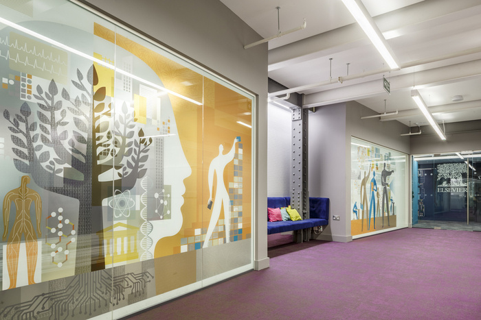
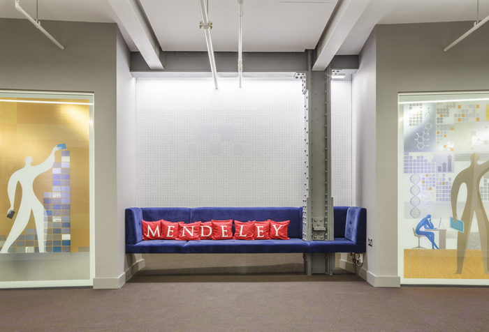
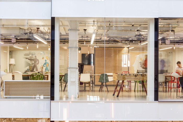
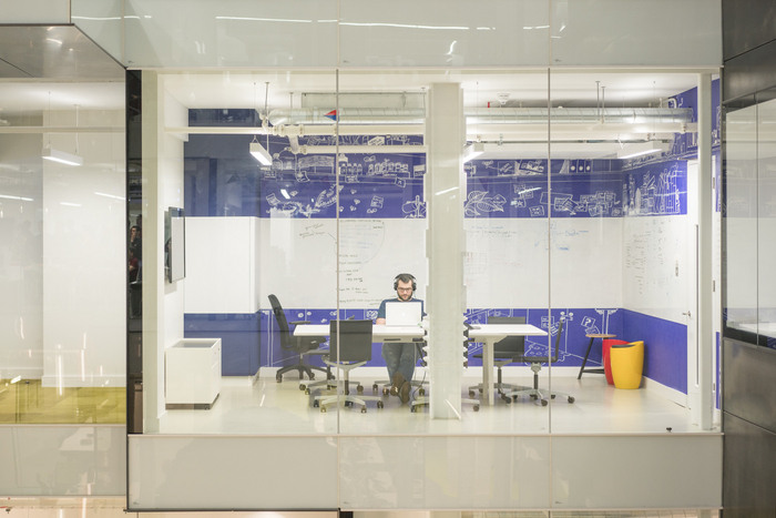
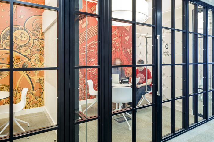
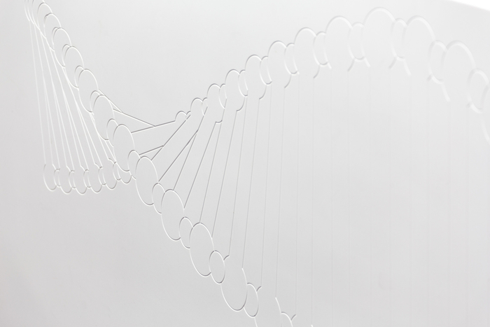
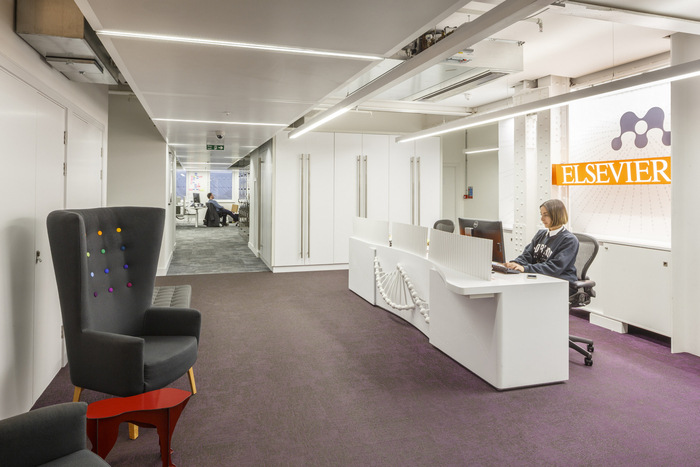
Reception: Visitors first arrive at the third floor level into a lift lobby area, which is bordered to the right and the left by two sets of glass doors, decorated with the Elsevier white tree logo. Two glass walls opposite feature eye-catching, full-height graphic illustrations, which are transparent enough to show the movement of figures the other side, but which also create a degree of privacy for the meeting spaces beyond. These came from Elsevier’s existing image library, but were selected by align to work specifically with the space and the overall colour scheme.
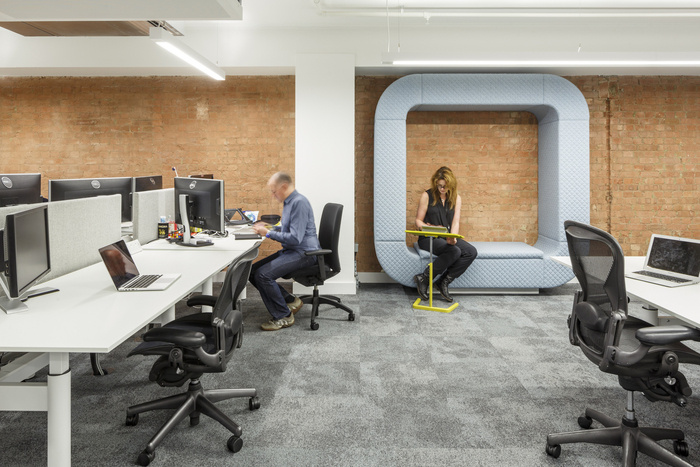
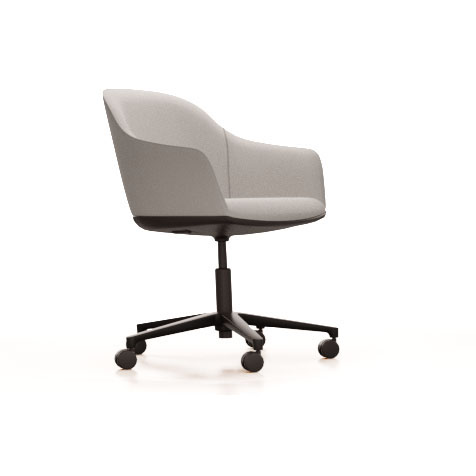
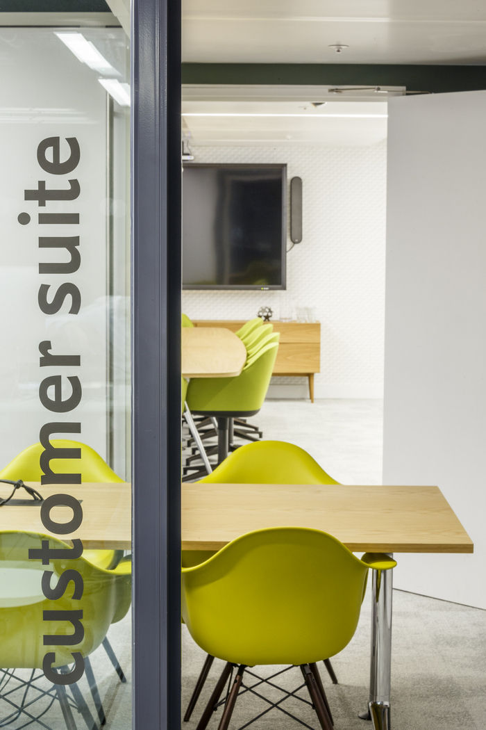
Main Work Zones: Behind reception is the first of the three main open-plan work zones. These feature large-format 1800mm-long workstations, so that two people can easily work at each if needed, divided by classic privacy and acoustic screens, clad in a grey Blazer fabric by Camira. Desking and chairs throughout the main zones are by Dutch manufacturer Gispen, who work with Reed Elsevier globally, whilst carpets here and in most meeting spaces are a dark grey: Composure by Interface, with an additional lighter grey used in the Board Room and Customer Experience Room.
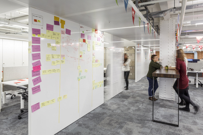
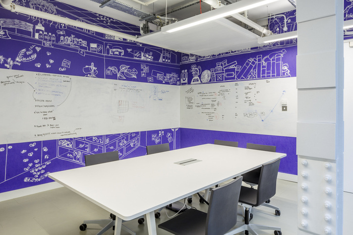
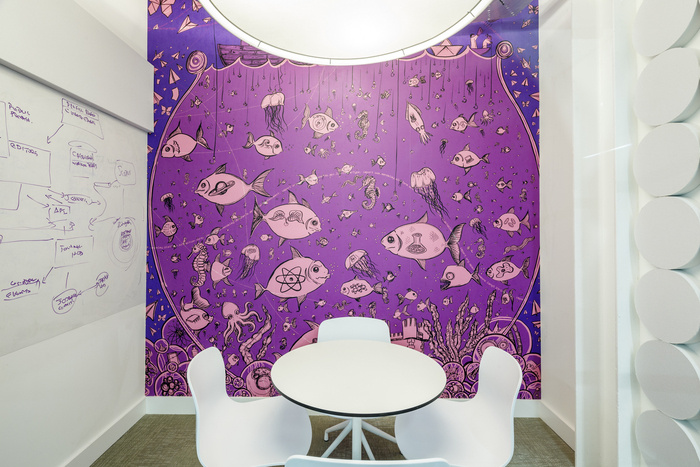
The most unique aspect of the zones comes in the use of wallcoverings with both sliding screens and write-on walls that enable Mendeley’s staff to work on coding and scheduling, whilst constantly benefitting from interaction with and input from other staff.
To ensure flexibility throughout these zones, staff use laptops work on whichever desk space is the most convenient for their task. There are no pedestals alongside desks and personal items and changes of clothes are kept in lockers. Each staff member has his or her own personal locker, located in banks around the office. Supplied by Maine, the lockers came in raw natural steel and were lacquered to be eye-catchingly reflective.
The Social: The Social is the longest single space within the scheme and serves as a ‘Town Hall’ meeting space, as well as a general space for eating, drinking and relaxation. It overlooks the atrium directly via a full-height glass wall and is announced by two fun, bespoke installations by Argent and Sable, made of hand-painted reclaimed timber, edged with fairground-style lighting, which book-end the space with the mantra ‘Eat, Drink, Code’.
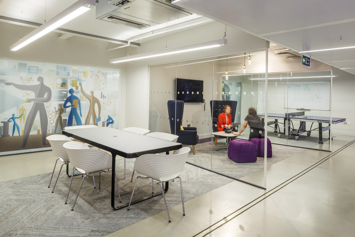
Meeting & Break-out Spaces: Further work zones lie beyond The Social, as do a range of meeting and break-out spaces, offering as much variety as possible.
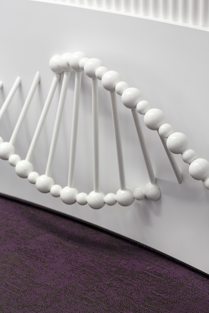
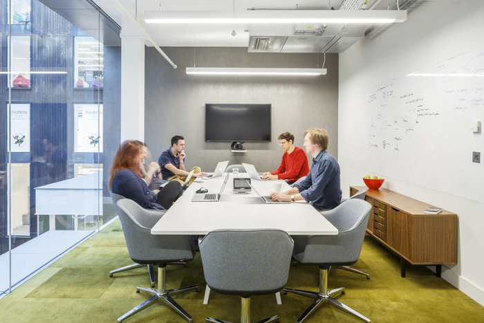
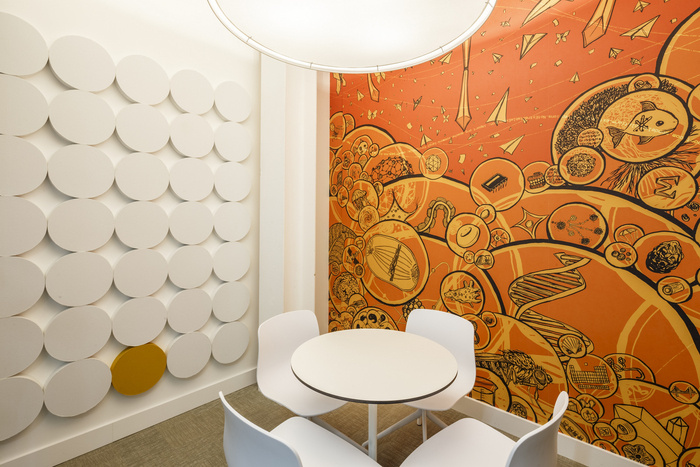
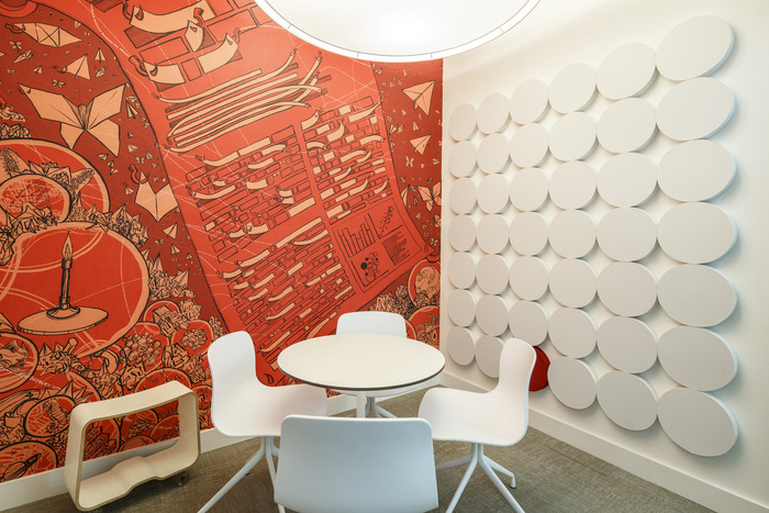
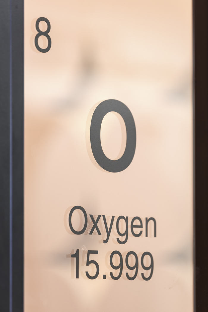
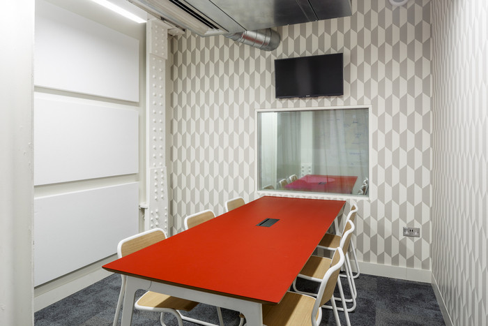
For example, on the opposite side of the atrium is a series of three closed meeting rooms, which accommodate just two people at one time, called Oxygen, Hydrogen and Nitrogen. A fourth room in the series, Carbon, is larger and is specially set-up for video-conferencing. The screen in the room is set against an almost-black wall, so that the screen effectively seems to disappear when switched off. Also in this cluster of rooms is a further meeting room called The Lab. Here, the client requested a room deliberately styled on a laboratory theme.
Design: align
Photography: Gareth Gardner

