V Kontakte’s Youthful Saint Petersburg Office
As Russia’s largest social network with over 100 million users, V Kontakte is a massive online destination. The company partnered with Finnish design firm Gullstén-Inkinen to create a youthful office in St. Petersburg.
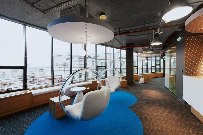
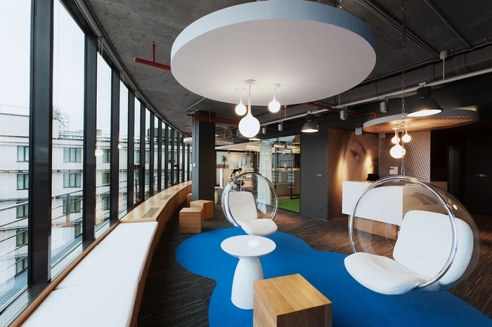
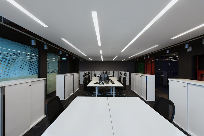
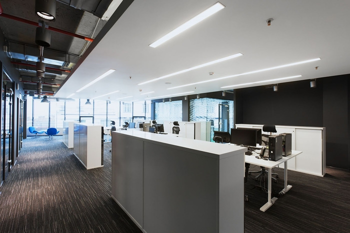
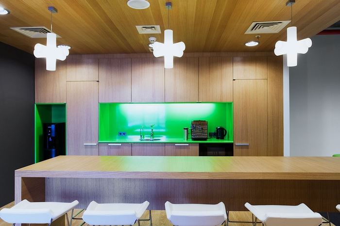
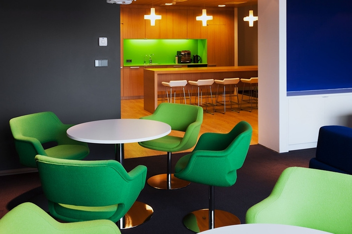
Awarded the Best Office Award 2012 in the Comfort and Ergonomics category at Finnish Design Days in Moscow, the space is truly a next generation office. One main goal of the space was to create many more informal work spaces and lessen the use of traditional work spaces. V Kontakte’s employees are young, so they were eager to have space that spoke to their generation.
We have previously seen V Kontakte’s office in St. Petersburg, but I am assuming it was the location prior to the one posted today.
Some great details about the space:
“During the design process, V Kontakte staffs’ inside joke was to want concrete effect wallpaper since concrete (real) walls are currently in ‘trend’ and specified everywhere where possible. They wanted that too. Some of walls within the office were specified brick and in appearance similar to the external walls. The brick wall effect was exposed to achieve the industrial theme as well as to achieve a slight ‘kitch’ impression.
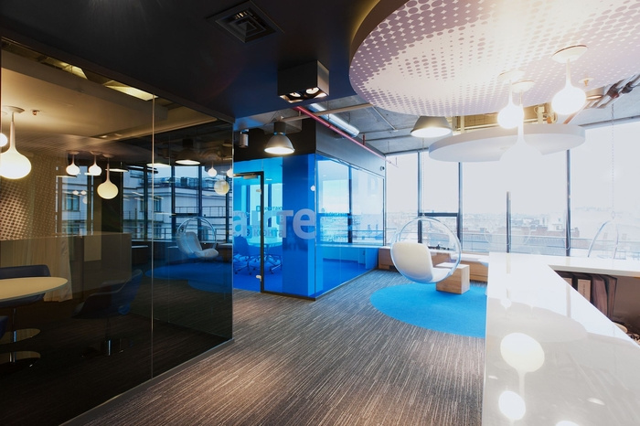
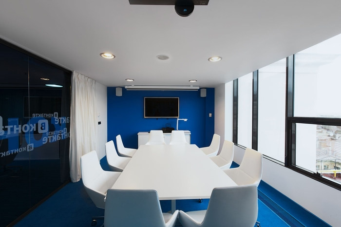
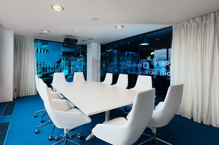
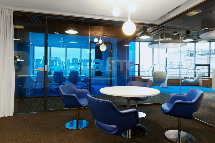
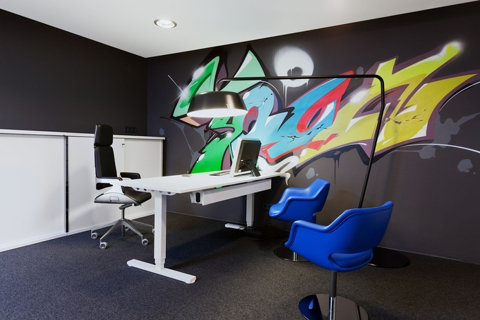
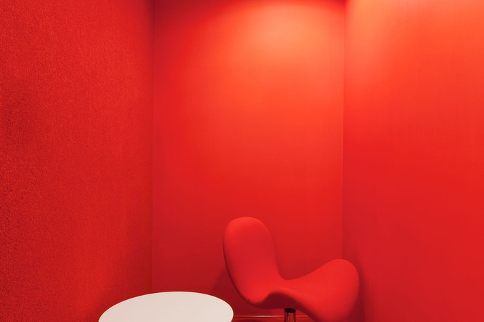
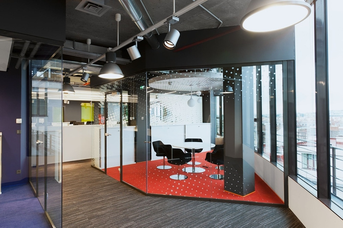
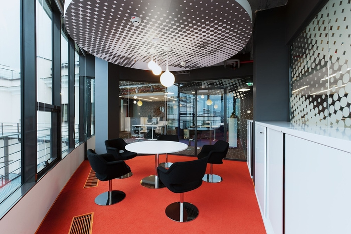
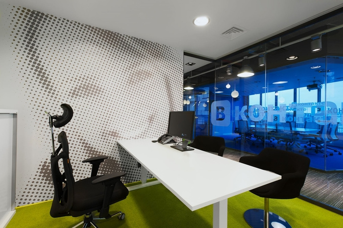
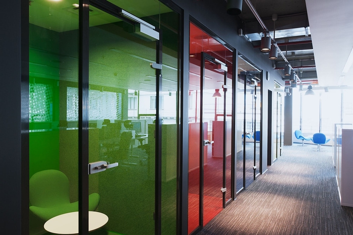
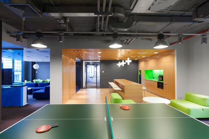
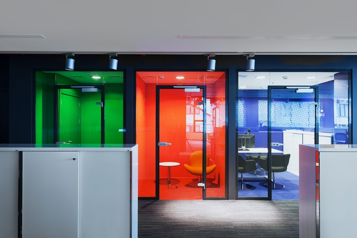
The new premises are mainly open plan and so detail to acoustics was critical to the success of the design. GI’s expertise is achieving silent open spaces and an open plan office in this case. Carpets were specified throughout since the majority of staff are young women with high heeled shoes. There are variety of spaces from phone booths to silent areas, from meeting rooms to play areas. Despite the dark colours on walls and ceilings; spaces are not dark or gloomy. To add a bit of brightness, playfulness colours and features have been added to furniture, textiled rugs and manifestations. Also, reflective finishes; splashes of white on ceilings and walls have been added within specific areas to achieve reflective light and brightness when needed.
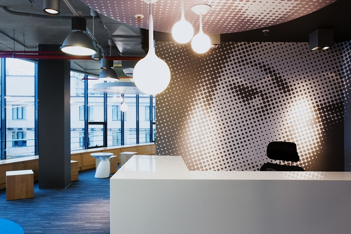
To highlight the type of company – social media, social networking; prints of peoples’ faces were added on manifestation. The images are relatively abstract;(raster) when near the image and once further you can see quite clearly the face (impressionist).
Each solution has been thought over in great detail and consideration and, as always, user driven/focus, the client wish list/brief. As well as incorporating the company’s image and brand.”
Design: Gullstén-Inkinen


Now editing content for LinkedIn.