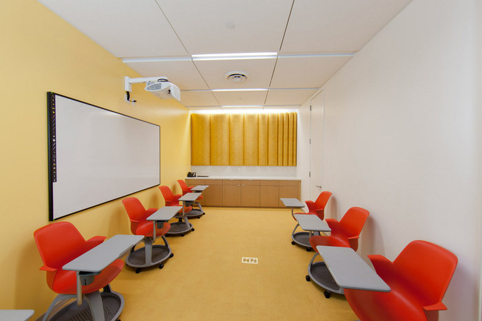
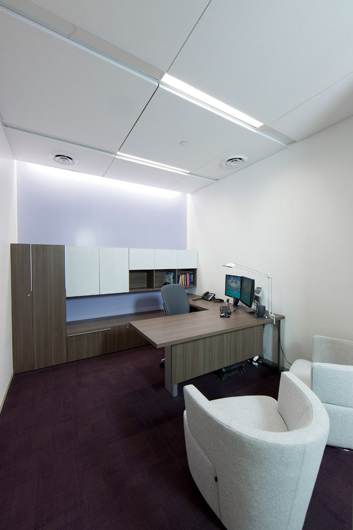
Inside Doc Magic’s Offices
RA-DA designed the offices of Torrance-based loan document company Doc Magic. The office is designed to use light and shape to convey the precise nature of the company in a physical way.
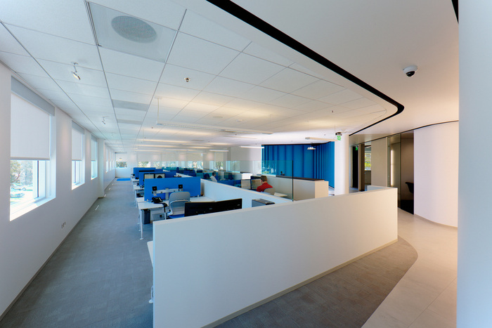
For the largest loan document tech company in the U.S, a company that deals in highly sensitive information transmitted over the internet, we conceptualized an interior work space that would represent the computer hub of their vast virtual network of documents. We had the difficult goal of conveying the company’s strong virtual existence with an equally powerful physical presence. We achieved this obscure aspiration, in short, with the unique use of light and careful sculpting of passageways that connect the open workspaces. Controlled and accurate detailing of all elements reflects the precise work ethic of the company.
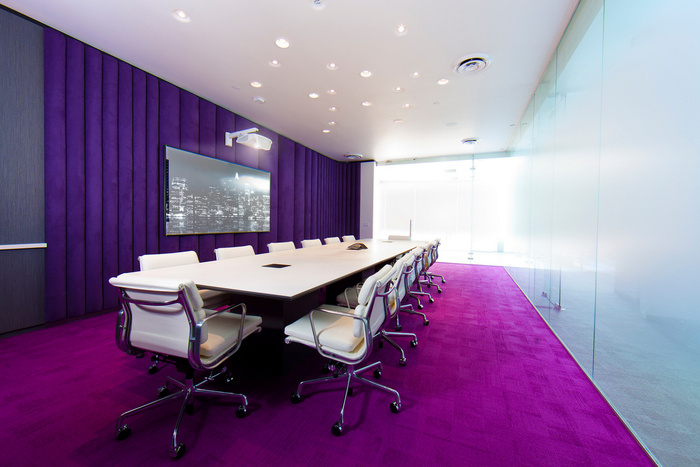
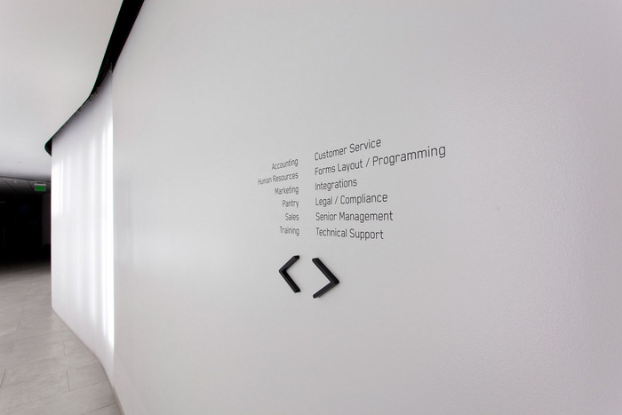
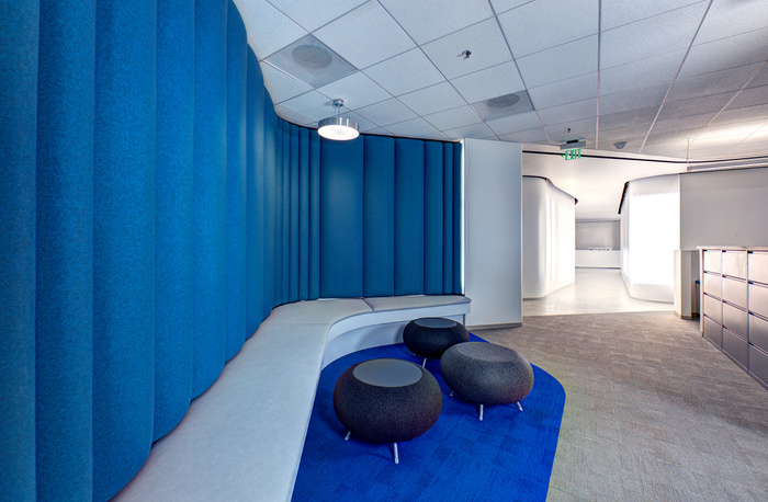
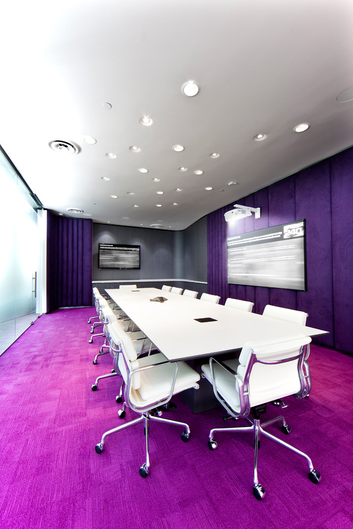
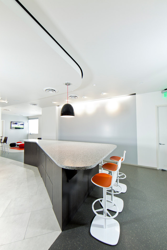
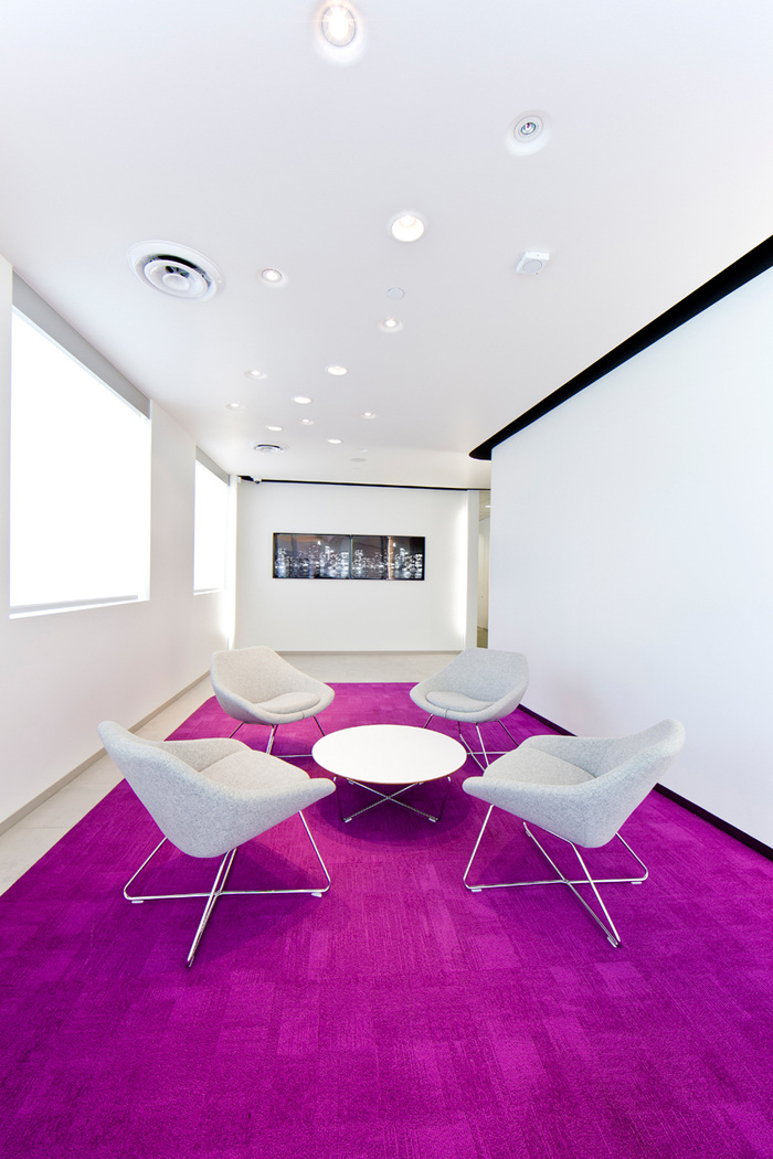
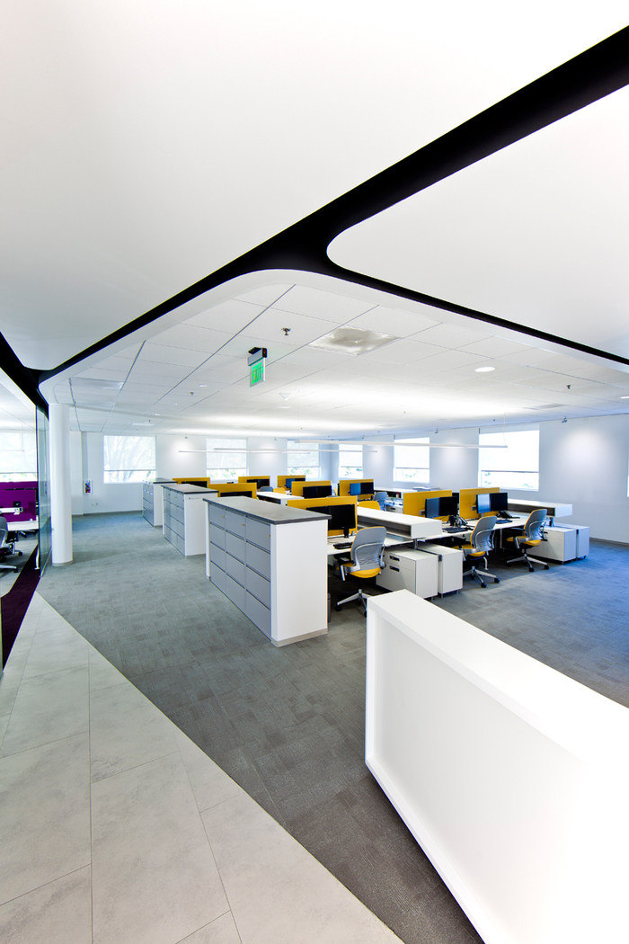
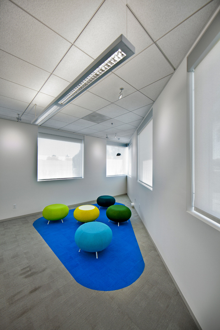
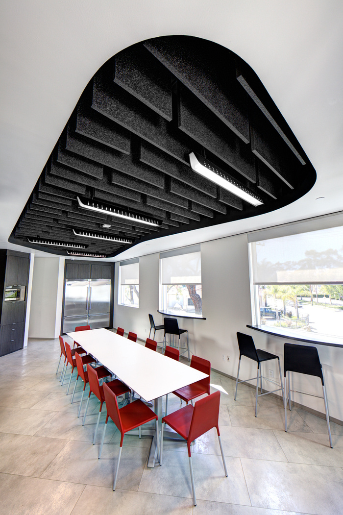
These pristine and glowing passageways meander through the space and peel away to reveal brightly colored patches that would accommodate small meeting areas, phone nooks and conference rooms. The passageways act as portals that lead to contrastingly open work areas, with a scattering of color used to define the different departments. As part of our work we needed to craft a space that would connect the two wings of the building. We took this as an opportunity to distill the core purpose of the company into an architectural statement: A mighty charge that resulted in a poignant architectural statement that would become the company’s branded image.
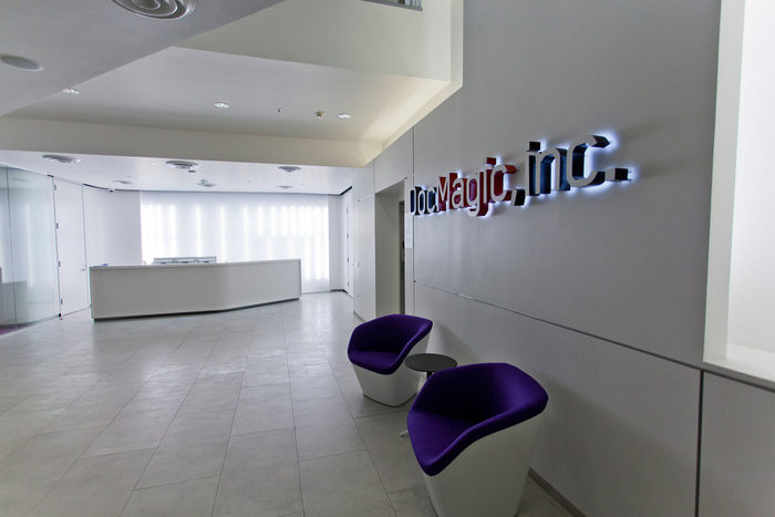
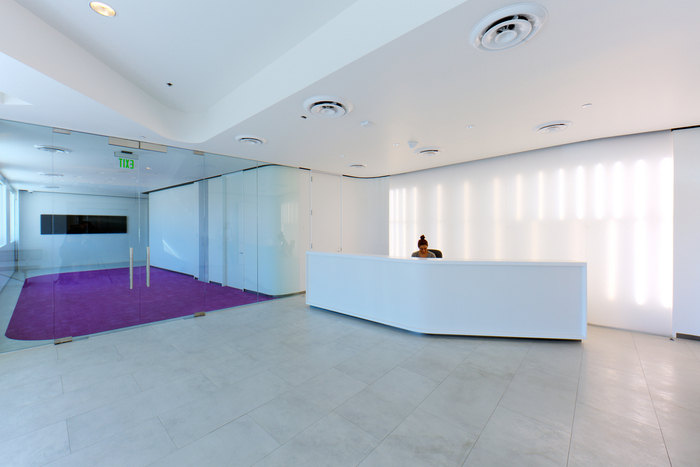
The result is a physical embodiment of the company’s strong virtual presence. We used carefully placed tubes of light behind a curvilinear translucent acrylic wall to create a seemingly non—tangible surface. After much experimentation with fixtures, materials, and spacing, we developed a language of light that projected varying intensities onto the surface at changing rhythms. The rows of lights converge at the corners to create strong vertical striations, marking the entry into and exit out of this zone. The same technique was used again at the downstairs building entry to brand the space and greet the visitor with an immediate sense of the company’s character.
The success of this project is not only in the commitment to the study of a single paradigm that so eloquently embodies an obscure goal, but also in the follow—through from concept to reality. Every aspect of the project needed to be controlled in order to allow the light passageways to work the way they are meant to. From the hidden mechanical system to the black recesses that hide the supports of the acrylic panels to the sheen of the paint on the white walls: each element is intentional and exact and together work towards creating a seamless and thus ethereal nature of space.
Design: RA-DA


Now editing content for LinkedIn.