Corporate Offices – Mogi das Cruzes
Fabiane Sakai + Larissa Burke have designed the offices for a business administration company located in Mogi das Cruzes, Brazil.
This corporate project was designed for a business administration company, in Mogi das Cruzes, a city located near São Paulo. For its architectural concept, two aspects of the spatial relationship were considered: the internal dynamics of the company in space, through the layout design, and the visual relation with the external side, through the valorization of the city landscape and the Itapeti Mountain Range as background to the proposed architecture.
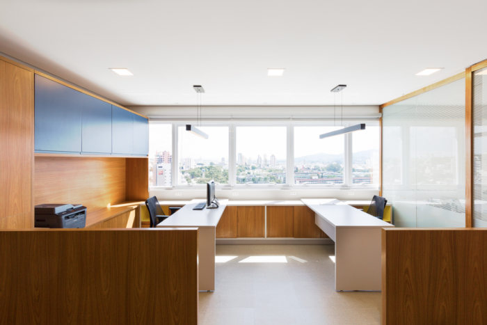
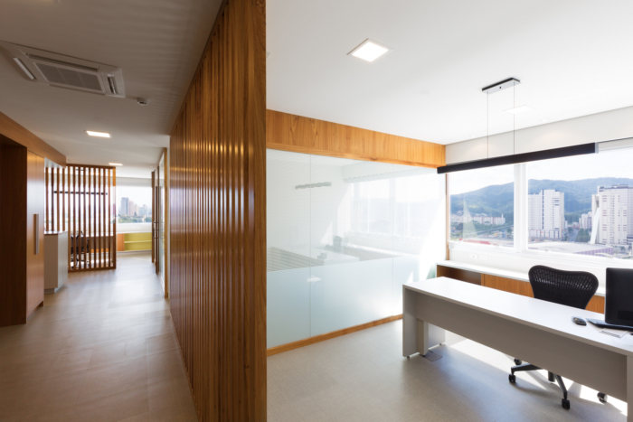
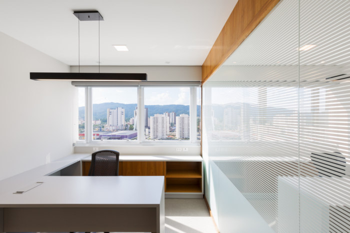
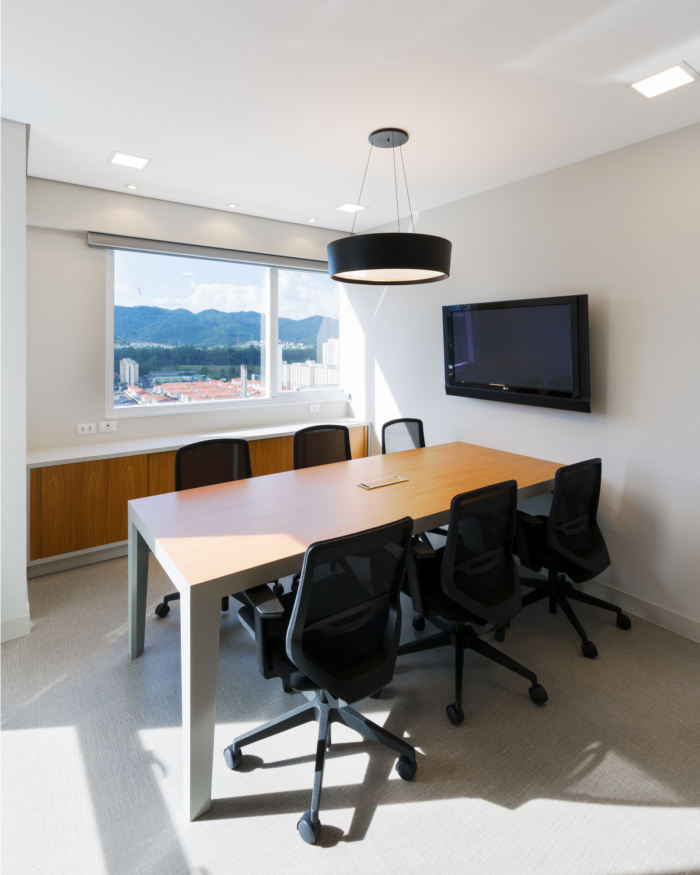
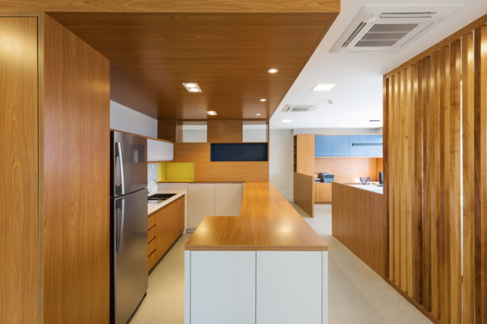
The spatial organization started from the distribution of the spaces of permanence – work areas, close to the windows. This starting point set out the U-shaped main office flow and resulted in the creation of a kernel, which was occupied by the coffee area. Acting as the heart of the place, the coffee area became an element of social integration between employees and customers, and it was highlighted by a lowered wooden ceiling. The features of this area also addressed the need for document storage spaces. Thus, from the combination of flows and forms it was possible to add functionality to the place.
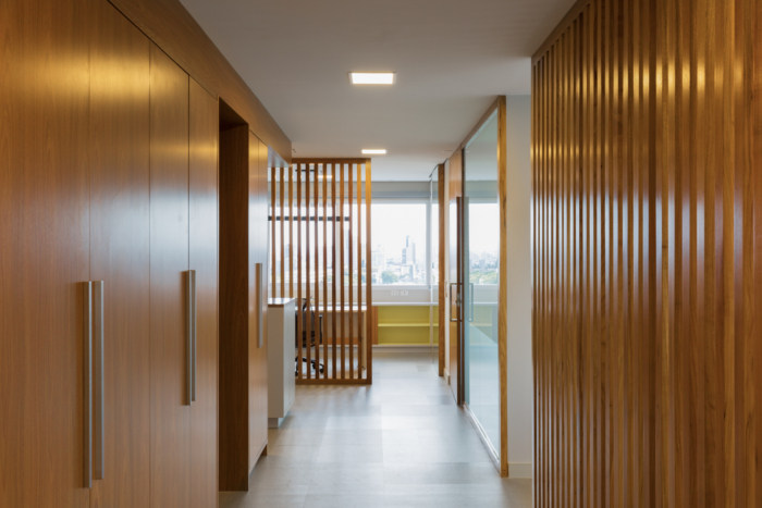
This combination also enabled the managers rooms to be isolated from the others, preserving the demarcation of hierarchy and privacy required. Wooden slats keep the language of the materials palette and represent the rooms demarcation without closing them, bringing, therefore, permeability for the entrance of natural light and amplitude to the office.
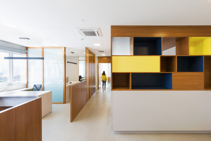
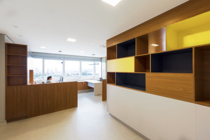
The reception room immediately at the entrance, without partitions and with a city view, makes the reception a warm and bright environment for those who arrive.
The wood niches divides the reception and the coffee area, and serve as support for the waiting room. The aesthetic path adopted for the project intended to follow a more conservative style to meet the company’s profile. The use of yellow and blue colors comes from the branding manual and bring the customer identity to the place. Neutral colors were blended with wood to create an sober, and yet cozy atmosphere.
Designer: Fabiane Sakai + Larissa Burke
Photography: Manuel Sá


Now editing content for LinkedIn.