iKame Offices – Hanoi
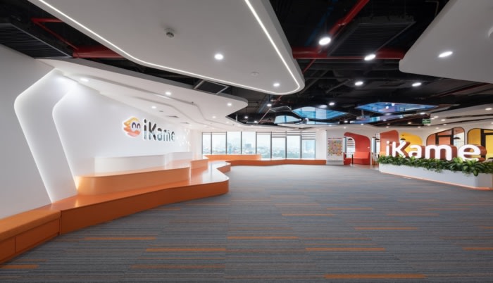
The proposed design for the iKame office in Hanoi by DPLUS VIETNAM utilized volcanic-inspired contours and various shapes with rounded corners to give the space a youthful and dynamic feel.
Layout
Currently, the office features a large glass facade wall that spans the entire space, allowing for 100% exposure to natural light. The area overlooking the beautiful lake is ideal for functional areas such as community activities and customer reception. However, half of the glass surface is located in the West and southwest direction, making it susceptible to intense sunlight from 12:00 to 17:00.With these advantages and disadvantages in mind, the proposed layout plan is to divide the space into two areas:
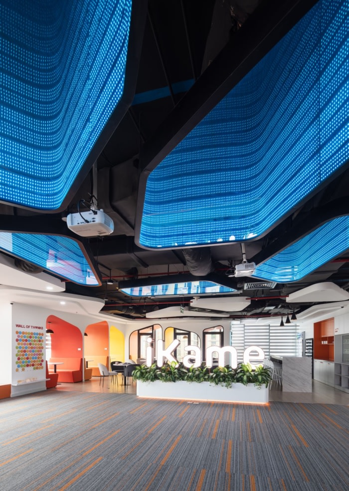
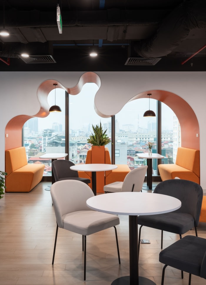
– The lakefront area, facing southwest, will serve as a public space with a multi-purpose area for training and events, a pantry, a gaming area, a cafe, and a phone booth.
– The remaining space will be designated as the working area, receiving morning sunlight and blocking the harsh afternoon sun.Detail
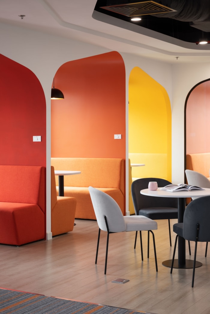
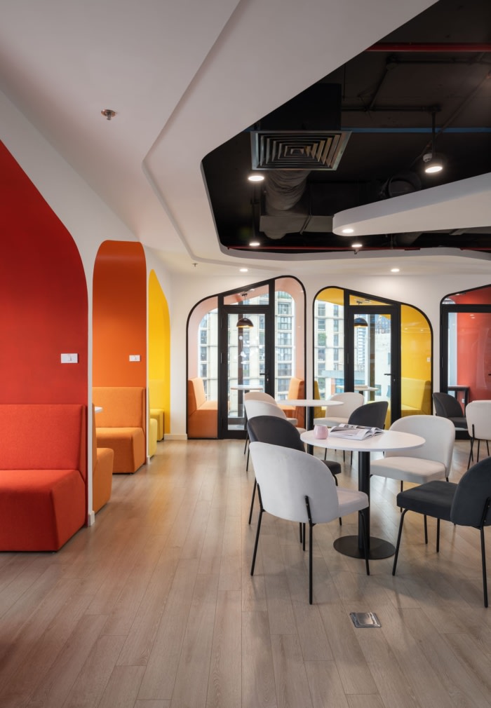
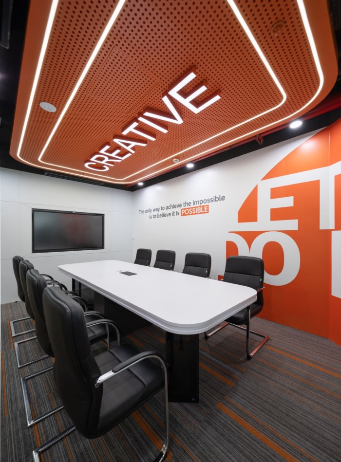
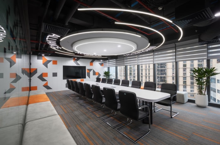
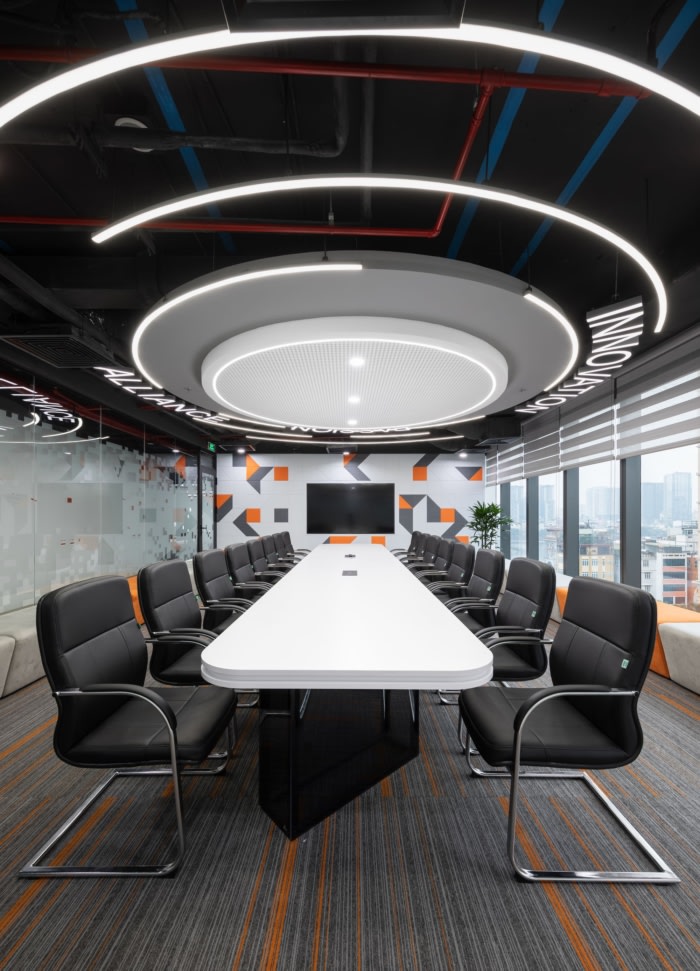
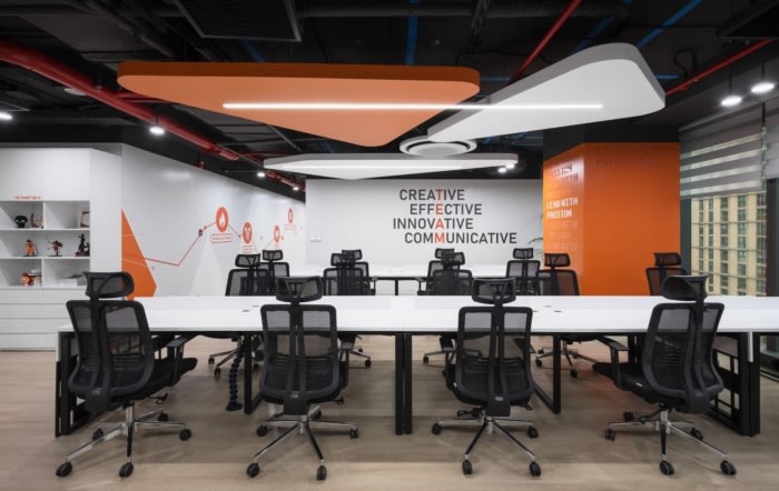
Color is an important factor in creating an impression for this space. Combination of solid color, contrast, and 60-30-10 color scheme.White and gray are the main colors of the project, accounting for 60%, exploited mainly on desks, work chairs as well as ceiling areas. The purpose is to create a neutral background color that supports the prominence of the brand identity color, creating a strong contrast effect overall.
Yellow accounts for 30% and is exploited in large decorative walls, EGD systems, and decorative lighting. The use of 30% yellow helps create a cohesive visual effect and gradient area for the IKAME brand identity accent color. In addition, using warm color tones will help the interior space become cozy and intimate and is also a way to convey the message of spreading the spirit of common fire.
Brand identity color accounts for 10% and is also the highlight color exploited in details that carry identification elements and impressive decor details. The purpose of using brand identity colors at a reasonable ratio is to help attract the eye when applied to spaces with a lot of interaction, high traffic density, and impressive details.
The colors orange and yellow are both vibrant and eye-catching, making them perfect for creating a strong impression. To achieve a balanced and pleasant atmosphere upon entering the space, we have simplified the use of shapes and lines.
Taking inspiration from the powerful image of a volcanic eruption, we have incorporated giant lava flows in the design through the use of contour lines. This element is predominantly featured in the multi-purpose area of the office.
The IKAME office boasts a variety of shapes, each with its unique form, but all with soft, rounded corners that contribute to the overall youthful and dynamic feel of the space
Design: DPLUS VIETNAM
Principal Architect: Doan Phuong
Project Manager: Phan Trung
Photography: Thien Thach


