Intercon Offices – Kyiv
Dolgopiatova Design renovated three apartments in Kyiv to create a unique and meaningful office space reflecting Intercon’s characters through custom elements and thoughtful design choices.
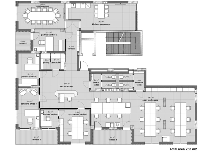
The owners of the company acquired three modest apartments on the ground floor of a new residential complex, near the Dnipro River embankment, to create a unified working space for their rapidly growing company. The company specializes in the renovation and construction of clinics, offices, and commercial spaces. Initially, the plan was to quickly create a typical, stylish, and functional office and relocate promptly. However, something went awry. Here’s the backstory.
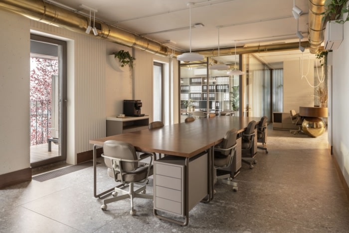
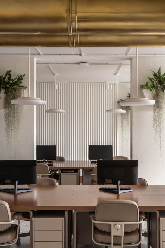
The project was intended to be comfortable for employees and partners, reflecting the high craftsmanship of the construction and related works, and it had to be exceptionally unique for my clients. I went further and imbued meaning into some elements, especially after getting to know the partners and the company’s work more closely.
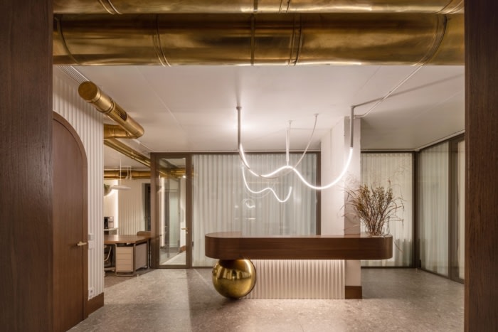
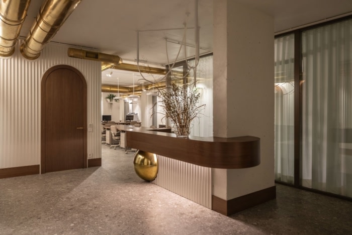
For example, the reception area. To avoid the typical approach of attaching the company logo and name, I tried to convey the company’s essence through shapes and materials.
At the heart of the reception area is a load-bearing monolithic concrete column symbolizing one of the partners who heads the construction department – the vertical of the company. He is precise, strict, and reliable, capable of withstanding any load. The second form is a robust wooden countertop – the second partner heading the departments of procurement, promotion, and organization. Horizontal strength of a soft material, softened further by the arched shape of the countertop. The brass sphere is the third partner of the company, responsible for the financial department. A round, movable form made of a material embodying the energy of radiance and sunlight. This is how she, the female partner, is – a combination of several energies. Another essential element is the surface of gypsum flutes. These flutes symbolize the company’s employees, each one crucial, from the lawyer to the construction worker. Therefore, so much attention was paid to the quality of the space. All primary forms are self-sufficient but securely connected to each other, creating a figure-performance welcoming the visitor-client.
You might ask, where in this composition is the form and material symbolizing the company’s clients? It’s the chandelier. Flexible light tubes creating a diagram of rises and falls, successful and sometimes problematic solutions, readiness to tackle any task, illuminating everything around. This is how you can imagine the construction process.
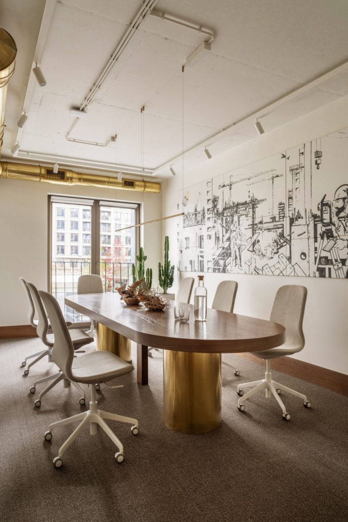
It was also important to mention the construction process as the company’s main activity, literally. Therefore, the decision was made to create a canvas with a comic-style graphic. The composition of the construction process, depicted on the joists, was commissioned from an artist who had been sketching on the actual construction sites of this company before starting the project. The most logical place for this element was the wall in the meeting room.
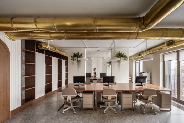
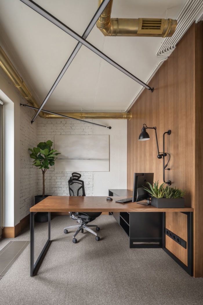
Despite the unified style of the entire office, some partner offices were deliberately designed in a slightly different style to emphasize each one’s individuality.
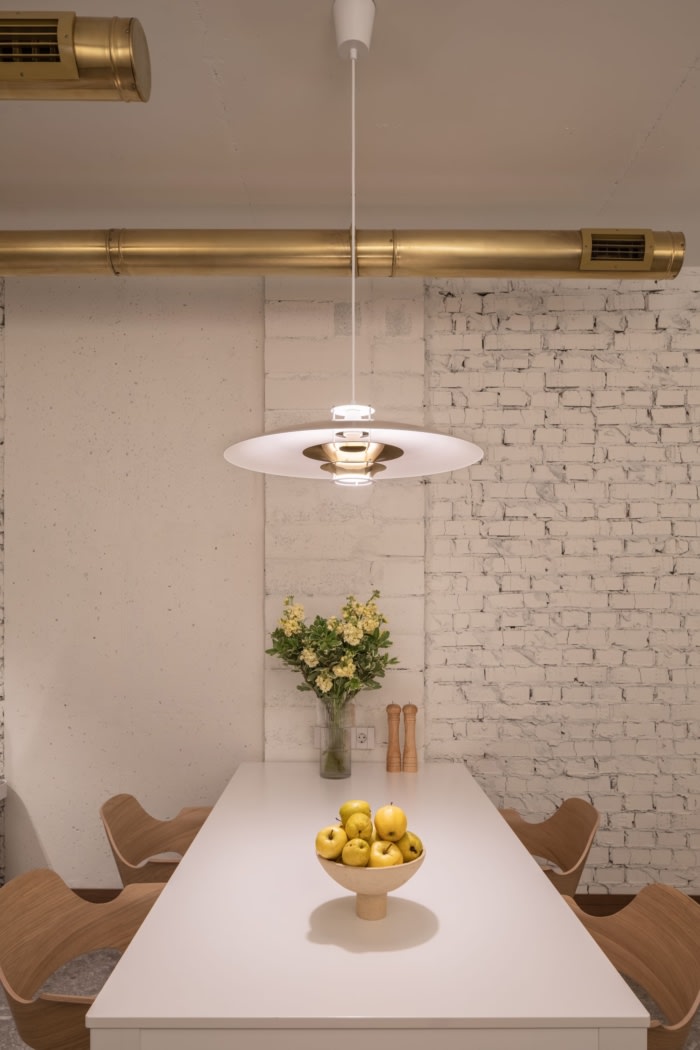
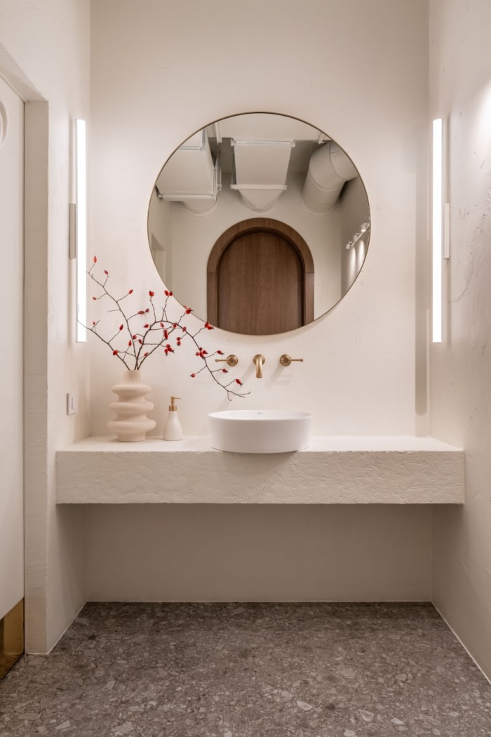
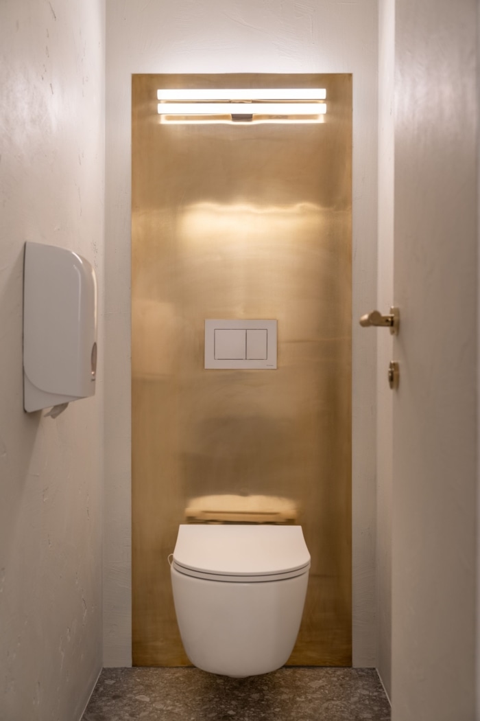
And of course, the bathrooms. The clients’ request was to have two gender-segregated bathrooms without a stylistic difference. However, I decided to play with forms slightly and, in a sense, underline the symbolism.
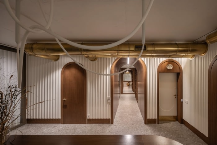
The abundance of arched forms symbolizes the company’s stability, as the arch is one of the load-bearing forms in engineering and construction. The eye above the entrance door, a conditionally inscribed triangle (in the arch), «symbolizes the Great Architect of the Universe, overseeing the labors of free masons».
Design: Dolgopiatova Design
Photography: Andriy Bezuglov


Now editing content for LinkedIn.