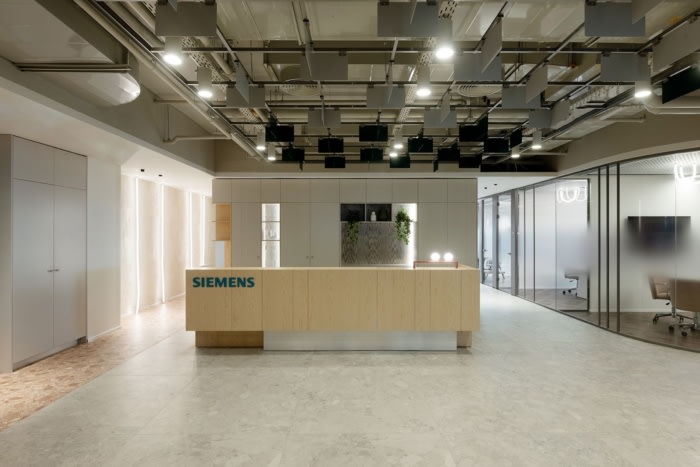
Siemens Israel Offices – Rosh Haayin
EN Design Studio designed a workspace for Siemens Technologies in Israel, emphasizing innovation and reliability through dynamic elements, transparent materials, and a color scheme inspired by the Siemens logo.
Siemens Technologies is a multinational corporation, perhaps one of the largest in the world that offers integrated solutions for a sustainable future – efficient manufacturing, integrated automation, intelligent infrastructure, complete mobility and sustainable energy.
Siemens challenged us to design a workspace that reflects the innovation and reliability of the company’s cutting-edge solutions for mission-critical applications.
We focused on the company’s leading principles and based our planning and design on these main focal points.
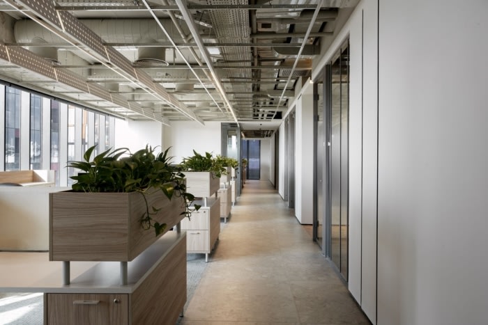
Intelligence – working with dynamic elements in the spaces that was created naturally between the blocs.
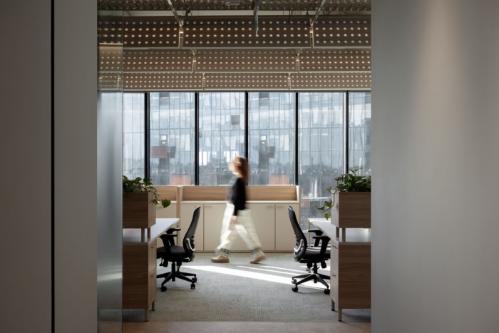
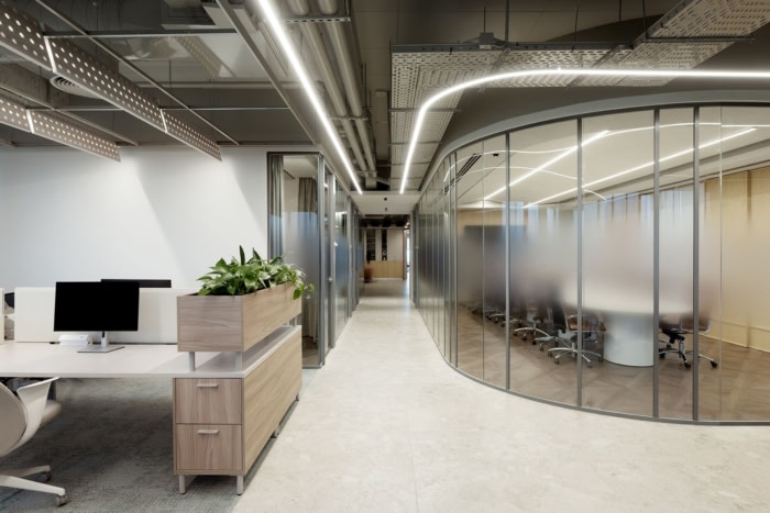
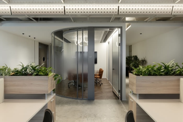
Mesh – working with transparent or perforated materials in order to create controlled intimacy.
Reshape – working with dynamic elements in the spaces that was created naturally between the blocksThe main project challenges were taking a corporate technological global company and giving it an innovative high-tech twist.
The main concept of the project was definition. Definition deals with identifying the essence of a subject and differentiating it from other things. It is a precise and exhaustive linguistic description of some concept. Differentiating whether it is a tangible object or even an abstract idea.
Most of the time, the identification of the type is done through the positive, while the differentiation is done through the negation or contrast, Siemens is corporate by all definition. We chose throughout the project to focus on the relationship between defined and undefined “defined-un-defined”
Our focus also extends to the detailed design of the laboratory and test areas, where we prioritized high strength materials and cabling to ensure the integrity of the building with Tempest regulations.
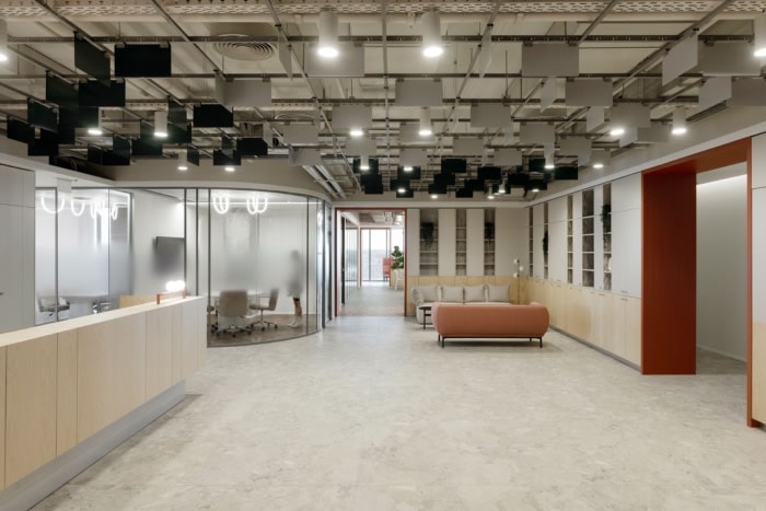
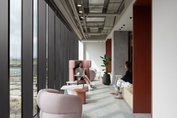
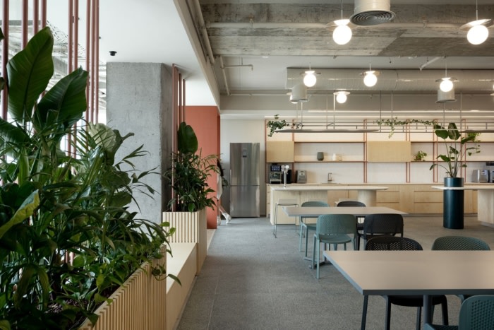
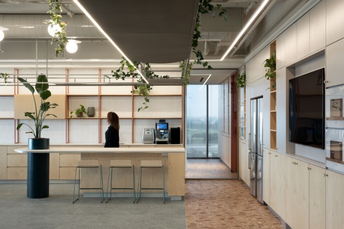
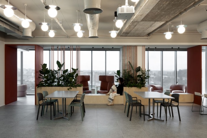
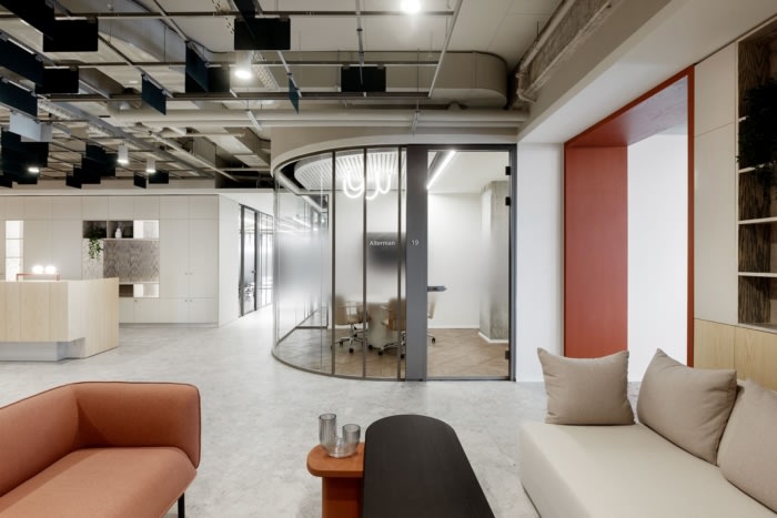
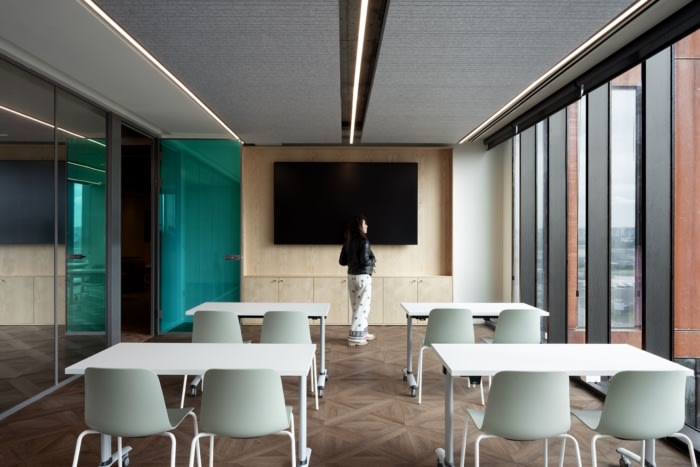
The choice of materials was carefully matched to the physical layout and functional requirements. Transparent materials were strategically used in open areas to promote transparency, collaboration and teamwork, while more opaque materials were carefully integrated in areas where privacy was required, such as meeting rooms, executive offices and phonebooths.
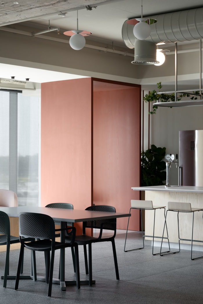
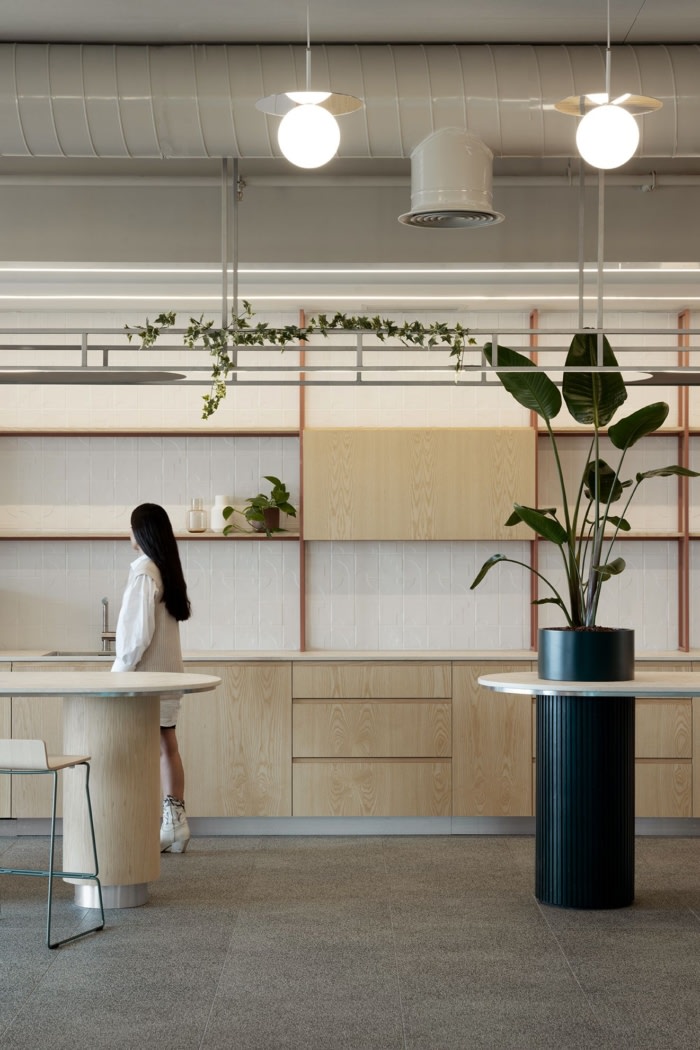
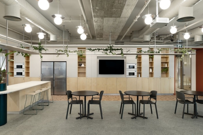
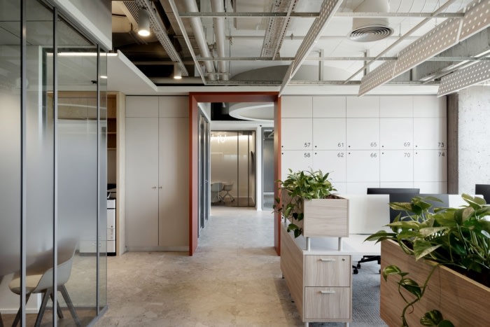
The color scheme embarked from the siemens logo creating a dynamic visual contrast , making the human experience navigation through the office space clear and familiar. In addition the usage of wood , concrete , lighting textiles and recycled acoustic materials allows a warm homely feel.
With all this said , the final result is unique and riveting which makes it possible to give a different interpretation to a multinational corporation, one that preserves the identity of the global company but at the same time allows character representation.
Design: EN Design Studio
Design Team: Sarit Aronowitz, Mayan Kim Petel, Michael Volovats, Eran Naim
Photography: Gidon Levin








Now editing content for LinkedIn.